Developing Products Is About Learning

Product development is a learning activity, fundamentally no different than any class you’ve had in school.

You start off with a goal, and only a general idea of how to get there. As you learn more about the product you are developing you get closer to that goal. Sometimes you hit roadblocks that you cannot find any way to overcome. Once in a while, things go exactly the way you thought they would. Most of the time product development falls somewhere in between these extremes.

I think that we all recognize this. The path through a product development project is uncertain, making project planning difficult. How many times are we going to design/test/redesign? What testing will we be doing? We can guess, be we don’t know. The duration of even “standard” activities have a lot of variability, and may easily vary by a factor of ten. Telling the boss or a customer when you expect to complete a product development project is very difficult, because the schedule is necessarily uncertain.

Instead of being an exercise in executing a project plan, product development is a sequence of learning cycles; it’s about constantly climbing the learning curve.

Project planning for product development can take this into account. Instead of drawing up plans where we say “specify this, then design it, then build it” in very sequential and defined steps, we can instead focus on the unknowns and the learning curve. Our plans can be focused on the unknowns; on the things that we need to learn in order to successfully complete the development. This turns our development process into a series of learning cycles, with known activities worked in around the learning activities.

More importantly, it forces us to plan. At the very beginning of the development process, we will have to think about the things that we don’t know and think about ways to turn them into designed product. We will have to think ahead. Planning like this is priceless.

Like any good project plan, there will be a planning horizon. We will progressively add detail as we go. At the earliest stages, we will just set out blocks of “we need to figure this out.” The team that will be doing the work needs to be involved in this, and they need to estimate the duration and possible variability of such events. As we get closer, the team needs to plan in greater detail, until you get to well-defined “learning events” with two- to four-week durations. Each “learning event” needs to have the desired outputs specified and the activities for each member of the team clearly laid out. At the end of each learning event, the team needs to regroup, share what they’ve learned and plan the next event. The level of planning conducted and the duration of each event needs to be determined by the amount of risk that the organization is willing to adopt.

Of course, not all learning events are going to come out with the desired results. That’s the nature of learning, and the cause of uncertainty and variation in product development. In fact, if you have an effective organization, about fifty percent of each learning cycle will have to be repeated. Unlike manufacturing, where repeating the same work—rework—is considered waste, this “rework” is value-added, because learning is a necessary part of the job. If your organization does not have mature processes for organizational learning, then you may have to repeat as much as ninety percent of the work. These extra repeats are not value-added; they are waste.

There are ways to reduce the cost associated with the learning cycles, and to reduce the number of cycles. TRIZ, for instance, can greatly shorten learning cycles and reduce the number of them by enabling engineers to learn from the hard-earned lessons of others. Processes that help the organization better understand the customer, such as QFD, add cycles at the beginning of the project. However, these cycles cost little and are entirely value-added, and they prevent or significantly reduce the number of costly, non-value-added cycles “fixing,” or reworking, a product design late in the development process.

When you have a roll in product development—whether as engineer, customer interface, product testing or manufacturing—keep this in mind: in product development, the real value to your organization comes from learning, and design your organization and processes accordingly.

I will discuss TRIZ, QFD, organizational design for product development and planning for product development in more detail in the future. In the meantime, I suggest reading Joel Spolsky’s thoughts on obtaining reliable schedules in product development.
Innumeracy

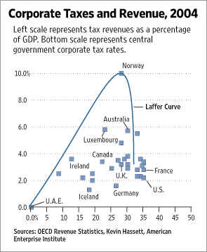
A number of blogs that I follow are talking about a recent article in the Wall Street Journal, We’re Number One, Alas. The author argues that the U.S.’s corporate tax rate is too high, claiming that countries with somewhat lower corporate tax rates generate more revenue from those taxes as a fraction of GDP. He uses the graph below to make his point.

Corporate Taxes and Revenue, 2004

The Laffer Curve on this graph is claimed to show the relationship between revenue and tax rate. A Laffer curve is based on the hypothesis that a government generates zero revenue when the tax rate is at either zero percent or one hundred percent, and that the maximum revenue from taxes falls somewhere in between these two extremes. The author is claiming that the optimum is below the current U.S. rate, and illustrates this by placing the U.S. on the far side of a big cliff.

This is an egregious case of innumeracy. I told myself when I started blogging that I would steer clear of the blog echo chamber as much as possible, but it is not all that uncommon to see similar presentations in the corporate world. Some data points are plotted, and then some chartjunk is added to tell a story…a story that may not be supported by the data at all. There are a few things that managers and engineers can do to combat this. For instance, if there’s supposed to be a correlation between values, we can ask for the correlation coefficient.

In this case, the correlation coefficient is about 0.1. This is equivalent to saying that just ten percent of the variation in revenues from taxes is due to the tax rate. If you were working on process improvement, you would not want to focus on a factor that only accounted for ten percent of the variation; you would be looking for a factor that explained greater than fifty percent.

Another approach would be to ask for a hypothesis test. The hypothesis would be that there is no correlation; the alternate hypothesis is that there is some correlation. As a business manager, you want to select the level of risk that you’re willing to accept. This is an economic decision, as risk analysis usually is. For the sake of argument, we will accept a risk of five percent. This is our “alpha” value (α-value), which we’ll express as a fraction: 0.05. We now need to perform the appropriate hypothesis test and compare the resulting p-value against our α-value. If the p-value is lower than the α-value, then we have correlation; if the p-value is greater than the α-value, there is no correlation.

There are plenty of statistics packages out there that can perform these analyses for us. Some are easier to use than others; some are more powerful than others. We use Minitab at work, and I find it indispensable. I also drop into R occasionally. R is much more powerful and free, but it’s all command-line programming, so it also has a much larger learning curve.

The p-value on this data is greater than 0.05, which means there is no linear correlation between the revenue and the tax rate.

Linear, though, means you have a straight line, and the Laffer curve is not linear by definition. The data fails our first tests, but the assumptions in our tests may have driven us to a false failure.

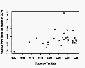
Let’s go back and start by plotting just the data.

Corporate Taxes and Revenue, 2004, data only

The exaggerated Laffer curve in the original presentation is not evident in this data. Excluding the outlier where revenue is 0.1 of GDP (looking at the Wall Street Journal’s graph, we see that this is for Norway), the data is roughly linear: zero revenue at a zero percent tax rate, and slightly increasing revenue with increasing tax rate. There may be a slight rounding-off or flattening in the tax rate range 0.20 to 0.35.

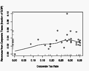
Since we do not know what shape the Laffer curve should take—where the maximum should be—and we don’t have enough data to find it, we can use the Lowess algorithm to create a smoothed curve.

Corporate Taxes and Revenue, 2004, with Lowess curve

This confirms our observation that the relationship is essentially linear, with a possible rounding off above 0.20. I’ve added a rug plot to the axes, which gives a tick for every data point. This is useful because it helps us to focus on the distribution of the data, much as a separate histogram would.

Where does all this get us? It tells us that the author’s curve was most likely drawn in just to make his point and does not fit any data or data analysis. It also tells us that the author’s story had nothing to do with the data.

I have seen this many times in the corporate world. Graphs of neat lines, where all the data points have been averaged out and left out. Graphs where a preconceived curve is fitted to data without regard for how well (or poorly) the curve fits the data. Data may be removed completely and fitted curves smoothed until they look “look right.”

Combating this is not hard. It just takes some thought and a few questions.

First, make sure you actually see the data, and not just some prettified lines. Graphs should contain data points, and real data usually is not terribly clean or smooth.

Second, when a curve is fit to the data, ask what the correlation is. This should be a number, and less than 0.5 (or 50%) means there is no useful correlation. The closer to 1 (or 100%), the better. Ask, too, what the basis of the fitted line is: is this just some high-order polynomial or spline that was selected because of the high correlation, or is there a solid physical—or theoretical—basis for the selected line? If there is no physical basis, straight lines are preferable to curves.

Third, ask for a numerical analysis. Graphs are powerful; they allow us to see all the data, to see the trends, and to determine what sorts of numerical analyses are possible. However, graphs are not a substitute for numerical, or statistical, analysis. The two compliment each other. So ask for the hypothesis statement and the alternate hypothesis. Ask for the p-value and the α-value (which should have been selected before the experiment was conducted).

I realize that this is unfamiliar territory for a lot of managers, who have little mathematical background and often no training in statistics. It’s not hard to ask the questions, and it’s not hard to understand the answers—they’re pretty straight-forward—and I don’t think that you need to have a deep understanding of the mathematics. Let the experts be the experts, but ask questions to make sure that you are covering the risk.

Lean Product Development Implementation Summit

A couple of weeks ago, I attended the Lean Product Development Implementation Summit, hosted by the Management Roundtable and chaired by Don Reinertsen, author of Developing Products in Half the Time and Managing the Design Factory. Don’s been a big advocate of understanding the theoretical underpinnings of Lean Manufacturing and applying them, sensibly, to new product development. His basic approach, if I can summarize in a single sentence, is to understand the development project’s economics, make sound decisions based on cost/value trade-offs and to engage in practices that encourage the flow of work. Since this is Lean, the goal is to be approximately correctly rather than wasting time trying to be perfect.

The Summit was delivered as a series of case studies, presented by the people actually implementing Lean in new product development (NPD). Presenters came from backgrounds ranging from software development to aircraft design.

It was extremely interesting, and generated a lot of ideas for me. Some of these ideas I have already implemented in my day job; others I’m working with on a longer time-frame, and some I’ve squirreled away for when I need them. For instance, Bernard North, V.P. of Global R, D & E at Kennametal and David J. Anderson, Senior Director of Software Engineering at Corbis, both presented (independent) case studies showing how simple visual controls allowed them and their teams to control both planned work and work in progress, greatly reducing cycle times and accelerating output. In the case of Kennametal, work in progress in the test labs was significantly reduced, eliminating the need to prioritize incoming requests and actually decreasing the amount of work in each request. Within five years, mean lead times were less than twenty percent of previous levels and the percent of revenue from new products had doubled. At Corbis, a very similar visual system enabled them to reduce “hot” requests while greatly accelerating the rate of sofware releases, all by limiting the number of active tasks or projects (applying WIP constraints).

These are two very different environments, but both used essentially the same solution to their problems of cycle time and communication.

Boeing implemented Lean PD, Theory of Constraints and Six Sigma in their development process. If I read the numbers right, it looks like they have cut their development cycle time in half by working to achieve flow in product development and managing projects to the buffers. Other presenters showed how creating very short cycle times (reducing batch sizes) and pushing testing further upstream greatly accelerates product development and reduces design defects.

Another company explicitly re-engineered their new product development process (PDP) around the idea that product development is a learning activity. Their PDP starts with a team meeting in which the goals for the next learning cycle are laid out and the work is divvied up. The team then breaks out for about two weeks to complete the planned work, and completes the cycle with another team meeting, in which they integrate what they’ve learned and plan the next cycle. These planning steps are essentially design reviews, but very explicitly focused on learning and team processes.

I have now put up a whiteboard for warranty returns, in the warranty processing area. It is divided up according to the phases of our analysis process. Each return is now tracked visually with a sticky note. Queued work (returns that have not been touched) is visible, as are heavy loads on resources. We can now calculate the lead time for our entire process, as well as for major phases within our process. In just a week’s time, the flow of work has smoothed out noticably, and our ability to communicate the status of each return–and problems such as resource overload–has changed from chaotic to dirt simple.

In the past week, we have realized that we also need to track dates, so that we know how old each request is. Our implementation is to simply write the date on the sticky notes each time we move them. This sort of change o.k.; we implemented the system knowing it was not perfect, and that we would improve along the way. This is continuous improvement in action.

There are still clear areas for improvement. One of the big ones is that we still have a push process rather than a pull process. I have not figured out what to do about that, as I have no control over the rate of incoming returns and our customer generally pushes hard to see activity on each return.

Still, this is a simple and effective technique, and can be applied in all areas of R, D & E. One of my long-term projects is the transfer of this technique outside of my sphere of authority.

Presenter David Anderson has posted his own thoughts on the Summit.

Getting Started

Getting started doing something is usually fifty percent of the battle. It’s hard to start. It’s such a common problem that it goes by many names: Student’s Syndrom; Analysis Paralysis; deferment; procrastination.

Take this blog, for instance: how do I start off the first post of the new blog; how do I say “hello world” without losing you, the reader, in the first sentence? Do I create a striking manifesto? Do I just jump right in, without providing any orientation?

So, how to start? Start where you’re comfortable. Start in the middle. Or the end. Start whereever you can. Just so long as you get started. Once you get going and have a little momentum, it’s relatively easy to shift gears and start doing it “right.”

It’s true for this blog, and it’s true for product development. There’s a high value on doing things right, especially when there are consequences for failure, but you’ll never get it right if you don’t first start. So get going.

In some later post, I’ll contradict myself by admonishing you to not start too early, but we have plenty of time to get there. Along the way, I’ll be writing about managing products and about product development. My focus will be on taking a systemic approach to the innovation “value chain,” that is: integrating all the steps from first concept through successful commercialization. I’ll write about how to develop the right products and avoid developing the wrong ones, about how to manage product development and how product development differs from other kinds of projects. I hope to create a dialog not just on how to design mechanisms but on how to create successful products. Since product development does not happen in a vacuum, but is part of the broader social and technical context, I’ll throw in other items of interest at times.

I hope to entertain and inform, and most of all to get you thinking.