Issue Logs and Risk Registers

Every product development project includes uncertainty over what will happen. The uncertainty—each assumption or best guess—reduces our chances of project success. The job of the project manager and team members is to ensure success by managing risk.

When something goes wrong—deviates from the plan—it stops being a risk and becomes an issue that must be addressed to ensure success. Issues are those conditions that are having a negative impact on your ability to execute the project plan. You can easily identify them because they directly cause schedule slippage and extra work.

There are two simple tools that can—and should—be used on every project to manage risks and issues to prevent disaster. One is the risk register; the other is the issue log. In my experience, these two documents are often conflated, but they are distinct documents that should contain different information and drive different actions.

The risk register is a means of capturing risks that we want to monitor over the life of the project so that we can take action before they have a negative impact on the project. These are conditions that you have decided not to explicitly work into the plan, but don’t want to let “slip under the radar” to create big issues for you later.

The issue log is where you record any problems that were not accounted for in the plan and that threaten to delay the project, push it off budget or reduce the scope (e.g. reduce product performance).

Issue Log Risk Register
Description of the issue Description of the risk
Underlying problem or cause of the issue Risk profile—sources of uncertainty and the potential impact
Action plan Potential actions
Priority or scheduling Monitoring plan
Who is responsible for assuring this issue is resolved Who is responsible for monitoring
Date opened and date resolved, sometimes a tracking number or other ID Date last updated, tracking ID

Issue Log

The issue log is fundamentally about corrective actions. The project has deviated from the plan, and now we need to get back on course to complete the project on time, on budget and with the agreed goals. The issue log is used to capture this information.

While the cause of the problem is often obvious, it is always a good idea to probe for deeper, systemic causes that could lead to further delays. Asking “why?” five times in order to permanently and irrevocably fix a problem doesn’t take very long compared to the total delays that a project can experience.

Risk Register

The hard part of a risk register is the risk profile. Different people respond differently to risk, and some are more comfortable with thinking about uncertain outcomes than others. These differences between people lead to a lot of variation and debate in identifying risks; a good strategy for making risk registers easy is to standardize. The best practices are to focus on the causes of the risk and the probable impacts and to standardize the process.

There has been a lot written about risk management. Some of the best, in my opinion, is the work by De Meyer, Loch and Pich, which was first brought to my attention by Glenn Alleman over at the Herding Cats blog. In their excellent book, Managing the Unknown: A New Approach to Managing High Uncertainty and Risk in Projects, they break down risk into two major components: relationship complexity and task complexity.

When the relationships of stakeholders or partners are complex—groups aren’t aligned—then you can expect disagreements and conflict. Successful strategies for dealing with relationship complexity include increased communication and more rigidly defined relationships.

When tasks are complex—there are many links between tasks, so that changing one task can affect many, or there is a high degree of uncertainty in what needs to be done—then the successful strategies range from critical path management to an entrepreneurial approach of working multiple solutions in parallel (see also De Meyer 2001).

By implementing these pairings of source of risk with management strategy in a risk register template, we can greatly simplify the process and drive more consistent risk management results. Adding in a simple analysis of the impact can help us with prioritization (where do we spend our resources monitoring) and monitoring frequency.

Monitoring is all about how you will know when to do something about the risk. i.e. You want to decide in advance what condition will trigger you to transition this risk to the issue log. Measures should be relevant to the risk, quantitative where possible and the method of measurement should be clearly defined (you don’t want people disagreeing over the project plan just because they measure something differently). Set up measurement intervals that make sense by asking yourself how long you can go without knowing that you have a problem. Plot the results as a time series or on a control chart to allow you to distinguish between normal variation in the measurement and a condition that requires action.

References

  • Loch, Christoph H, Arnoud De Meyer, and Michael T Pich. Managing the Unknown. Hoboken, New Jersey: John Wiley & Sons, 2006. Print.
  • De Meyer, Arnoud, Christoph H Loch, and Michael T Pich. “Uncertainty and Project Management: Beyond the Critical Path Mentality.” 2001 : 1–23. Print.

Apple-Google Wage Fixing and Systems Thinking

It seems that some of the most successful people in the world, at some of the world’s largest and most respected companies, engaged in an apparently wide-spread and illegal effort to limit employees’ job opportunities and wages.

This was stupid. It was stupid for the obvious reason: it was illegal. It was stupid for a more insidious reason, though: it will backfire on the company. We can explore why if we use a couple of system archetypes to think about the situation. These archetypes will come in handy in a wide range of situations.

The problem was retaining talent, who could be easily enticed away by more attractive compensation packages or to work at more exciting companies. Either it was easier to get an attractive compensation packages at a competitor, or the work did not stay sufficiently interesting or engaging. Simply put: employees were not happy enough.

The fix was to limit recruitment among competing companies.

In systems thinking, this is a classic “shifting the burden” dynamic. In shifting the burden, pictured below, you have two types of solutions to the symptoms of a problem: the fundamental solution—a corrective action for the root cause—and the symptomatic solution. The symptomatic solution reduces the symptom, but also creates a side effect that has a negative impact on the fundamental problem. Symptomatic solutions only have a temporary benefit before things get worse.

The classic shifting the burden system archetype describes wage-fixing practices as solutions to employee turnover.

The classic shifting the burden system archetype describes wage-fixing practices as solutions to employee turnover.

The green links, labelled “+,” indicate that the two conditions at either end of the tail increase and decrease together. The application of more symptomatic solution causes an increase in the side effect; reducing the use of symptomatic solutions causes a decrease in the side effect. The red links, labelled “–,” indicate that the two conditions at either end work in opposite directions. An increase in the side effect causes a decrease in the effectiveness of the fundamental solution.

There are three cycles, or loops, in this diagram. Two of them are “balancing loops;” over time, one factor tends to balance out the other, and the situation stabilizes. The third loop is a “self-reinforcing loop;” such loops will “snow-ball” or continue increasing over time:

  1. Applying a symptomatic solution
  2. increases the side effect
  3. which reduces the effectiveness of the fundamental solution
  4. which increases the symptom
  5. which drives more application of the symptomatic solution
  6. and increases the side effect.

The solution is to focus on fundamental solutions—get at the root cause—and avoid or limit reliance on symptomatic solutions. Symptomatic solutions are always temporary and usually make things worse in the long term; fundamental solutions are permanent and don’t have negative side effects.

Why employees leave is also explained, in broad strokes, by another system archetype: the limits to growth.

The classic limits to growth system archetype describes why it’s hard to keep employees engaged and hold down turnover.

Here we have a self-reinforcing dynamic created by successes and interesting work with good compensation. Over time, employees should generate more success and have more interesting work and better compensation. However, this is coupled to a balancing loop that becomes stronger over time, and slows down the reinforcing loop, like the brakes in a car. Employees burn out, or generally stop producing as much. This balancing loop is driven by some limiting condition, which makes the slowing action—burnout or disengagement—stronger over time. While this simple version looks like it will lead to a steady state, more realistic versions often result in a crash, where the results not only level off, but actually decrease.

The solution to a limits to growth system is to attack the limiting condition. If employees get bored doing the same thing over time, then you have to find a way for them to be engaged with enough new, interesting work. If they can earn substantially better compensation packages at competitors, then you have to (approximately) match those packages.

If you don’t fix the limiting condition, you might see a temporary improvement via the dynamics of shifting the burden (or the closely-related archetype, fixes that fail), but in the long term the problem will only get worse.

Process Stability

(Updated below)

While performing a web search, I remembered how difficult the concept of “process stability” can be. How do you know when a process is stable?

D. C. Montgomery, one of the recognized authorities on the subject of statistical process control, seems to give conflicting advice on this. For instance, he’s careful to point out the assumptions underlying all of the measures that one would use on a process, and unstable processes invalidate most or all of these assumptions. How do you know if a process is stable if none of your analyses are applicable?

Process stability needs an operational definition. Luckily, there are at least two:

1) No signals on the appropriate process behavior chart (a.k.a. control chart);

2) Cpk / Ppk == 1 and Cp / Pp == 1

Signals on a process behavior chart do not necessarily mean that a process is out of control (i.e. false signals are possible, and expected at certain mathematically determinable rates), but we can be sure of process stability if there are no signals.

Likewise, we can take issue with using the process capability indices Pp, Ppk, Cp and Cpk in this manner. All assume a normal distribution, which you only get with a stable process, so you shouldn’t trust them as measures of process capability. In this case, that’s fine: don’t report the actual values; just report the ratio of Cp to Pp or Cpk to Ppk. When the ratio is 1, the process is stable; the larger the ratio, the worse the process. Donald Wheeler discusses this use of Ppk and Cpk, and the measures’ relation to production costs, in his latest column for Quality Digest.

Whether or not the process is economical (i.e. Cpk and Ppk are high enough) is a question completely separate from stability.

Update:

I was discussing this with a friend who, for various reasons, needs to allow for some process drift. In other words, a Ppk less than Cpk is expected and acceptable, but only up to a certain point. The nice thing about the Cpk/Ppk ratio is that it’s simple: a ratio of 1 means the process is stable; a ratio greater than 1 means the process is not stable; a ratio of less than 1 means someone has made a mistake or is lying. If we need to allow for some process drift, we lose this simplicity.

So suppose that we have a Cpk of 1.66. There are then five standard deviations between the process mean and the nearest specification limit. Assuming a process drift of 1.5 Sigmas, our Ppk is 1.16, giving us a ratio Cpk/Ppk of 1.43. If, however, our Cpk is 1.00, then a process drift of 1.5 Sigmas gives us a Cpk/Ppk ratio of 2.00.

With an allowed process drift of a fixed number of Sigma, it’s no longer so simple to determine, from the Cpk/Ppk ratio, whether or not a process is “stable” within the limits set by management.

A slightly more sophisticated calculation is needed, then. What we can calculate is the ratio

(Short Term SigmaLong Term Sigma) / Allowed Process Drift

If the result is less than or equal to 1, then the process is “good enough” (i.e. within our allowed drift). If the ratio is greater than 1, then the process is considered out of control and action needs to be taken to eliminate sources of variation. If the ratio is less than 0, then someone made a mistake or is lying (i.e. long-term Sigma can never be less than short-term Sigma).

Graphing Highly Skewed Data

Recently Chandoo.org posted a question about how to graph data when you have a lot of small values and a few larger values. It’s not the first time that I’ve come across this question, and I’ve seen a lot of answers, many of them really bad. While all solutions involve trade-offs for understanding and interpreting graphs, some solutions are better than others.

Data graphs tell stories by revealing patterns in complex data. Good data graphs let the data tell the story by revealing the patterns, rather than trying to impose patterns on the data.

As William Cleveland discusses in The Elements of Graphing Data and his 1993 paper A Model for Studying Display Methods of Statistical Graphics, there are two basic visual operations that people employ when looking at and interpreting graphs: pattern perception and table look-up. Pattern perception is where we see the geometric patterns in a graph: groupings; relative differences (larger/smaller); or trends (straight/curved or increasing/decreasing). Table look-up is where we explore details of values and names on a graph. These two operations are distinct and complimentary, and it is through these two operations that the data’s story is told.

month sales
1 Feb 09 200
2 Mar 09 300
3 Apr 09 200
4 May 09 300
5 Jun 09 200
6 Jul 09 300
7 Aug 09 350
8 Sep 09 400
9 Oct 09 450
10 Nov 09 1200
11 Dec 09 100000
12 Jan 10 85000
13 Feb 10 450

So suppose that we have some data like that at right, where we are interested in the patterns of smaller, individual values, but there are also a few extremely large values, or outliers. We describe such data as being skewed. How do we plot this data? First, for such a small data set, a simple table is the best approach. People can see the numbers and interpret them, there aren’t too many numbers to make sense of and the table is very compact. For more complicated data sets, though, a graph is needed. There’s a few basic options:

  • Graph as-is;
  • Graph with a second axis;
  • Graph the logarithm of the data;
  • Use a scale break.
  • Plot the data multiple times.

Graph As-Is

Bar chart with all data plotted

A bar chart with all data, including outliers, plotted on the same scale.

This is the simplest solution, and if you’re only interested in knowing about the outliers (Dec ’09 and Jan ’10) then it will do. However, it completely hides whatever is happening in the rest of the months. Pattern recognition tells us that two months near the end of the series have the big numbers. Table-lookup tells us the approximate values and that these months are around December ’09 and February ’10, but the way the labels string together and overlap the tick marks, it’s not clear exactly what the labels are, let alone which label applies to which bar (which months are those, precisely? Is that “09 Dec” and “09 Feb?” Do the numbers even go with the text, or are they separate labels?).

For all but the simplest of messages, this rendition defeats both pattern recognition and table look-up. We definitely need a better solution.

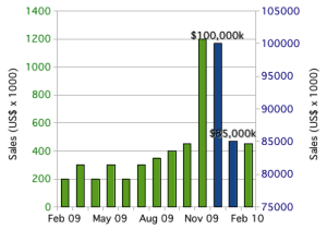
Use a Secondary Axis

Excel gives us an easy solution: break the data into two columns (“small” numbers in one and “large” numbers in the other) and plot them on separate axes. Now we can see all the data, including the patterns in all the months.

Bar Chart with Outliers on Secondary Axis

Bar chart, with outliers plotted using a secondary axis.

Unfortunately, pattern recognition tells us that the big-sales months are about the same as all the other months. It’s only the table look-up that tells us how big of a difference there is between the two blue columns and the rest of the data. This is why I’ve added data labels to the two columns: to aid table look-up.

Even if we tweaked around with the axes to set the outliers off from the rest of the data, we’d still have the same basic problem: pattern recognition would tell us that there is a much smaller difference than there actually is. By using a secondary axis, we’ve set up a basic conflict between pattern recognition and table look-up. Worse, it’s easy to confuse the axes; which bars go with which axis? Reproduction in black and white or grayscale would make it impossible to correctly connect bars to the correct axis. Some types of color blindness would similarly make it difficult to interpret the graph. Table look-up is easily defeated with secondary axes.

The secondary axis presents so many problems that I always advise against using it. Stephen Few, author of Show Me The Numbers and Information Dashboard Design, calls graphs with secondary axes “dual-scaled graphs.” In his 2008 article Dual-Scaled Axes in Graphs, he concludes that there is always a better way to display data than by using secondary axes. Excel makes it easy to create graphs like this, but it’s always a bad idea.

Take the Logarithm

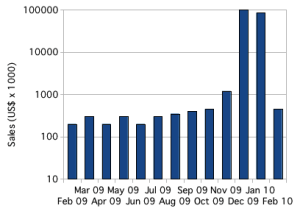
In scientific applications, skewed data is common, and the usual solution is to plot the logarithm of the values.

Bar Chart with Logarithmic Axis

Bar chart plotting skewed with logarithmic axis.

With the logarithm, it is easy to plot, and see, all of the data. Trends in small values are not hidden. Pattern perception immediately tells us the overall story of the data. Table look-up is easier than with secondary axes, and immediately tells us the scale of the differences. Plotting the logarithm allows pattern perception and table look-up to compliment each other.

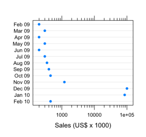
Below, I’ve created the same graph using a dot plot instead of a bar chart. Dot plots have many advantages over bar charts: most obviously, dot plots provide a better arrangement for category labels (e.g. the months); also, dot plots provide a clearer view of the data by plotting the data points rather than filling in the space between the axis and the data point. There are some nice introductions to dot plots, including William Cleveland’s works and a short introduction by Naomi Robbins. The message is clear: any data that you might present with a bar chart (or pie chart) will be better presented using dot plots.

Dot plot with logarithmic scale

Skewed data plotted on a dot plot using a logarithmic scale.

Use a Scale Break

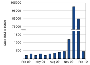
Another approach, which might be better for audiences unfamiliar with logarithmic scales, is to use a scale break, or broken axis. With some work, we can create a scale break in Excel or OpenOffice.org.

Bar chart with a subtle scale break on the Y axis.

Bar chart with outliers plotted by introducing a subtle scale break on the y-axis.

There are plenty of tutorials for how to accomplish this in Excel. For this example, I created the graph in OpenOffice.org Spreadsheet, using the same graph with the secondary axis, above. I adjusted the two scales, turned off the labels for both y-axes and turned off the tick marks for the secondary y-axis. Then I copied the graph over to the OpenOffice.org Draw application and added y-axis labels and the break marks as drawing objects.

That pretty much highlights the first problem with this approach: it takes a lot of work. The second problem is that those break marks are just too subtle; people will miss them.

The bigger problem is with interpretation. As with the secondary axis, this subtle scale break sets up a basic conflict between the two basic operations of graph interpretation. Pattern recognition tells us that the numbers are comparable; it’s only table look-up that tells us what a large difference there is.

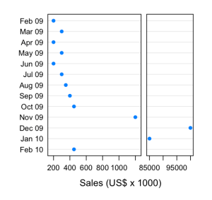
Cleveland’s recommendation, when the logarithm won’t work, is to use a full-panel scale break. In this way, pattern recognition tells that there are two distinct groups of data, and table look-up tells us what they are.

Dot plot with full scale break

Dot plot with a full scale break to show outliers.

The potential disadvantage of this approach is that pattern perception might be fooled. While the scale break visually groups the “large” values from the “small” ones, the scale also changes, so that the broader panel on the left actually represents a much narrower range of values (about 1100 dollars range) than the narrower panel on the right (about 17000 dollars range). Our audience might have difficulties interpreting this correctly.

Small Multiples

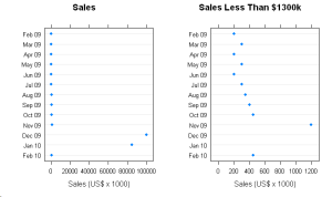
Edward Tufte has popularized the idea of small multiples, the emphasis of differences by repeating a graph or image with small changes from one frame to the next. In this case, we could show the full data set, losing fidelity in the smaller values, and then repeat the graph while progressively zooming in on a narrower and narrower slice with each repetition.

Dot Plot showing full data (including outliers) side-by-side with zoomed view.

The full data, with outliers, is plotted on the left. On the right, a zoomed view showing detail in the smaller values.

This shares many similarities to Cleveland’s full scale break, but provides greater flexibility. With this data, there are two natural ranges: 0 – 100000 and 0 – 1200. If there were more data between 1200 and 85000, we might repeat the graph several times, zooming in more with each repetition to show lower levels of detail.

I think there are two potential pitfalls. As with the full scale break, the audience might fail to appreciate the effect of the changes to scale. Worse, the audience might be fooled into thinking that each graph represented a different set of data, rather than just a different slice of the same data. Some care  in preparing such graphs will be needed for successful communication.

Summary

When presenting data that is, like the data above, arranged by category, use a dot plot instead of bar charts. When your data is heavily skewed, the best solution is to graph the logarithm of the data. However, if your audience will be unable to correctly interpret the logarithm, try a full scale break or small multiples.

Team Size and Organizational Structure, Part 1

With this post, I am stepping outside my core skills and into an area that I am less familiar with, but still find very interesting.

I’ve worked in small- to mid-sized companies, where an emphasis was placed on getting things done quickly. This always means acquiring resources from outside of your core team. These resources might be team members, materials, equipment or utilities. In most cases, there has not been any formal mechanism for requesting, locating, allocating or releasing those resources.

Senior management often treats successfully locating and negotiating for these resources as a natural part of everyone’s job. In a very small company, everyone knows everyone else and such negotiation seems to be a natural extension of the social relationships. I suspect that this is how even larger companies look to senior managers, who routinely have to negotiate with their peers (who are limited in number). As companies grow, however, problems appear for people lower down in the organization.

It becomes more difficult to determine who has the needed resources, or if the resources even exist. Conflicting priorities across groups make the negotiations more difficult. As the company grows, relationships between people become less social and more purely professional, reducing the common ground that eases the negotiations in very small companies. I believe that this can be described as a shift from high context communication in small companies to low context communication in larger companies. Finally, the negotiations become more political, developing aspects of one-upmanship or CYA that drive behaviors aimed at benefiting the individual but not the entire company.

Some individuals can overcome such challenges. They have the charisma, social graces or relationships with senior management to get what they want, and sometimes they’ll even do what is best for the company globally. For the rest, success becomes more difficult, and they end up aligning themselves with those who can succeed. When this happens during company growth, it fractures a company along political lines, into groups that treat each other as outsiders, if not as outright enemies.

It seems to me that this political division of a company is harmful to the business goals and to the people. A former colleague used to say that we must attend to the quality of our relationships. I have wondered how best to do this, and would like to explore the beginnings of my own ideas.

I was recently considering the number of possible interactions in a group, and at the same time came across mention of Dunbar’s number. Dunbar’s number is named after one Robin Dunbar, who proposed that, based on cognitive limitations, there is a limit to the number of people that one can maintain stable social relationships. Larger groups require more formal rules to remain stable. Dunbar proposed that this limit was one hundred fifty people. Other estimates exist, ranging to about two hundred fifty people. These estimates appear to be based off of a mix of speculation and study of tribal group sizes.

Organizational structures are often described by one of three basic structures: functional; project and matrix. Each of these breaks a company into smaller, largely independent units. A fourth model, not as widely recognized, exists: the spider web. In a spider web, everyone is connected to everyone else, and almost anyone can step into any other role in the company, at least temporarily. It is my understanding that this spiderweb only works in small companies. I’ll bet it only works in companies smaller than Dunbar’s number. The spider-web organization is also the type of organization where direct negotiation is easiest.

In the next post, I will look at smaller team interactions and size limitations. I will follow that with conclusions about organizational structure and growth.

Definitions

I was recently asked a question that raised some good design issues. The question went “why should changing this cause a change in that characteristic?”

The immediate and obvious answer was that it wouldn’t and couldn’t. Theoretically, a large decrease in this (X) might cause an increase of a few percent in that (Y); nothing more. Only someone was claiming that decreasing X decreased Y, too.

They were right. No, the theoretical relationship isn’t wrong. It’s right.

The theoretical calculation is fairly straightforward. You put so much of X in, and, after some calculation, you get so much of Y out. The less X you have, the more Y you get. The hard part is figuring out just how much of X you’re putting in.

The measurement of Y introduces a bunch of variation based on other factors. You measure by changing certain conditions A, B and C. These, in turn, affect some other factors, M and N. X, A, M and N together determine what value you measure for Y.

So decreasing X affects the other factors in such a way that the net effect is a decrease in the measured value of Y.

“Oh, sure,” you respond. “But the theoretical calculation should account for that.”

Not really. The theoretical calculation should tell us what the best case is…what our target should be. The actual measurement is going to produce different results based on various factors, some of which we control and some we can’t. A calculation based on the measurement process would require uncertainty ranges and return a probability distribution; not a singular value. Messy.

Engineers and researchers need to consider both of these as definitions. If you’re designing for some characteristic, as a researcher or engineer you’re usually going to be concerned with the theoretical calculations. This is how you were taught in school, and you’ll naturally be interested in getting as close to the best case as possible. However, not everyone is going to be interested in the theoretical calculation. The folks in Quality who are checking the product for conformance will be more interested in how it’s measured, the operational definition, than in the theoretical definition. The manufacturing plant only want to hear about the operational definition; for them, the world would be a better place without the theoretical definition.

As a design engineer, you need to be more concerned about the operational definition. You’ll be arguing that you designed a part for Y performance (or to “do Y“). The next question that management and your customers should (and probably will) ask is, how do you know you designed it to do that? The answer is always by data analysis. How do you get the data? Via the operational definition. What you know is determined by how you measure, and that’s the operational definition.

This has applicability well outside of engineering design. Physicists have been arguing this very point ever since Bohm and Heisenberg developed the Copenhagen interpretation of quantum physics. Management by objective depends on the ability to close the loop by measuring outcomes. This means that management by objectives requires operational definitions of every objective (though few organizations actually get this far, and management by objectives becomes management by manager gut feeling). Even more enlightened management techniques, such as those advocated by Deming and Scholtes, require operational definitions to enable an organization’s performance improvement (e.g. through the use of control charts, which are only possible with operational definitions).

Use the theoretical definition to tell you the best possible case, but be sure to design according to the operational definition.

Beginning to End

Product development covers all activities from program initiation and concept development through the start of production or service delivery. There are many process models for product development, among them the classic waterfall, the spiral, the Systems V model, Lean and Agile. In the U.S. automotive industry, the product development process is defined, or at least constrained, by the Advanced Product Quality Planning (APQP) manual from the Automotive Industry Action Group, or AIAG. The standard in academia seems to be laid out in Ulrich and Eppinger’s Product Design and Development (U&E).Most of these have some common features. Many start with defining the business goals and authorizing the project. The rest start with the next step: identifying customer needs. They also end somewhere between the hand-off to manufacturing and post-manufacturing support.

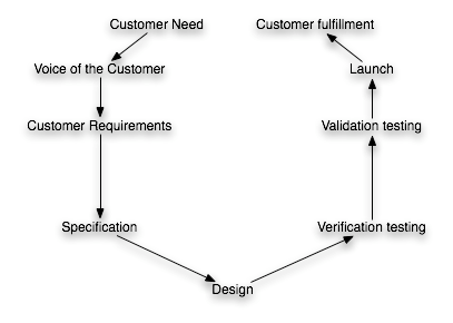
We can see that product development is a process that starts with the customer and ends with the customer. The output of product development is customer fulfillment; not merely an engineering design. The input is customer needs; not a product specification. Product development is not simply an engineering activity; it’s blend of business and engineering activities, the goal of which is to maximize company profit through customer fulfillment. Product development is a customer-focused process, and it looks something like this rather cycle:

Product Development as Customer-Focused Process

From a customer’s perspective, though, this process looks much simpler:

Product Development as Customer-Focused Process, From the Customer’s Perspective

One of the primary problems with product development is this delay. For you, the developer, all of the technical and market risk are wrapped up in this delay, and the market risk is the more troublesome of the two risks. Market risk is the risk that the customer will change their mind, developing a new set of priorities, or that a competitor will enter the market with a similar product before you do.

One of the key mitigation strategies for product development is the reduction of this delay. Design and manage your product development processes to bring the customer closer to their fulfillment.

To achieve this in a consistent and effective manner, you have to understand the economics of your development projects and the market. Every decision in product development is a trade off, and these trade-offs need to be focused on the goal: increasing profit through by increasing the gap between value and costs. For instance, you will be faced with a choice: spending more time in requirements gathering and analysis vs. decreasing the delay in delivering product to the customer. Just how you balance this depends on the cost of a performance shortfall (technical risk) vs. the cost of delay. With highly risk-averse customers, the cost of a performance shortfall is much greater than the cost of delay, which is probably why aerospace projects are notorious for falling behind schedule yet often held up as the gold standard for safety and technical performance. In contrast, consumer electronics tend to have very short time-to-market, but notoriously poor reliability; the customers value immediate fulfillment over technical performance.

It is important, too, to recognize that these kinds of trade-offs are not made just once; they are made on a daily basis. The upper management of the development organization needs to understand these economics so that they can design the product portfolio and product development strategy (e.g. selecting between more modular designs, shifting technology development off the critical path of customer deliverables, vs. more integrated designs that are more tailored to fit the customer needs). The program managers and design responsible engineers need this knowledge, too, in order to intelligently design and manage the product.

Your product development processes, then, must be designed to provide rapid feedback to project managers and engineers relative to these trade-offs between risks, and to assist them in making consistent decisions. The natural result of this line of reasoning is the development of decision tools, standard cost models and standard measurements focused on technical performance risk, project expenses, product costs and delays.

The Value of Standard Work

I recently had a conversation with a colleague about standardizing and documenting some of our work. He commented, in a mix of humor and exasperation “nothing we do here is standard.”

I’ve spent most of my career in R&D, and usually management have stated things a little more seriously and strongly: “we can’t standardize what we do; it’s not possible.” Their argument usually takes one of two forms: (A) this is R&D, so we can’t possibly know what the next step is, and therefore we cannot standardize; or (B) this is R&D and standardization is the enemy of the creativity that is needed.

Hogwash.

What I’ve found, and others have also reported, is that standard work is the best and surest way to improve R&D effectiveness and efficiency. Standard work enables and facilitates

  • Avoidance of errors, assuring that lessons learned are utilized and not forgotten;
  • Team learning and training;
  • Improvements to make the work more effective;
  • Reduction in variability;
  • Creation of meaningful job descriptions;
  • Greater innovation by reducing the mental and physical overhead of repetitive or standardized work.

In one job, I had the responsibility to develop a small problem-solving group, responsible for initiating and overseeing root cause analysis and corrective action activities. The problem solving activities had been performed on an as-needed basis by another group of experts, but were largely ad hoc. There was an element of customer interface, and my job was to maintain customer satisfaction through timely resolution of problems while reducing the overall cost of the work.

The workload increased by five to ten times during my tenure, but total, bottom-line costs remained roughly constant, representing an increase in efficiency of roughly eighty percent. These cost savings came about almost entirely by developing standard work: documenting processes and developing a suitable set of tools

Mind you, this wasn’t cut-and-dried work; it was problem-solving at its most difficult and “creative.” We were identifying and tracking down new problems with no idea of where we would end up and little indication of where to start. We didn’t have a pre-defined roadmap for tracking down the problems, and the information we had going into each case sometimes looked the same as other cases, yet we would end up with completely different root causes and corrective actions. The work required a high degree of thoughtful assessment and planning of next steps, with a very narrow look-ahead window (in almost every case, the next step would depend on what we learned from the test that we were initiating).

Despite the fact that we were learning at each step and determining what to do next based on newly-available data, we were able to standardize much of the work, reducing the error rate, reducing the effort required for each case and reducing the variation in effort required from case to case.

Standard work does not preclude flexibility. You can still do a lot of different jobs, and be able to address new problems. Standard work just takes the things you do repeatedly and makes them routine, so you don’t waste time thinking about them.

Individual and Team Learning

If product development is about learning, then there must be at least two kinds of learning going on: individual learning and team learning. By their very nature, individuals and teams must learn in different ways, so our product development and management processes need to support both kinds of learning. I will lay the groundwork for future posts by looking at how people and teams learn and what sort of behaviors they engage in as part of the learning process. Learning and behavior are open fields of research, with volumes of published material. I will be brief.

Nancy Leveson, in her book Safeware: System Safety and Computers, has a couple of excellent chapters on human learning and behavior, from which I’ll borrow. I recommend her book; the first ten chapters or so are well worth reading even if you’re not involved with computers. Borrowing from Jens Rasmussen, she discusses three levels of cognitive control: skill-based behavior; rule-based behavior; and knowledge-based behavior.

Knowledge-based behavior sits at the highest level of cognitive learning and control. Performance is controlled by explicit goals and actions are formulated through a conscious analysis of the environment and subsequent planning. One of the primary learning tools used at this level is the scientific method of hypothesis formulation, experimentation and evaluation.

Rule-based behavior develops when the environment is familiar and fairly unchanging. Situations are controlled through the application of heuristics, or rules, that are acquired through training and experience, and that are triggered by conditions or indicators of normal events or states. This sort of behavior is very efficient, and learning is achieved primarily through experimentation, or trial and error, that leads to further refinement of the rules and improved identification of conditions under which to apply those rules. People transition back to knowledge-based behavior when the environment changes in unexpected ways, but only as they become aware that the rules-based behaviors are failing to produce the usual results.

Skill-based behavior “is characterized by almost unconscious performance of routine tasks, such as driving a car on a familiar road.” The behavior requires a trade-off, often between speed and accuracy, and learning involves constant tests of the limits of that trade-off. These tests are experimental in nature, but largely sub-conscious (not planned). Only by occasionally crossing the limits (making “mistakes”) can learning be achieved. As with rule-based behavior, people transition from skill-based behavior to rules-based behavior only after they become aware of a change in the environment that is having a negative impact on outcomes of the skill-based behavior.

When people learn new skills they typically progress from knowledge-based behaviors to rule-based behaviors and eventually to skill-based behaviors. A surprising amount of engineering is based on heuristics rather than knowledge. This is often a good thing, as it allows us to efficiently deal with very complex problems and systems, making it possible to arrive at approximately-correct solutions much faster than through more explicit planning and evaluation. It can also go badly wrong when signs incorrectly lead one to apply the wrong rules to a situation that appears familiar but is not.

What might not be obvious is that learning at any level is only possible through a mix of successful and non-successful experiments. Unexpected outcomes (“mistakes,” “errors” or “failures”) are a necessary part of learning. In fact, the rate of learning is maximized (learning is most efficient) when the rate of unexpected outcomes is 50%.

Teams learn when individuals communicate, sharing and synthesizing the knowledge and heuristics that they’ve learned. This occurs primarily through two behaviors or tools: assessment and feedback. Assessment involves observation and reflection on what behaviors are working or not working in pursuit of the team goals. It should be performed by both by individuals and by the team as a whole. Feedback is comprised of constructive observations provided by others and objective measurements, and is the input to assessment. Because feedback and assessment are so important to team learning and growth, they should be planned, structured and ongoing.

For assessment to be effective at generating team learning and growth, some action needs to follow. An action might be to change an existing condition (e.g. change how meetings are run, explore design alternatives, etc.), or to document a process or norm that “works” and sharing the result with team members (e.g. documenting the work flow, standardizing parts, implementing decision processes, etc.).

Repeated and effective use of both individual and team learning behaviors results in team learning cycles. In any product development project, these learning cycles occur in different domains simultaneously. The main forms of feedback in product design are testing and design review, and there are multiple ways to assess and plan those feedback loops. Project feedback comes primarily from monitoring the schedule performance. At the same time, the team should be eliciting feedback about its ability to make decisions, work together and work with the rest of the organization, and assessing that feedback.

Peter Scholtes’ The Team Handbook is a well-written and practical guide to implementing team processes and behaviors, and is geared toward both team members and team leaders. It’s the kind of book that a new team could refer to throughout a project to guide them in becoming more cohesive and effective. His The Leader’s Handbook: Making Things Happen, Getting Things Done also provides an excellent supplement, geared more toward team leaders and business managers.

To summarize, product development processes and organizations must be designed to support repeated structured and “accidental” experimentation by individuals and team processes of feedback, assessment, decision-making and actions that result in either change or standardization.

Waste in TPS vs. Lean PD

The Toyota Production System (TPS), or Lean, is widely considered a remarkable and effective system for improving operations. People naturally try to apply the same system to other product streams and other activities. However, I have found that people often struggle with the correct application of the concepts, especially to product development. For instance, Glen Reynolds, an experienced project manager, is working to understand Agile, and has recently come across the statement by some Agile advocates that “testing is a waste.” Calling testing a waste, as a general statement, is nonsense, and Glen is engaged in some excellent discussion on the subject.

I have encountered a fair number of people with experience in product development, and a fair number with experience in Lean manufacturing, but few people with sufficient overlap in the two domains to combine them. The TPS is very formulaic, laying out clear rules or guidelines that are easily followed. Unfortunately, product development is sufficiently different from manufacturing that the TPS cannot be applied directly.

The TPS defines waste as any activity (or inactivity) that does not add value to the product. Value is defined from the customer’s perspective as any activity that the customer is willing to pay for as a part of the product. Assembling the product adds value; holding the product in inventory does not. Shipping product in exchange for payment adds value; the time spent processing that payment through Accounting does not.

Testing is used in manufacturing to detect defects. The customer is willing to pay for a correctly-manufactured product; not for the rejects. From this perspective, testing is a waste, because it does nothing to add value to the product. In fact, all of product development should be considered waste, because product development does not produce any product (unless, of course, your product happens to be product designs for others to manufacture, as with Ideo).

However, in product development, testing can add value. In fact, testing is probably the only way to maximize value creation in product development.

Manufacturing is a highly repetitive activity, which takes as its input a product and process design and tooling, and produces as its output a physical product. The physical product generates revenue. Ideally, the product is manufactured exactly to specification, and there are no activities required that do not lead directly to the manufacture of the product. There is no uncertainty as to what the output should be. Waste, then, is any deviation from this ideal state. Economically, the assumption is that the product is designed to maximize revenue generation, and the process is designed to correctly manufacture the product. Since nothing is perfect, the TPS seeks to improve profit by eliminating or minimizing those activities that do not generate revenue.

In contrast, product development is a highly variable activity, with variable inputs. The goal of product development is not simply to produce product designs according to some predefined specification. If it was, then product development would be a simple exercise in transforming specifications into conforming drawings. In fact, product development operates under a high degree of uncertainty; from the start of the project, the desired outcome is not fully known. In order to overcome this uncertainty, product developers have to learn. They have to learn about the customer—the end user—and about the technology that they are working with. Value is created as the uncertainties are resolved. The goal of product development is to maximize the rate of learning, thereby maximizing the rate of value creation.

The best way to learn is through trial and error, following the scientific method of hypothesis testing. So testing not a waste if it generates new knowledge. Testing that does not generate new knowledge is a waste. If you generate data that you already had, you’re generating waste. If you generate data that you don’t use, you’re generating waste. If the organization learns something, then you’ve created value.

Notice that this definition of product development follows the same principle that is used in the TPS: do what creates (or produces) value; eliminate or minimize everything else. The details change in the presence of uncertainty about the desired outcome.

We can take this a step further, to develop a more sophisticated approach to managing product development projects, if we understand the economics of our project. The uncertainty that is reduced through testing is all technical risk that the product will not meet the market’s requirements. This means that testing translates into increased sales volumes. Testing in product development adds time, which means a later entry into the market and possibly reduced sales volumes. If we have some estimate of what the cost of delay and the cost of risk are, we can then perform a cost-benefit analysis on the proposed testing to determine whether or not it results in a net creation of value.

Such economic models do not have to be complex, and they do not have to be highly accurate. They need to be just accurate enough that they do not lead to very bad decisions and they must be usable. This suggests, as Reinertsen has advocated, that new product development projects should develop economic models as early as possible and derive decision rules that project managers and lead engineers can use on a daily basis.