Many of our statistical tests make assumptions about the distribution of the underlying population. Many of the most common—ImR (XmR) and XbarR control charts, ANOVA, t-tests—assume normal distributions in the underlying population (or normal distributions in the residuals, in the case of ANOVA), and we’re often told that we must carefully check the assumptions.
At the same time, there’s a lot of conflicting advice about how to test for normality. There are the statistical tests for normality, such as Shapiro-Wilk or Anderson-Darling. There’s the “fat pencil” test, where we just eye-ball the distribution and use our best judgement. We could even use control charts, as they’re designed to detect deviations from the expected distribution. We are discouraged from using the “fat pencil” because it will result in a lot of variation from person to person. We’re often told not to rely too heavily on the statistical tests because they are not sensitive with small sample sizes and too sensitive to the tails. In industrial settings, our data is often messy, and the tails are likely to be the least reliable portion of our data.
I’d like to explore what the above objections really look like. I’ll use R to generate some fake data based on the normal distribution and the t distribution, and compare the frequency of p-values obtained from the Shapiro-Wilk test for normality.
A Function to test normality many times
First, we need to load our libraries
library(ggplot2)
library(reshape2)
To make this easy to run, I’ll create a function to perform a large number of normality tests (Shapiro-Wilk) for sample sizes n = 5, 10 and 1000, all drawn from the same data:
#' @name assign_vector
#' @param data A vector of data to perform the t-test on.
#' @param n An integer indicating the number of t-tests to perform. Default is 1000
#' @return A data frame in "tall" format
assign_vector <- function(data, n = 1000) {
  # replicate the call to shapiro.test n times to build up a vector of p-values
  p.5 <- replicate(n=n, expr=shapiro.test(sample(my.data, 5, replace=TRUE))$p.value)
  p.10 <- replicate(n=n, expr=shapiro.test(sample(my.data, 10, replace=TRUE))$p.value)
  p.1000 <- replicate(n=n, expr=shapiro.test(sample(my.data, 1000, replace=TRUE))$p.value)
  #' Combine the data into a data frame,
  #' one column for each number of samples tested.
  p.df <- cbind(p.5, p.10, p.1000)
  p.df <- as.data.frame(p.df)
  colnames(p.df) <- c("5 samples","10 samples","1000 samples")
  #' Put the data in "tall" format, one column for number of samples
  #' and one column for the p-value.
  p.df.m <- melt(p.df)
  #' Make sure the levels are sorted correctly.
  p.df.m <- transform(p.df.m, variable = factor(variable, levels = c("5 samples","10 samples","1000 samples")))
  return(p.df.m)
}
Clean, random data
I want to simulate real-word conditions, where we have an underlying population from which we sample a limited number of times. To start, I’ll generate 100000 values from a normal distribution. To keep runtimes low I’ll have assign_vector() sample from that distribution when performing the test for normality.
n.rand <- 100000
n.test <- 10000
my.data <- rnorm(n.rand)
p.df.m <- assign_vector(my.data, n = n.test)
We would expect that normally distributed random data will have an equal probability of any given p-value. i.e. 5% of the time we’ll see p-value ≤ 0.05, 5% of the time we’ll see p-value > 0.05 and ≤ 0.10, and so on through > 0.95 and ≤ 1.00. Let’s graph that and see what we get for each sample size:
ggplot(p.df.m, aes(x = value)) +
  geom_histogram(binwidth = 1/10) +
  facet_grid(facets=variable ~ ., scales="free_y") +
  xlim(0,1) +
  ylab("Count of p-values") +
  xlab("p-values") +
  theme(text = element_text(size = 16))

Histogram of p-values for the normal distribution, for sample sizes 5, 10 and 1000.
This is, indeed, what we expected.
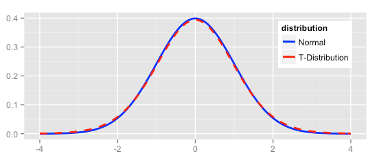
Now let’s compare the normal distribution to a t distribution. The t distribution would pass the “fat pencil” test—it looks normal to the eye:
ggplot(NULL, aes(x=x, colour = distribution)) +
  stat_function(fun=dnorm, data = data.frame(x = c(-6,6), distribution = factor(1)), size = 1) +
  stat_function(fun=dt, args = list( df = 20), data = data.frame(x = c(-6,6), distribution = factor(2)), linetype = "dashed", size = 1) +
  scale_colour_manual(values = c("blue","red"), labels = c("Normal","T-Distribution")) +
  theme(text = element_text(size = 12),
        legend.position = c(0.85, 0.75)) +
  xlim(-4, 4) +
  xlab(NULL) +
  ylab(NULL)
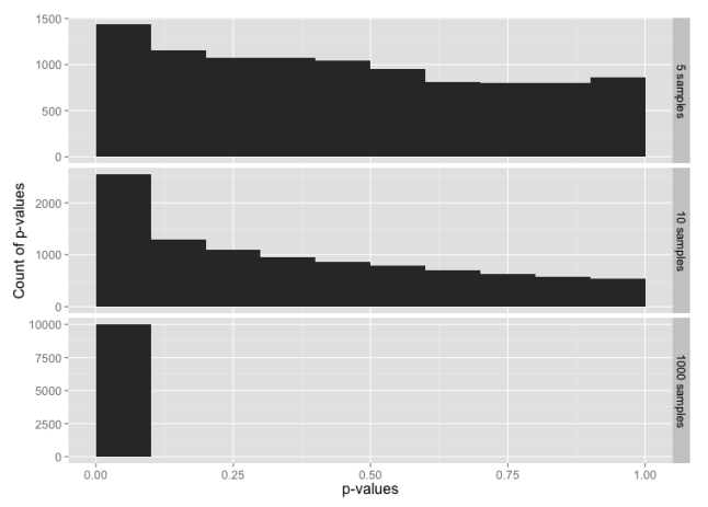
Starting with random data generated from the t-distribution:
my.data <- rt(n.rand, df = 20)
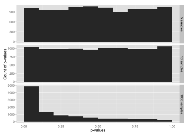
Histogram of p-values for the t distribution, for sample sizes 5, 10 and 1000.
The tests for normality are not very sensitive for small sample sizes, and are much more sensitive for large sample sizes. Even with a sample size of 1000, the data from a t distribution only fails the test for normality about 50% of the time (add up the frequencies for p-value > 0.05 to see this).
Testing the tails
Since the t distribution is narrower in the middle range and has longer tails than the normal distribution, the normality test might be failing because the entire distribution doesn’t look quite normal; we haven’t learned anything specifically about the tails.
To test the tails, we can construct a data set that uses the t distribution for the middle 99% of the data, and the normal distribution for the tails.
my.data <- rt(n.rand, df = 20)
my.data.2 <- rnorm(n.rand)
# Trim off the tails
my.data <- my.data[which(my.data < 3 & my.data > -3)]
# Add in tails from the other distribution
my.data <- c(my.data, my.data.2[which(my.data.2 < -3 | my.data.2 > 3)])
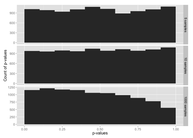
Histogram of p-values for sample sizes 5, 10 and 1000, from a data set constructed from the t distribution in the range -3 to +3 sigmas, with tails from the normal distribution below -3 and above +3.
Despite 99% of the data being from the t distribution, this is almost identical to our test with data from just the normal distribution. It looks like the tails may be having a larger impact on the normality test than rest of the data
Now let’s flip this around: data that is 99% normally-distributed, but using the t distribution in the extreme tails.
my.data <- rnorm(n.rand)
my.data.2 <- rt(n.rand, df = 20)
# Trim off the tails
my.data <- my.data[which(my.data < 3 & my.data > -3)]
# Add in tails from the other distribution
my.data <- c(my.data, my.data.2[which(my.data.2 < -3 | my.data.2 > 3)])
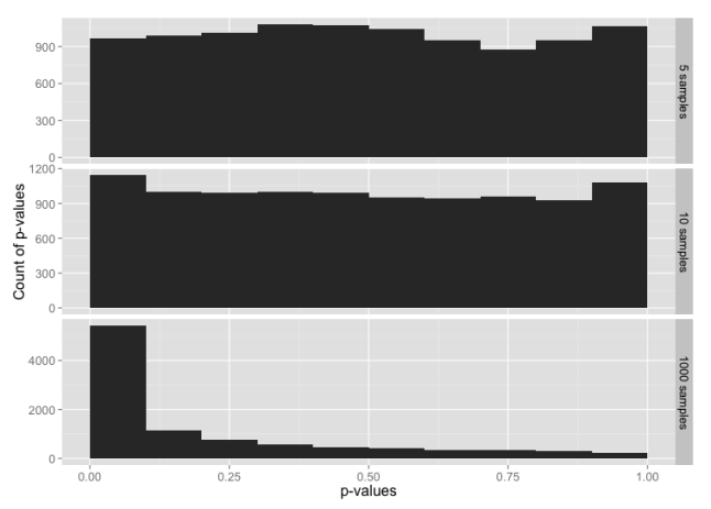
Histogram of p-values for sample sizes 5, 10 and 1000, from a data set constructed from the normal distribution in the range -3 to +3 sigmas, with tails from the t-distribution below -3 and above +3.
Here, 99% of the data is from the normal distribution, yet the normality test looks almost the same as the normality test for just the t-distribution. If you check the y-axis scales carefully, you’ll see that the chance of getting p-value ≤ 0.05 is a bit lower here than for the t distribution.
To make the point further, suppose we have highly skewed data:
my.data <- rlnorm(n.rand, 0, 0.4)
This looks like:
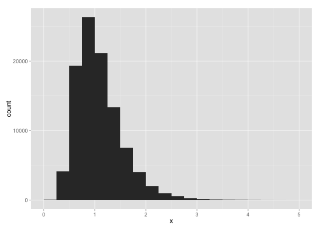
For small sample sizes, even this is likely to pass a test for normality:
What have we learned?
- With small sample sizes, everything looks normal.
- The normality tests are, indeed, very sensitive to what goes on in the extreme tails.
In other words, if we have enough data to fail a normality test, we always will because our real-world data won’t be clean enough. If we don’t have enough data to reliably fail a normality test, then there’s no point in performing the test, and we have to rely on the fat pencil test or our own understanding of the underlying processes.
Don’t get too hung up on whether your data is normally distributed or not. When evaluating and summarizing data, rely mainly on your brain and use the statistics only to catch really big errors in judgement. When attempting to make predictions about future performance, e.g. calculating Cpk or simulating a process, recognize the opportunities for errors in judgment and explicitly state you assumptions.


 , of around 2500 kilograms per cubic meter (similar to fiberglass). Water has a density,
  , of near 1000 kilograms per cubit meter (depending on temperature). The diameter of the turbine will be near 180 meters, so the radius, R, of our “hula-hoop” is half that, or 90 meters. From the pictures, it looks like the thickness of that hula-hoop is a few percent of the total diameter of the turbine, so we can figure an outside diameter of the “hula-hoop” of about 2 meters, for a radius, r, of 1 meter. Figure that at least ten percent of this is composite, and the rest is the hollow, water-filled portion.
 and length equal to the circumference of the “hula-hoop,”
  . The volume of such a cylinder is equal to the cross-sectional area of the water column,
  times the length of the column, l. The total mass of the water,
  is the density times this volume.
 kg
kg . So the mass of the composite is
 kg
kg


You must be logged in to post a comment.