A number of blogs that I follow are talking about a recent article in the Wall Street Journal, We’re Number One, Alas. The author argues that the U.S.’s corporate tax rate is too high, claiming that countries with somewhat lower corporate tax rates generate more revenue from those taxes as a fraction of GDP. He uses the graph below to make his point.
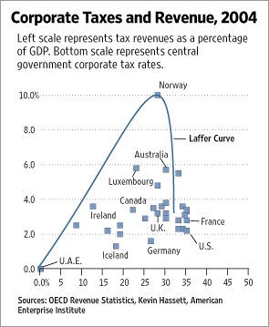
The Laffer Curve on this graph is claimed to show the relationship between revenue and tax rate. A Laffer curve is based on the hypothesis that a government generates zero revenue when the tax rate is at either zero percent or one hundred percent, and that the maximum revenue from taxes falls somewhere in between these two extremes. The author is claiming that the optimum is below the current U.S. rate, and illustrates this by placing the U.S. on the far side of a big cliff.
This is an egregious case of innumeracy. I told myself when I started blogging that I would steer clear of the blog echo chamber as much as possible, but it is not all that uncommon to see similar presentations in the corporate world. Some data points are plotted, and then some chartjunk is added to tell a story…a story that may not be supported by the data at all. There are a few things that managers and engineers can do to combat this. For instance, if there’s supposed to be a correlation between values, we can ask for the correlation coefficient.
In this case, the correlation coefficient is about 0.1. This is equivalent to saying that just ten percent of the variation in revenues from taxes is due to the tax rate. If you were working on process improvement, you would not want to focus on a factor that only accounted for ten percent of the variation; you would be looking for a factor that explained greater than fifty percent.
Another approach would be to ask for a hypothesis test. The hypothesis would be that there is no correlation; the alternate hypothesis is that there is some correlation. As a business manager, you want to select the level of risk that you’re willing to accept. This is an economic decision, as risk analysis usually is. For the sake of argument, we will accept a risk of five percent. This is our “alpha” value (α-value), which we’ll express as a fraction: 0.05. We now need to perform the appropriate hypothesis test and compare the resulting p-value against our α-value. If the p-value is lower than the α-value, then we have correlation; if the p-value is greater than the α-value, there is no correlation.
There are plenty of statistics packages out there that can perform these analyses for us. Some are easier to use than others; some are more powerful than others. We use Minitab at work, and I find it indispensable. I also drop into R occasionally. R is much more powerful and free, but it’s all command-line programming, so it also has a much larger learning curve.
The p-value on this data is greater than 0.05, which means there is no linear correlation between the revenue and the tax rate.
Linear, though, means you have a straight line, and the Laffer curve is not linear by definition. The data fails our first tests, but the assumptions in our tests may have driven us to a false failure.
Let’s go back and start by plotting just the data.
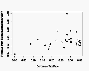
The exaggerated Laffer curve in the original presentation is not evident in this data. Excluding the outlier where revenue is 0.1 of GDP (looking at the Wall Street Journal’s graph, we see that this is for Norway), the data is roughly linear: zero revenue at a zero percent tax rate, and slightly increasing revenue with increasing tax rate. There may be a slight rounding-off or flattening in the tax rate range 0.20 to 0.35.
Since we do not know what shape the Laffer curve should take—where the maximum should be—and we don’t have enough data to find it, we can use the Lowess algorithm to create a smoothed curve.
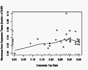
This confirms our observation that the relationship is essentially linear, with a possible rounding off above 0.20. I’ve added a rug plot to the axes, which gives a tick for every data point. This is useful because it helps us to focus on the distribution of the data, much as a separate histogram would.
Where does all this get us? It tells us that the author’s curve was most likely drawn in just to make his point and does not fit any data or data analysis. It also tells us that the author’s story had nothing to do with the data.
I have seen this many times in the corporate world. Graphs of neat lines, where all the data points have been averaged out and left out. Graphs where a preconceived curve is fitted to data without regard for how well (or poorly) the curve fits the data. Data may be removed completely and fitted curves smoothed until they look “look right.”
Combating this is not hard. It just takes some thought and a few questions.
First, make sure you actually see the data, and not just some prettified lines. Graphs should contain data points, and real data usually is not terribly clean or smooth.
Second, when a curve is fit to the data, ask what the correlation is. This should be a number, and less than 0.5 (or 50%) means there is no useful correlation. The closer to 1 (or 100%), the better. Ask, too, what the basis of the fitted line is: is this just some high-order polynomial or spline that was selected because of the high correlation, or is there a solid physical—or theoretical—basis for the selected line? If there is no physical basis, straight lines are preferable to curves.
Third, ask for a numerical analysis. Graphs are powerful; they allow us to see all the data, to see the trends, and to determine what sorts of numerical analyses are possible. However, graphs are not a substitute for numerical, or statistical, analysis. The two compliment each other. So ask for the hypothesis statement and the alternate hypothesis. Ask for the p-value and the α-value (which should have been selected before the experiment was conducted).
I realize that this is unfamiliar territory for a lot of managers, who have little mathematical background and often no training in statistics. It’s not hard to ask the questions, and it’s not hard to understand the answers—they’re pretty straight-forward—and I don’t think that you need to have a deep understanding of the mathematics. Let the experts be the experts, but ask questions to make sure that you are covering the risk.
