Time to Upgrade?

A full data analysis

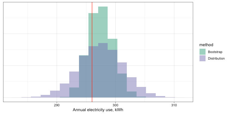
Comparison of bootstrap and norm distribution methods.

My friend Guy has been monitoring electricity consumption of his old refrigerator, and he wants to know if the refrigerator is still as efficient as it should be, or if it’s time to replace it.

Though the data set is small, it is real data and presents many of the challenges to a data scientist that any real data set will. Here I walk the reader through a complete analysis in R, step-by-step, from data entry to final recommendation.

https://rpubs.com/tomhopper/refrigerator

The Most Useful Data Plot You’ve Never Used

Those of us working in industry with Excel are familiar with scatter plots, line graphs, bar charts, pie charts and maybe a couple of other graph types. Some of us have occasionally used the Analysis Pack to create histograms that don’t update when our data changes (though there is a way to make dynamic histograms in Excel; perhaps I’ll cover this in another blog post).

One of the most important steps in data analysis is to just look at the data. What does the data look like? When we have time-dependent data, we can lay it out as a time-series or, better still, as a control chart (a.k.a. “natural process behavior chart”). Sometimes we just want to see how the data looks as a group. Maybe we want to look at the product weight or the cycle time across production shifts.

Unless you have Minitab, R or another good data analysis tool at your disposal, you have probably never used—maybe never heard of—boxplots. That’s unfortunate, because boxplots should be one of the “go-to” tools in your data analysis tool belt. It’s a real oversight that Excel doesn’t provide a good way to create them.

For the purpose of demonstration, let’s start with creating some randomly generated data:

head(df)
##   variable   value
## 1   group1 -1.5609
## 2   group1 -0.3708
## 3   group1  1.4242
## 4   group1  1.3375
## 5   group1  0.3007
## 6   group1  1.9717
tail(df)
##     variable   value
## 395   group1  1.4591
## 396   group1 -1.5895
## 397   group1 -0.4692
## 398   group1  0.1450
## 399   group1 -0.3332
## 400   group1 -2.3644

If we don’t have much data, we can just plot the points:

library(ggplot2)

ggplot(data = df[1:10,]) +
  geom_point(aes(x = variable, y = value)) +
  coord_flip() +
  theme_bw()

Points plot with few data

But if we have lots of data, it becomes hard to see the distribution due to overplotting:

ggplot(data = df) +
  geom_point(aes(x = variable, y = value)) +
  coord_flip() +
  theme_bw()

Points plot with many data

We can try to fix this by changing some parameters, like adding semi-transparency (alpha blending) and using an open plot symbol, but for the most part this just makes the data points harder to see; the distribution is largely lost:

ggplot(data = df) +
  geom_point(aes(x = variable, y = value), alpha = 0.3, shape = 1) +
  coord_flip() +
  theme_bw()

Points plot with many data using alpha blending

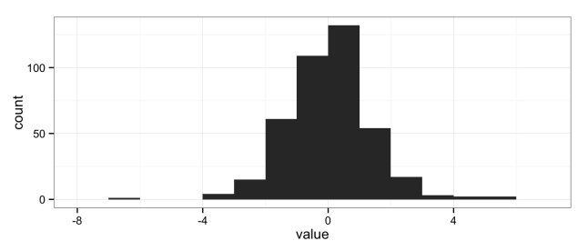
The natural solution is to use histograms, another “go-to” data analysis tool that Excel doesn’t provide in a convenient way:

ggplot(data = df) +
  geom_histogram(aes(x = value), binwidth = 1) +
  theme_bw()

histogram

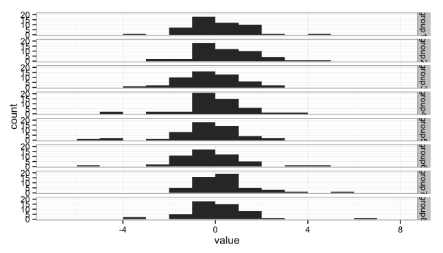
But histograms don’t scale well when you want to compare multiple groups; the histograms get too short (or too narrow) to really provide useful information. Here I’ve broken the data into eight groups:

head(df)
##   variable   value
## 1   group1 -1.5609
## 2   group1 -0.3708
## 3   group1  1.4242
## 4   group1  1.3375
## 5   group1  0.3007
## 6   group1  1.9717
tail(df)
##     variable   value
## 395   group8 -0.6384
## 396   group8 -3.0245
## 397   group8  1.5866
## 398   group8  1.9747
## 399   group8  0.2377
## 400   group8 -0.3468
ggplot(data = df) +
  geom_histogram(aes(x = value), binwidth = 1) +
  facet_grid(variable ~ .) +
  theme_bw()

Stacked histograms

Either the histograms need to be taller, making the stack too tall to fit on a page, or we need a better solution.

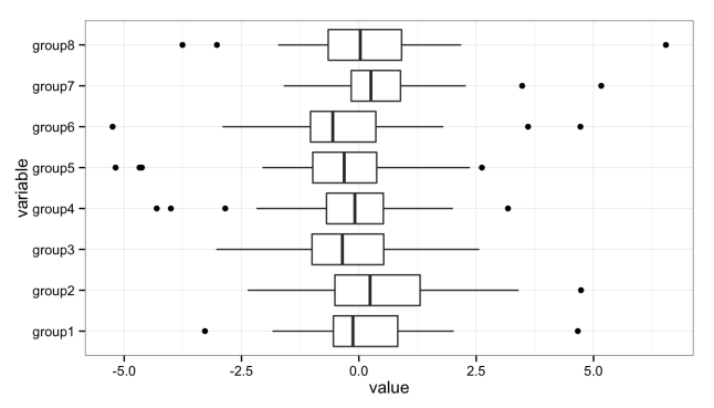
The solution is the box plot:

ggplot() +
  geom_boxplot(data = df, aes(y = value, x = variable)) +
  coord_flip() +
  theme_bw()

Stacked boxplots

The boxplot provides a nice, compact representation of the distribution of a set of data, and makes it easy to compare across a large number of groups.

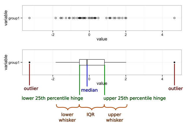
There’s a lot of information packed into that graph, so let’s unpack it:

Boxplot with markup

Median
A measure of the central tendency of the data that is a little more robust than the mean (or arithmetic average). Half (50%) of the data falls below this mark. The other half falls above it.
First quartile (25th percentile) hinge
Twenty-five percent (25%) of the data falls below this mark.
Third quartile (75th percentile) hinge
Seventy-five percent (75%) of the data falls below this mark.
Inter-Quartile Range (IQR)
The middle half (50%) of the data falls within this band, drawn between the 25th percentile and 75th percentile hinges.
Lower whisker
The lower whisker connects the first quartile hinge to the lowest data point within 1.5 * IQR of the hinge.
Upper whisker
The upper whisker connects the third quartile hinge to the highest data point within 1.5 * IQR of the hinge.
Outliers
Any data points below 1.5 * IQR of the first quartile hinge, or above 1.5 * IQR of the third quartile hinge, are marked individually as outliers.

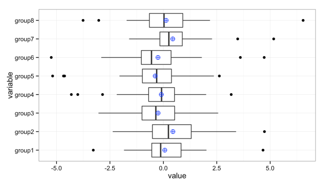
We can add additional values to these plots. For instance, it’s sometimes useful to add the mean (average) when the distributions are heavily skewed:

ggplot(data = df, aes(y = value, x = variable)) +
  geom_boxplot() +
  stat_summary(fun.y = mean, geom="point", shape = 10, size = 3, colour = "blue") +
  coord_flip() +
  theme_bw()

Stacked box plots with means

Graphs created in the R programming language using the ggplot2 and gridExtra packages.

References

  1. R Core Team (2014). R: A language and environment for statistical computing. R Foundation for Statistical
    Computing, Vienna, Austria. URL http://www.R-project.org/.
  2. H. Wickham. ggplot2: elegant graphics for data analysis. Springer New York, 2009.
  3. Baptiste Auguie (2012). gridExtra: functions in Grid graphics. R package version 0.9.1.
    http://CRAN.R-project.org/package=gridExtra

Combining the Voice of the Customer with the Voice of the Process

Setting product specifications is an iterative and challenging process, combining lab test data, historical data and educated guesses. All too often, the result is a set of product and process specifications that must be changed to meet manufacturing needs and that do not meet all customer requirements. To achieve specifications that are correct and defendable, the engineer must understand how the voice of the customer and the voice of the process interact, and must fully specify product through both specification limits (also called tolerance limits) and production capability, or Cpk.

Voice of the Customer

What the customer expects a product to do—what they are willing to pay for—is known as the “voice of the customer” (VoC). A customer’s expectations may not all be written or explicitly stated, and unwritten or unrecognized needs or wants can be even more important than the written ones. As we design a product, we first translate the VoC to engineering requirements and then flow the requirements down to subcomponents.

For simplicity, I will adopt the convention of referring to the specifications or tolerances as the Target Specification, the Upper Specification Limit (USL) and the Lower Specification Limit (LSL). The target, USL and LSL are the engineering translation of the VoC. I will refer to the measure being specified—length, mass, voltage, etc.—as a characteristic.

Voice of the Process

What we know about the parts actually produced—maximum and minimum, average, standard deviation, outliers, etc.—is known as the “voice of the process” (VoP). The VoP tells us the limits of our manufacturing abilities.

Suppose that we know from the production plant that the typical weight of our product is between 99.2 and 104.2 kg. This is the VoP; it may or may not be acceptable to the customer or fit within the USL and LSL. When we engage in statistical process control (SPC), we are listening to the VoP, but not the VoC.

The engineer must design to the VoC while considering the VoP.

Specification Limits

First, some definitions:

Target Specification
The desired value of the characteristic.
Mean Specification
The average of the upper and lower specification values—the value in the middle of the specification or tolerance range.
Nominal Specification
Used in different ways. May mean the target value of the specification. Sometimes the value printed in marketing literature or on the product, which may be the minimum or some other value.
Upper Specification Limit
The maximum allowed value of the characteristic. Sometimes referred to as the upper tolerance.
Lower Specification Limit
The minimum allowed value of the characteristic. Also referred to the lower tolerance.

Suppose that the customer has said that they want our product to weigh at least 100 kg. Since the customer will always want to pay as little as possible, a customer-specified lower specification limit of 100 kg is equivalent to saying that they are only willing to pay for 100 kg worth of costs; any extra material is added cost that reduces our profit margin.

If the customer does not specify a maximum weight, or upper specification limit, then we can choose the upper limit by the maximum extra material cost we want to bear. For this example, we decide that we are willing to absorb up to 5% additional cost. For our product, material and construction contributes 50% to the total assembled part cost, so the USL on weight is 110 kg.

Defect Rates and Cpk: Where VoC and VoP Intersect

Defect rates are expressed variously as Sigma, Cpk (“process capability”), Ppk (“process performance”), parts per million (ppm), yield (usually as a percent) or defects per million opportunities (DPMO). “Sigma” refers to the number of standard deviations that fit between the tolerance limits and the process mean. A 1-Sigma process has 1 standard deviation (\sigma) between the mean (\mu) and the nearest specification limit. Cpk is a measure of the number of times that three standard deviations (3\sigma) fit between the mean and the nearest specification limit. Cpk is often used by customers, especially automotive OEMs. We can easily convert between Cpk, Sigma yield, ppm and DPMO.

Production tells us that historically, they usually see a range of about 5 kg in assembled part weight, with weights between 99.2 kg and 104.2 kg. With enough data, the range of observed data will cover roughly the range from [mean – 3 standard devations] to [mean + 3 standard devations], so this gives us \mu \approx 101.7 kg and \sigma \approx 0.83 kg. From (\mu-LSL)/\sigma=Sigma, \left(101.7-100\right)/0.83=2.0, we have a 2-Sigma process. With this data, we could estimate the percent of parts that will be below the LSL.

Defect Rate Calculation

We can use this data to estimate the percent of product that will be out of the customer’s specification. We’ll assume that our process produces parts where the weight is normally distributed (having a Gaussian or bell-shaped curve).

Using Minitab, you can do this by opening the “Calc” menu, the “Probability Distributions” submenu, and choosing “Normal….” Then choose “Cumulative probability,” enter “101.7” for the mean and “0.83” for the standard deviation. Select “Input constant” and enter “100.” Click “OK.” The result in the Session Window looks like:

Cumulative Distribution Function

Normal with mean = 101.7 and standard deviation = 0.83

  x  P( X <= x )
100     0.02027

This is read as: the probability of seeing a weight X less than or equal to the given value x = 100 is 0.02, so we can expect about 2% of parts to be out of specification. This can also be done in Excel using NORMDIST(100, 101.7, 0.83, TRUE) or, in Excel 2010 and later, NORM.DIST(100, 101.7, 0.83, TRUE). In R we would use pnorm(100, 101.7, 0.83).

Minitab can also display this graphically. Open the “Graph” menu, select “Probability Distribution Plot…” Select “View Probability” (the right-most option) and click “OK,” On the “Distribution” tab, select “Normal” from the distribution menu and enter “101.7” for the mean and “0.83” for the standard deviation. Then switch to the “Shaded Area” tab, select “X Value,” “Left Tail” and enter “100” for the “X value.” Click on “OK” to obtain a plot like that below.
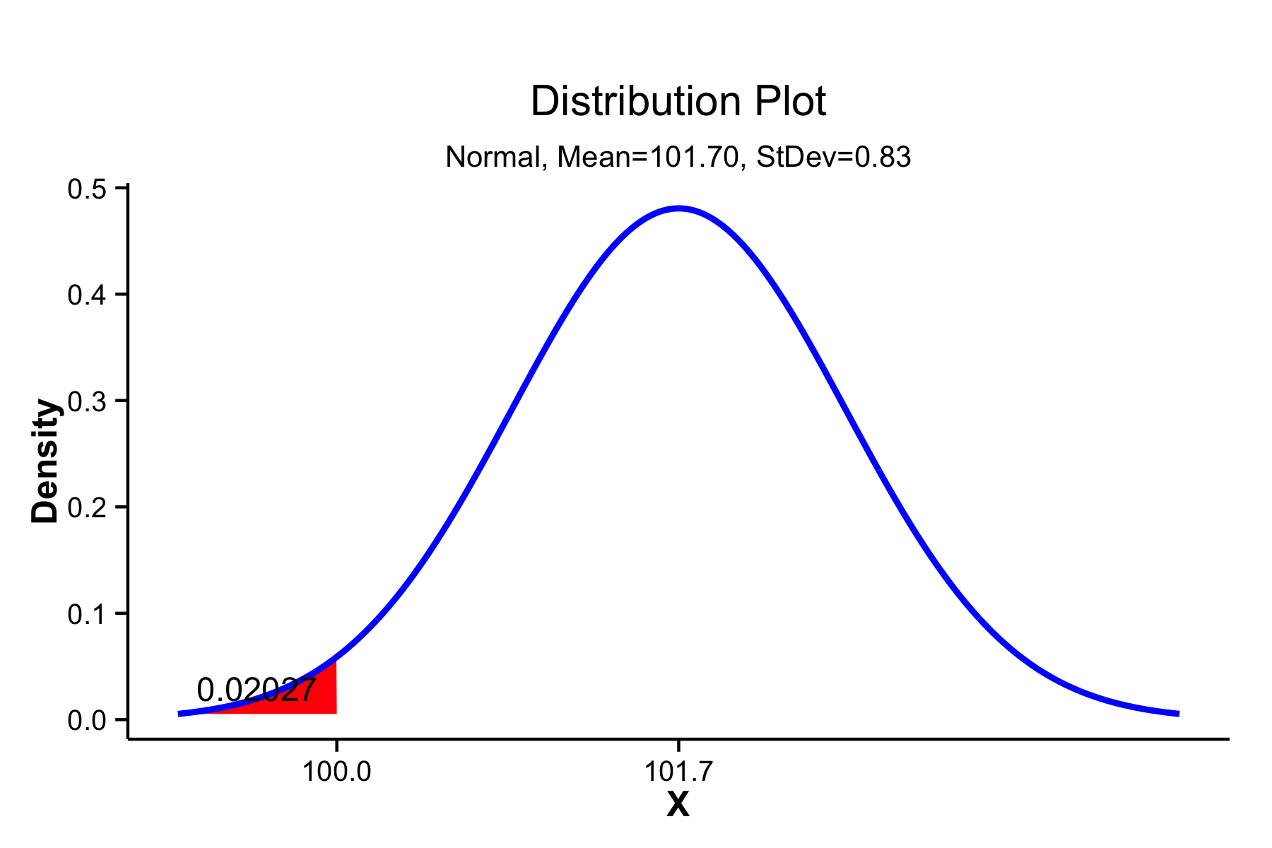
Probability density distribution showing cumulative probability below a target value of 100 shaded in red.

Probability density distribution showing cumulative probability below a target value of 100 shaded in red.

Of course, not all processes produce parts that are normally distributed, and you can use a distribution that fits your data. However, a normal distribution will give you a good approximation in most circumstances.

Cpk

The calculation for Cpk is:

where Cpu and Cpl are defined as:

If \mu is centered between the USL and the LSL, then by simple algebra we have

which is often a convenient form to use to estimate the “best case” process capability, even when we do not know what \mu is.

The combination of VoC-derived specification limits (USL, LSL and T) with process data (\mu and \sigma) ties together the VoC and the VoP, and allows us to predict future performance against the requirements.

Multiplying Cp or Cpk by \sqrt{1+\left(\left(\mu-T\right)/\sigma\right)^{2}} produces a measure of the process capability that includes centering on the target value, T, referred to as Cpm or Cpkm, respectively. These versions are more informative but much less commonly used than Cp and Cpk.

In the example, \mu-LSL=101.7-100=1.7=2\times0.83=2\sigma. We can then calculate the Cpk:

Acceptable values of Cpk are usually 1.33, 1.67 or 2.0. Automotive OEMs typically require Cpk = 1.33 for non-critical or new production processes, and Cpk = 1.67 or 2.0 for regular production. In safety-critical systems, a Cpk should be 6 or higher. The “Six Sigma” improvement methodology and Design For Six Sigma refers to reducing process variation until six standard deviations of variation fit between the mean and the nearest tolerance (i.e. Cpk = 2), achieving a defect rate of less than 3.4 per million opportunities. Some typical Cpk, and corresponding process sigma and process yield are provided in table [tblCpkSigmaYield].

Cpk Sigma Yield (max) Yield (likely)
0.33 1 85.% 30.%
1.00 3 99.9% 90.%
1.33 4 99.997% 99.%
1.67 5 99.99997% 99.98%
2.00 6 99.9999999% 99.9997%

In the table, “Yield (max)” assumes that the process is perfectly stable, such that parts produced today and parts produced weeks from now all exhibit the same mean and variance. Since no manufacturing process is perfectly stable, “Yield (likely)” assumes additional sources of variation that shift the process by 1.5\sigma (e.g. seasonal effects, or differences in setups across days or shifts). This 1.5\sigma shift is a standard assumption in such calculations when we do not have real data about the long-term process stability of our processes.

Specification Limits and Cost

When parts are out of specification—that is, they may be identified prior to shipment as defective or nonconforming—they they can have four possible impacts:

  • they must be reworked;
  • they must be scrapped;
  • they come back as warranty claims; or
  • they result in lost customers (reduced revenue without reducing “fixed” costs).

For example, underweight or damaged injection-molded plastics might be melted and reprocessed, but this adds cost in capital for the added equipment to proces the parts and cost for extra electricity and labor to move, sort and remelt. Later in production, defective parts will have to be scrapped.

We can see, then, that a cost function can be associated with each end of a specification range. The specification limits must be derived from the VoC, but the VoP imposes the cost function. The figures below illustrate this for both one-sided and two-sided specifications.

Percent of target production costs given an average production weight and four different process capabilities.

Percent of target production costs given an average production weight and four different process capabilities.

Percent of target production costs given an average production weight and four different process capabilities.

Percent of target production costs given an average production weight and four different process capabilities.

The minimum of the cost function is a good place to set our target specification, unless we have some strong need to set a different target.

Variance of Components and Cpk

When a part characteristic is the sum of the part’s components, as with weight, then the variation in the part characteristic is likewise due to the variation in the individual components. However, while the weight adds as the sum of the components,

the variance in weight, \sigma^{2}, adds as the sum of squares

Since the given \sigma is the maximum allowed for the assembled part to meet the desired Cpk, this means that the component variances, \sigma_{i}^{2}, are an estimate for the maximum allowed component variance. Manufacturing can produce parts better than this specification, but any greater variance will drive the parent part out of specification.

Specifying Characteristics

Very often, only specification ranges (or tolerances)—the USL and LSL—are provided by engineering when designing parts. Almost as often, these ranges are based on a target value (derived from the VoC) with some “allowed” tolerance based on what manufacturing says they can achieve on the existing equipment and processes (the VoP). It should be clear from the above that a minimally-adequate part specification includes USL and LSL derived from the VoC and the minimum acceptable Cpk derived from both the VoC and the VoP. The inclusion of the minimum process capability is the only way to ensure that the parts are made within the target costs and at the target quality level.

The next challenge is to flow these requirements down to the components. Having laid the groundwork for the basis of requirements flow-down, I will look at a way to do this in a future post.

References

All graphs created in R using ggplot2.

  • R Core Team (2014). R: A language and environment for statistical computing. R Foundation for
    Statistical Computing, Vienna, Austria. URL http://www.R-project.org/.
  • H. Wickham. ggplot2: elegant graphics for data analysis. Springer New York, 2009.
Combining Expert Judgements

Both product development and project planning often require making educated guesses. There are two models that I’ve seen for doing this. The first is to have a designated subject matter expert (SME) who provides The Answer. The second is to get a group of SMEs together to discuss and arrive at a consensus answer.

Under most circumstances, I’m not a fan of the first approach. Individuals are simply too fallible, too easily swayed by anecdotes rather than real data or too busy to consider a problem fully and in depth. The exception is when you are estimating work; then the SME is the person who will actually have to do the work, and their estimate is better than anyone else’s. The second solution often suffers from several other problems. Too many people working a problem can take a long time, answers can be driven by the most vocal or the most risk-averse members of the group and groups sometimes deliver bad answers due to diffusion of responsibility or other “group think” effects.

One solution to the problems of group decisions is to use Affinity Diagramming and the Analytical Hierarchy Process (AHP) to structure the problem, gather individual judgements of the alternatives, and then determine their relative values or importance. Affinity diagramming followed by AHP is incredibly powerful, and does a great job taking the individual bias out of the equation. I’ve used it with teams to rank the importance of product requirements, as a training exercise to accurately estimate the relative area of geometric shapes and personally to decide which car to buy. It works.

Unfortunately, AHP takes time, and for any but the simplest assessments, you really need custom software to support the process. Affinity diagramming can be done very effectively with Post-It notes, but the calculations of AHP cannot be easily set up in a program like Excel. It also requires discrete alternatives to choose from. For estimates of a single variable, such as lifetime, or other performance characteristics, I have had to develop a different approach.

The technique below works when you want to create a point estimate of a continuous variable. For instance, you might need to estimate product lifetime and establish a warrant period, or you might need to estimate a performance level that can be communicated to customers (implying a performance guarantee), or you might need to estimate the duration of a set of project activities. We can easily implement the calculations in Excel, R, or a similar tool.

Example

What we’re going to do is get the SMEs to individually estimate a range of possible results (low, most likely, high). Then we’ll generate triangular probability distributions from each estimate and finally combine those estimates. To get a robust result, we will account for the SME’s estimation of their own accuracy, and treat their different estimates discrete distributions when combining.

The below is the data entered by the SMEs.

Subject Matter Experts data entries for estimating a continuous variable

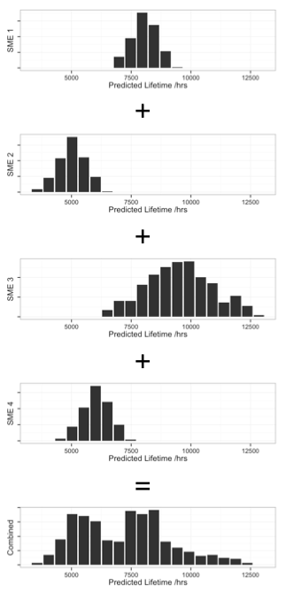
Using the above data, we can calculate triangular probability distributions for each, then combine them by treating them as discrete distributions. This produces the sequence of distributions, below.

Combining estimation distribution from Subject Matter Experts

We can then summarize the combined distribution with some useful values:

most likely: 7087
likely low: 4360
likely high: 10711
50% between 5162 and 8370

The process

  1. Bring a few SMEs together. While the technique will work with any number, usually five to six is more than sufficient, and ten should be considered the maximum for useful input. We’ll call this number N so we can refer to it later.
  2. Define the problem. Everyone should agree precisely what you are estimating.
  3. Agree on a basis for the evaluation. This might be an agreed conceptual model of how the product behaves or a set of criteria or goals to evaluate against.
  4. Collect three estimates—low, most likely, high—from each SMEs for the variable of interest (call this variable X).

Collecting a range is important; we need to be honest with ourselves that we don’t know what the value will actually be: there is uncertainty in the SME judgement—if we had the data to be more precise then we’d use that—and there’s variation to consider. Ranges allow us to derive probabilistic estimates that represent both the limits of our SME’s knowledge and the natural variation.

  1. Ask each SME for their assessment of three probabilities on a scale of 0% to 100%:
    1. How likely are we to see the real data fall within this range if your reasoning or model is correct? This will usually be very high, like 95% or higher.
    2. How likely are we to see the real data fall within this range even if your reasoning has some flaw? This may also be high, but you can use 50% if the answer is “I don’t know.”
    3. How likely is it that the reasoning is correct? Again, this will usually be pretty high. That’s why they’re SMEs.

At this point, you have all the information that you need from the SMEs and can proceed to the calculations.

  1. Using the three probabilities of the argument accuracy, calculate the values of X at end points for a triangular probability distribution.
  2. For each SME’s guesstimates, use the triangle distributions to generate a large number of probabilities across the total range of possible Xs.
  3. For each value of X used in the generation of the probability distributions, randomly choose a probability from one of the SMEs. For each value of X, we now have N probabilities that we treat as part of a discrete distribution.
  4. Use the resulting combined distribution to determine values of interest, e.g. the median, fifth percentile, ninety-fifth percentile and so on.

From a diverse set of estimates, you now have a single, robust estimation for a variable. The resulting probability distribution will not be smooth, but you will be able to pull out single values that are meaningful and robust, such as the ninety-fifth percentile for duration estimates.

A few tips

How you ask for the estimates matters. Just asking for “low,” “middle” and “high” estimates will get you very inconsistent results. Likewise, asking for “worst-case” or “best-case” will often get you some pretty wild estimates. You want to ask questions like “how long would this take if many things went right,” “how long would the product last in more severe operating conditions” or “what is the most likely power available?” You don’t want the “middle” estimate, but a “most likely” estimate; you’re not shooting for half-way between the low and high estimates, but for a high-probability point estimate.

When some SMEs know more about the variable being estimated than others, you could also weight their judgements. This weighting is used in the second to last step by adjusting the probability of randomly selecting a value from each SME’s probability distribution.

Issue Logs and Risk Registers

Every product development project includes uncertainty over what will happen. The uncertainty—each assumption or best guess—reduces our chances of project success. The job of the project manager and team members is to ensure success by managing risk.

When something goes wrong—deviates from the plan—it stops being a risk and becomes an issue that must be addressed to ensure success. Issues are those conditions that are having a negative impact on your ability to execute the project plan. You can easily identify them because they directly cause schedule slippage and extra work.

There are two simple tools that can—and should—be used on every project to manage risks and issues to prevent disaster. One is the risk register; the other is the issue log. In my experience, these two documents are often conflated, but they are distinct documents that should contain different information and drive different actions.

The risk register is a means of capturing risks that we want to monitor over the life of the project so that we can take action before they have a negative impact on the project. These are conditions that you have decided not to explicitly work into the plan, but don’t want to let “slip under the radar” to create big issues for you later.

The issue log is where you record any problems that were not accounted for in the plan and that threaten to delay the project, push it off budget or reduce the scope (e.g. reduce product performance).

Issue Log Risk Register
Description of the issue Description of the risk
Underlying problem or cause of the issue Risk profile—sources of uncertainty and the potential impact
Action plan Potential actions
Priority or scheduling Monitoring plan
Who is responsible for assuring this issue is resolved Who is responsible for monitoring
Date opened and date resolved, sometimes a tracking number or other ID Date last updated, tracking ID

Issue Log

The issue log is fundamentally about corrective actions. The project has deviated from the plan, and now we need to get back on course to complete the project on time, on budget and with the agreed goals. The issue log is used to capture this information.

While the cause of the problem is often obvious, it is always a good idea to probe for deeper, systemic causes that could lead to further delays. Asking “why?” five times in order to permanently and irrevocably fix a problem doesn’t take very long compared to the total delays that a project can experience.

Risk Register

The hard part of a risk register is the risk profile. Different people respond differently to risk, and some are more comfortable with thinking about uncertain outcomes than others. These differences between people lead to a lot of variation and debate in identifying risks; a good strategy for making risk registers easy is to standardize. The best practices are to focus on the causes of the risk and the probable impacts and to standardize the process.

There has been a lot written about risk management. Some of the best, in my opinion, is the work by De Meyer, Loch and Pich, which was first brought to my attention by Glenn Alleman over at the Herding Cats blog. In their excellent book, Managing the Unknown: A New Approach to Managing High Uncertainty and Risk in Projects, they break down risk into two major components: relationship complexity and task complexity.

When the relationships of stakeholders or partners are complex—groups aren’t aligned—then you can expect disagreements and conflict. Successful strategies for dealing with relationship complexity include increased communication and more rigidly defined relationships.

When tasks are complex—there are many links between tasks, so that changing one task can affect many, or there is a high degree of uncertainty in what needs to be done—then the successful strategies range from critical path management to an entrepreneurial approach of working multiple solutions in parallel (see also De Meyer 2001).

By implementing these pairings of source of risk with management strategy in a risk register template, we can greatly simplify the process and drive more consistent risk management results. Adding in a simple analysis of the impact can help us with prioritization (where do we spend our resources monitoring) and monitoring frequency.

Monitoring is all about how you will know when to do something about the risk. i.e. You want to decide in advance what condition will trigger you to transition this risk to the issue log. Measures should be relevant to the risk, quantitative where possible and the method of measurement should be clearly defined (you don’t want people disagreeing over the project plan just because they measure something differently). Set up measurement intervals that make sense by asking yourself how long you can go without knowing that you have a problem. Plot the results as a time series or on a control chart to allow you to distinguish between normal variation in the measurement and a condition that requires action.

References

  • Loch, Christoph H, Arnoud De Meyer, and Michael T Pich. Managing the Unknown. Hoboken, New Jersey: John Wiley & Sons, 2006. Print.
  • De Meyer, Arnoud, Christoph H Loch, and Michael T Pich. “Uncertainty and Project Management: Beyond the Critical Path Mentality.” 2001 : 1–23. Print.

Normality and Testing for Normality

Many of our statistical tests make assumptions about the distribution of the underlying population. Many of the most common—ImR (XmR) and XbarR control charts, ANOVA, t-tests—assume normal distributions in the underlying population (or normal distributions in the residuals, in the case of ANOVA), and we’re often told that we must carefully check the assumptions.

At the same time, there’s a lot of conflicting advice about how to test for normality. There are the statistical tests for normality, such as Shapiro-Wilk or Anderson-Darling. There’s the “fat pencil” test, where we just eye-ball the distribution and use our best judgement. We could even use control charts, as they’re designed to detect deviations from the expected distribution. We are discouraged from using the “fat pencil” because it will result in a lot of variation from person to person. We’re often told not to rely too heavily on the statistical tests because they are not sensitive with small sample sizes and too sensitive to the tails. In industrial settings, our data is often messy, and the tails are likely to be the least reliable portion of our data.

I’d like to explore what the above objections really look like. I’ll use R to generate some fake data based on the normal distribution and the t distribution, and compare the frequency of p-values obtained from the Shapiro-Wilk test for normality.

A Function to test normality many times

First, we need to load our libraries

library(ggplot2)
library(reshape2)

To make this easy to run, I’ll create a function to perform a large number of normality tests (Shapiro-Wilk) for sample sizes n = 5, 10 and 1000, all drawn from the same data:

#' @name assign_vector
#' @param data A vector of data to perform the t-test on.
#' @param n An integer indicating the number of t-tests to perform. Default is 1000
#' @return A data frame in "tall" format
assign_vector <- function(data, n = 1000) {
  # replicate the call to shapiro.test n times to build up a vector of p-values
  p.5 <- replicate(n=n, expr=shapiro.test(sample(my.data, 5, replace=TRUE))$p.value)
  p.10 <- replicate(n=n, expr=shapiro.test(sample(my.data, 10, replace=TRUE))$p.value)
  p.1000 <- replicate(n=n, expr=shapiro.test(sample(my.data, 1000, replace=TRUE))$p.value)
  #' Combine the data into a data frame, 
  #' one column for each number of samples tested.
  p.df <- cbind(p.5, p.10, p.1000)
  p.df <- as.data.frame(p.df)
  colnames(p.df) <- c("5 samples","10 samples","1000 samples")
  #' Put the data in "tall" format, one column for number of samples
  #' and one column for the p-value.
  p.df.m <- melt(p.df)
  #' Make sure the levels are sorted correctly.
  p.df.m <- transform(p.df.m, variable = factor(variable, levels = c("5 samples","10 samples","1000 samples")))
  return(p.df.m)  
}

Clean, random data

I want to simulate real-word conditions, where we have an underlying population from which we sample a limited number of times. To start, I’ll generate 100000 values from a normal distribution. To keep runtimes low I’ll have assign_vector() sample from that distribution when performing the test for normality.

n.rand <- 100000
n.test <- 10000
my.data <- rnorm(n.rand)
p.df.m <- assign_vector(my.data, n = n.test)

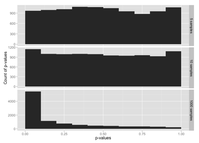
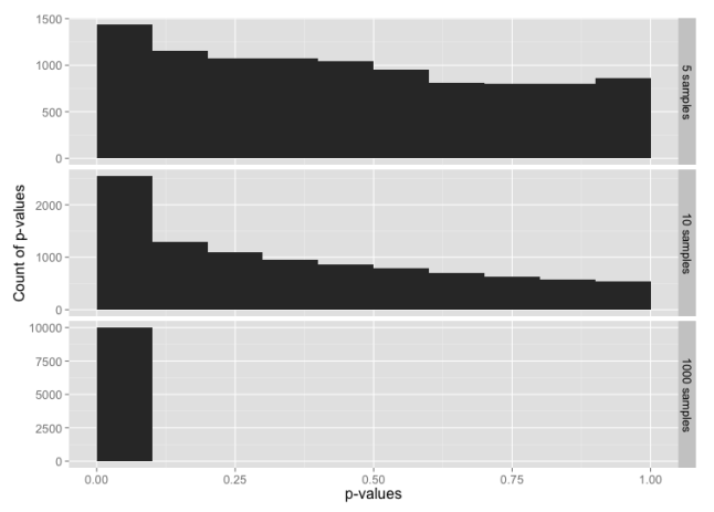
We would expect that normally distributed random data will have an equal probability of any given p-value. i.e. 5% of the time we’ll see p-value ≤ 0.05, 5% of the time we’ll see p-value > 0.05 and ≤ 0.10, and so on through > 0.95 and ≤ 1.00. Let’s graph that and see what we get for each sample size:

ggplot(p.df.m, aes(x = value)) + 
  geom_histogram(binwidth = 1/10) + 
  facet_grid(facets=variable ~ ., scales="free_y") + 
  xlim(0,1) +
  ylab("Count of p-values") +
  xlab("p-values") +
  theme(text = element_text(size = 16))

Histogram of p-values for the normal distribution, for sample sizes 5, 10 and 1000.

Histogram of p-values for the normal distribution, for sample sizes 5, 10 and 1000.

This is, indeed, what we expected.

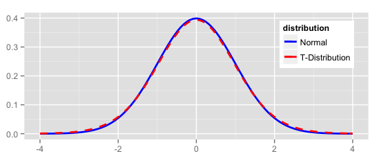
Now let’s compare the normal distribution to a t distribution. The t distribution would pass the “fat pencil” test—it looks normal to the eye:

ggplot(NULL, aes(x=x, colour = distribution)) + 
  stat_function(fun=dnorm, data = data.frame(x = c(-6,6), distribution = factor(1)), size = 1) + 
  stat_function(fun=dt, args = list( df = 20), data = data.frame(x = c(-6,6), distribution = factor(2)), linetype = "dashed", size = 1) + 
  scale_colour_manual(values = c("blue","red"), labels = c("Normal","T-Distribution")) +
  theme(text = element_text(size = 12),
        legend.position = c(0.85, 0.75)) +
  xlim(-4, 4) +
  xlab(NULL) +
  ylab(NULL)

Density plot of normal and t distributions

Starting with random data generated from the t-distribution:

my.data <- rt(n.rand, df = 20)

Histogram of p-values for the t distribution, for sample sizes 5, 10 and 1000.

Histogram of p-values for the t distribution, for sample sizes 5, 10 and 1000.

The tests for normality are not very sensitive for small sample sizes, and are much more sensitive for large sample sizes. Even with a sample size of 1000, the data from a t distribution only fails the test for normality about 50% of the time (add up the frequencies for p-value > 0.05 to see this).

Testing the tails

Since the t distribution is narrower in the middle range and has longer tails than the normal distribution, the normality test might be failing because the entire distribution doesn’t look quite normal; we haven’t learned anything specifically about the tails.

To test the tails, we can construct a data set that uses the t distribution for the middle 99% of the data, and the normal distribution for the tails.

my.data <- rt(n.rand, df = 20)
my.data.2 <- rnorm(n.rand)
# Trim off the tails
my.data <- my.data[which(my.data < 3 & my.data > -3)]
# Add in tails from the other distribution
my.data <- c(my.data, my.data.2[which(my.data.2 < -3 | my.data.2 > 3)])

Histogram of p-values for sample sizes 5, 10 and 1000, from a data set constructed from the t distribution in the range -3 to +3 sigmas, with tails from the normal distribution below -3 and above +3.

Histogram of p-values for sample sizes 5, 10 and 1000, from a data set constructed from the t distribution in the range -3 to +3 sigmas, with tails from the normal distribution below -3 and above +3.

Despite 99% of the data being from the t distribution, this is almost identical to our test with data from just the normal distribution. It looks like the tails may be having a larger impact on the normality test than rest of the data

Now let’s flip this around: data that is 99% normally-distributed, but using the t distribution in the extreme tails.

my.data <- rnorm(n.rand)
my.data.2 <- rt(n.rand, df = 20)
# Trim off the tails
my.data <- my.data[which(my.data < 3 & my.data > -3)]
# Add in tails from the other distribution
my.data <- c(my.data, my.data.2[which(my.data.2 < -3 | my.data.2 > 3)])

Histogram of p-values for sample sizes 5, 10 and 1000, from a data set constructed from the normal distribution in the range -3 to +3 sigmas, with tails from the t-distribution below -3 and above +3.

Histogram of p-values for sample sizes 5, 10 and 1000, from a data set constructed from the normal distribution in the range -3 to +3 sigmas, with tails from the t-distribution below -3 and above +3.

Here, 99% of the data is from the normal distribution, yet the normality test looks almost the same as the normality test for just the t-distribution. If you check the y-axis scales carefully, you’ll see that the chance of getting p-value ≤ 0.05 is a bit lower here than for the t distribution.

To make the point further, suppose we have highly skewed data:

my.data <- rlnorm(n.rand, 0, 0.4)

This looks like:
Histogram of log-normal data

For small sample sizes, even this is likely to pass a test for normality:
Histogram of p-values for a log-normal distribution

What have we learned?

  • With small sample sizes, everything looks normal.
  • The normality tests are, indeed, very sensitive to what goes on in the extreme tails.

In other words, if we have enough data to fail a normality test, we always will because our real-world data won’t be clean enough. If we don’t have enough data to reliably fail a normality test, then there’s no point in performing the test, and we have to rely on the fat pencil test or our own understanding of the underlying processes.

Don’t get too hung up on whether your data is normally distributed or not. When evaluating and summarizing data, rely mainly on your brain and use the statistics only to catch really big errors in judgement. When attempting to make predictions about future performance, e.g. calculating Cpk or simulating a process, recognize the opportunities for errors in judgment and explicitly state you assumptions.

And You Thought Physics Was *YAWN*

Part of my day job involves monitoring the renewable energy market, and particularly keeping abreast of storage technologies. It’s like combining my hobby with my job.

A new wind turbine design was recently announced, the SeaTwirl. It’s an off-shore turbine design using vertical blades. The key technological advance here is that it includes a method to store energy, so that it can continue to produce electricity when the wind stops blowing. This ability to deliver a constant output is important, because, as you may have heard, wind energy is intermittent; you only get electricity when the wind blows, and only to the degree that it’s blowing. Demand, unfortunately, doesn’t follow wind’s intermittancy—nobody stops to check that the wind is blowing before they turn on their lights—and the utilities, transmission system operators and distribution system operators all have to supply electricity to meet demand.

The SeaTwirl stores energy by integrating an unusual wind turbine design with a pumped hydro system. It has the turbine blades on a large circular ring, which rotates parallel to the water’s surface kind of like a hula-hoop. This ring is hollow (more or less), and is filled up with water when the wind blows. When the wind stops blowing, the momentum of the water keeps the tube spinning, generating electricity, and the water is allowed to drain back out, spinning a hydro turbine to generate electricity.

The nice thing about this is that the storage can always be “recharged” and it’s “free.” Or at least it seems to be. If you’ve ever held a bucket while spinning around, you know that spinning with an empty bucket takes a lot less effort than spinning around with a full bucket. In part, this is because of a property known as the moment of inertia. The heavier or larger a spinning object gets, the more it resists changes to its rate of rotation (or rpm).

If the SeaTwirl is filling up this horizontal “hula-hoop” with water, then the weight of the tube is increasing and so is the moment of inertia. As the moment of inertia increases, the energy needed to reach a given rpm increases. Wind turbines normally generate electricity in proportion to the wind speed, because the rpm of the blades is proportional to the wind speed. Increase the moment of inertia and you decrease the rpm, which means you generate less electricity for a given wind speed.

Now comes the physics. For something shaped like a hula-hoop, the moment of inertia, I, is calculated from the mass, M, and the radius of the hoop, R, according to:

I = M R^{2}

The energy, E, in a spinning object is equal to the moment of inertia times the speed of rotation, ω, according to

E=\frac{1}{2} I \omega ^{2}

If we know the energy (because we know the wind speed), then we can calculate the speed of rotation, ω, by rearranging that equation to get ω on the left-hand side:

\omega = \sqrt{\frac{2E}{I}}

We can then replace I with mass and radius from the first equation to get

\omega = \sqrt{\frac{2E}{MR^{2}}}

So we can see that, if we don’t change the energy E (or don’t change the wind speed), and don’t change the radius R of the spinning hoop, then increasing the mass M results in a slower rate of rotation.

From SeaTwirl’s website and press releases, we can estimate how big the SeaTwirl is, which will let us estimate how much slower a full SeaTwirl will spin than an empty one, and therefore how much less electricity must be generated. We can calculate this by taking the ratio of ω full to ω empty, so that the parts that we don’t have to know E and R.

\frac{\omega_{full}}{\omega_{empty}} = \frac{\sqrt{\frac{2E}{M_{full}R^{2}}}}{\sqrt{\frac{2E}{M_{empty}R^{2}}}} = \sqrt{\frac{\frac{2E}{R^{2}}}{\frac{2E}{R^{2}}}}\sqrt{\frac{M_{empty}}{M_{full}}}=\sqrt{\frac{M_{empty}}{M_{full}}}

For the SeaTwirl, we now have to find out what R is, and estimate M for both filled and empty

The whole turbine assembly is made of composite materials, which probably have a density, \rho_{c}, of around 2500 kilograms per cubic meter (similar to fiberglass). Water has a density, \rho_{w}, of near 1000 kilograms per cubit meter (depending on temperature). The diameter of the turbine will be near 180 meters, so the radius, R, of our “hula-hoop” is half that, or 90 meters. From the pictures, it looks like the thickness of that hula-hoop is a few percent of the total diameter of the turbine, so we can figure an outside diameter of the “hula-hoop” of about 2 meters, for a radius, r, of 1 meter. Figure that at least ten percent of this is composite, and the rest is the hollow, water-filled portion.

To estimate the weight of the water in the “hula-hoop,” we can approximate the water as being a cylinder of radius r_{w} = 0.9r and length equal to the circumference of the “hula-hoop,” l = 2\pi R. The volume of such a cylinder is equal to the cross-sectional area of the water column, A_{w}=\pi r_{w}^{2} times the length of the column, l. The total mass of the water, m_{w} is the density times this volume.

m_{w} = \rho_{w}\pi r_{w}^{2}2\pi R = \rho_{w}3\pi (0.9r)^{2} R

Plugging in our estimates for the above values gives us

m_{w} = 1000 \cdot 3\pi (0.9)^{2} 90 = 687000 kg

That’s a lot of water.

Now for the empty “hula-hoop.” We can treat it in the same way: a cylinder of material of radius r, length l = 2\pi R. However, we don’t want to calculate for a solid cylinder of composite; we have to subtract out the hollow part with radius r_{w}. So the mass of the composite is

m_{c} = \rho_{c} 2 \pi R ( \pi r^{2} - \pi r^{2}_{w} )

m_{c} = 2500 \cdot 3 \pi 90 (1^{2} - 0.9^{2} ) = 403000 kg

So the water more than doubles the weight of the hoop.

From the picture, you can see that there’s another hoop at the top, and the two hoops are connected by the turbines, which combined are probably worth at least another hoop in weight, so we can further assume that the mass of this bottom hoop, empty, is roughly one-third of the total mass of the movable parts of turbine.

The mass of the turbine, empty, is therefore about 1200000 kg, or 1200 tons. Filled with water, this goes up to about 1900000 kg, or 1900 tons. Empty, that’s maybe twice the largest off-shore turbine currently in existence, but this thing is easily twice as big as any current turbine, so our estimate appears to be in the right neighborhood.

Now we go back to our equation for the ratio of the rotational velocities, ω, and plug in these weights:

\frac{\omega_{full}}{\omega_{empty}} = \sqrt{\frac{M_{empty}}{M_{full}}} =\sqrt{\frac{1200}{1900}} = 0.8

So we get about 80% as much electricity from a water-filled turbine as from an empty one, when the wind blows. This is a direct efficiency loss due to the storage of energy in the spinning-water-hoop.

In addition, there’s the efficiency losses in loading water into the hoop, or “charging” the hoop, and the efficiency losses of “discharging” the hoop, running the water back out through a hydro turbine. Pumped hydro is usually about 72% efficient, or less, in each direction, so the total round-trip efficiency of storage + discharge is about 50% efficient. There are a lot of other storage technologies that do at least this good, if not better.

These two figures, the 80% efficiency loss of just operating the turbine and the 50% storage-discharge efficiency, can be used to directly compare SeaTwist with other wind turbine + storage technology solutions. Any storage technology that has at least a 50% round-trip efficiency and increases the total system cost by less than 20% over the system’s operating lifetime will outperform SeaTwist in terms of return on investment.