Recently Chandoo.org posted a question about how to graph data when you have a lot of small values and a few larger values. It’s not the first time that I’ve come across this question, and I’ve seen a lot of answers, many of them really bad. While all solutions involve trade-offs for understanding and interpreting graphs, some solutions are better than others.
Data graphs tell stories by revealing patterns in complex data. Good data graphs let the data tell the story by revealing the patterns, rather than trying to impose patterns on the data.
As William Cleveland discusses in The Elements of Graphing Data and his 1993 paper A Model for Studying Display Methods of Statistical Graphics, there are two basic visual operations that people employ when looking at and interpreting graphs: pattern perception and table look-up. Pattern perception is where we see the geometric patterns in a graph: groupings; relative differences (larger/smaller); or trends (straight/curved or increasing/decreasing). Table look-up is where we explore details of values and names on a graph. These two operations are distinct and complimentary, and it is through these two operations that the data’s story is told.
| month | sales | |
|---|---|---|
| 1 | Feb 09 | 200 |
| 2 | Mar 09 | 300 |
| 3 | Apr 09 | 200 |
| 4 | May 09 | 300 |
| 5 | Jun 09 | 200 |
| 6 | Jul 09 | 300 |
| 7 | Aug 09 | 350 |
| 8 | Sep 09 | 400 |
| 9 | Oct 09 | 450 |
| 10 | Nov 09 | 1200 |
| 11 | Dec 09 | 100000 |
| 12 | Jan 10 | 85000 |
| 13 | Feb 10 | 450 |
So suppose that we have some data like that at right, where we are interested in the patterns of smaller, individual values, but there are also a few extremely large values, or outliers. We describe such data as being skewed. How do we plot this data? First, for such a small data set, a simple table is the best approach. People can see the numbers and interpret them, there aren’t too many numbers to make sense of and the table is very compact. For more complicated data sets, though, a graph is needed. There’s a few basic options:
- Graph as-is;
- Graph with a second axis;
- Graph the logarithm of the data;
- Use a scale break.
- Plot the data multiple times.
Graph As-Is
This is the simplest solution, and if you’re only interested in knowing about the outliers (Dec ’09 and Jan ’10) then it will do. However, it completely hides whatever is happening in the rest of the months. Pattern recognition tells us that two months near the end of the series have the big numbers. Table-lookup tells us the approximate values and that these months are around December ’09 and February ’10, but the way the labels string together and overlap the tick marks, it’s not clear exactly what the labels are, let alone which label applies to which bar (which months are those, precisely? Is that “09 Dec” and “09 Feb?” Do the numbers even go with the text, or are they separate labels?).
For all but the simplest of messages, this rendition defeats both pattern recognition and table look-up. We definitely need a better solution.
Use a Secondary Axis
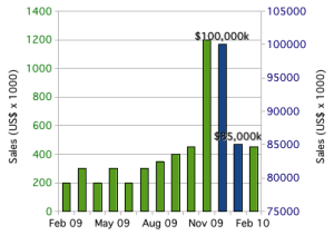
Excel gives us an easy solution: break the data into two columns (“small” numbers in one and “large” numbers in the other) and plot them on separate axes. Now we can see all the data, including the patterns in all the months.
Unfortunately, pattern recognition tells us that the big-sales months are about the same as all the other months. It’s only the table look-up that tells us how big of a difference there is between the two blue columns and the rest of the data. This is why I’ve added data labels to the two columns: to aid table look-up.
Even if we tweaked around with the axes to set the outliers off from the rest of the data, we’d still have the same basic problem: pattern recognition would tell us that there is a much smaller difference than there actually is. By using a secondary axis, we’ve set up a basic conflict between pattern recognition and table look-up. Worse, it’s easy to confuse the axes; which bars go with which axis? Reproduction in black and white or grayscale would make it impossible to correctly connect bars to the correct axis. Some types of color blindness would similarly make it difficult to interpret the graph. Table look-up is easily defeated with secondary axes.
The secondary axis presents so many problems that I always advise against using it. Stephen Few, author of Show Me The Numbers and Information Dashboard Design, calls graphs with secondary axes “dual-scaled graphs.” In his 2008 article Dual-Scaled Axes in Graphs, he concludes that there is always a better way to display data than by using secondary axes. Excel makes it easy to create graphs like this, but it’s always a bad idea.
Take the Logarithm
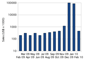
In scientific applications, skewed data is common, and the usual solution is to plot the logarithm of the values.
With the logarithm, it is easy to plot, and see, all of the data. Trends in small values are not hidden. Pattern perception immediately tells us the overall story of the data. Table look-up is easier than with secondary axes, and immediately tells us the scale of the differences. Plotting the logarithm allows pattern perception and table look-up to compliment each other.
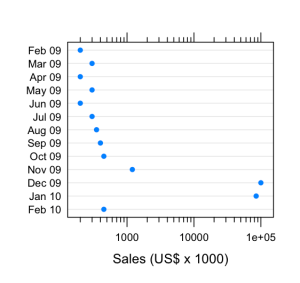
Below, I’ve created the same graph using a dot plot instead of a bar chart. Dot plots have many advantages over bar charts: most obviously, dot plots provide a better arrangement for category labels (e.g. the months); also, dot plots provide a clearer view of the data by plotting the data points rather than filling in the space between the axis and the data point. There are some nice introductions to dot plots, including William Cleveland’s works and a short introduction by Naomi Robbins. The message is clear: any data that you might present with a bar chart (or pie chart) will be better presented using dot plots.
Use a Scale Break
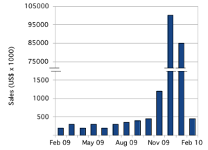
Another approach, which might be better for audiences unfamiliar with logarithmic scales, is to use a scale break, or broken axis. With some work, we can create a scale break in Excel or OpenOffice.org.
There are plenty of tutorials for how to accomplish this in Excel. For this example, I created the graph in OpenOffice.org Spreadsheet, using the same graph with the secondary axis, above. I adjusted the two scales, turned off the labels for both y-axes and turned off the tick marks for the secondary y-axis. Then I copied the graph over to the OpenOffice.org Draw application and added y-axis labels and the break marks as drawing objects.
That pretty much highlights the first problem with this approach: it takes a lot of work. The second problem is that those break marks are just too subtle; people will miss them.
The bigger problem is with interpretation. As with the secondary axis, this subtle scale break sets up a basic conflict between the two basic operations of graph interpretation. Pattern recognition tells us that the numbers are comparable; it’s only table look-up that tells us what a large difference there is.
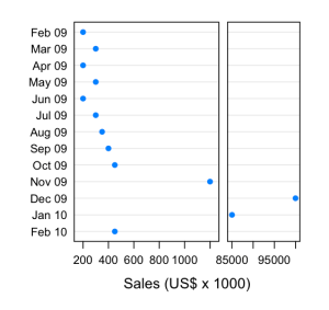
Cleveland’s recommendation, when the logarithm won’t work, is to use a full-panel scale break. In this way, pattern recognition tells that there are two distinct groups of data, and table look-up tells us what they are.
The potential disadvantage of this approach is that pattern perception might be fooled. While the scale break visually groups the “large” values from the “small” ones, the scale also changes, so that the broader panel on the left actually represents a much narrower range of values (about 1100 dollars range) than the narrower panel on the right (about 17000 dollars range). Our audience might have difficulties interpreting this correctly.
Small Multiples
Edward Tufte has popularized the idea of small multiples, the emphasis of differences by repeating a graph or image with small changes from one frame to the next. In this case, we could show the full data set, losing fidelity in the smaller values, and then repeat the graph while progressively zooming in on a narrower and narrower slice with each repetition.
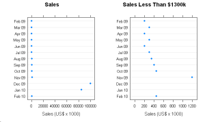
The full data, with outliers, is plotted on the left. On the right, a zoomed view showing detail in the smaller values.
This shares many similarities to Cleveland’s full scale break, but provides greater flexibility. With this data, there are two natural ranges: 0 – 100000 and 0 – 1200. If there were more data between 1200 and 85000, we might repeat the graph several times, zooming in more with each repetition to show lower levels of detail.
I think there are two potential pitfalls. As with the full scale break, the audience might fail to appreciate the effect of the changes to scale. Worse, the audience might be fooled into thinking that each graph represented a different set of data, rather than just a different slice of the same data. Some care in preparing such graphs will be needed for successful communication.
Summary
When presenting data that is, like the data above, arranged by category, use a dot plot instead of bar charts. When your data is heavily skewed, the best solution is to graph the logarithm of the data. However, if your audience will be unable to correctly interpret the logarithm, try a full scale break or small multiples.

How would I attach a picture of how I think this chart should look?
I don’t think WordPress supports attachments in comments, so I would suggest posting it to a free image hosting site, like Imageshack.us, Flickr or Picassa Web Albums, and then providing the link here.
OK. I tried imageshack.us… here is the URL http://img839.imageshack.us/i/chartswithsmalllargeval.png/
I tried this link and it seems to work. Interesting.
dropforge, there are some nice features about your graph. I particularly like the presentation of both absolute values and percentages. It’s certainly an improvement on my “As-Is” example. Still, I see a few problems with this approach.
Adding tabular data only bolsters table lookup (i.e. reading values); pattern perception is not enhanced. It is because pattern perception tells us so little in this graph (nothing at all, for eleven of the thirteen months) that you’ve had to add so many labels to the graph. Put another way: if the small values are important enough for us to add their values to the chart, then they are important enough for us to graph them in a way that supports the user in both pattern perception and table lookup operations.
Also, this technique of overcoming the limitations of the graph by adding table data only works for a small data set. If there were a few dozen categories, or two or three values for each category, then such data labels would be cumbersome to read.
Finally, though I didn’t mention it above, a good data graph follows the maxim of Antoine de Saint Expury, “perfection is achieved, not when there is nothing more to add, but when there is nothing left to take away.” The “As-Is” graph with added tabular data plots the same data three times on one graph (bars + axis labels, absolute values and percentages), and this added clutter can actually make it harder to correctly interpret the story that the data tells. The best presentation will strip the redundancies and present the data once, cleanly.
Taking the logarithm or using a scale break, while they have their own difficulties, are preferable to adding labels on a graph design that does not meet the demands of the viewer.
Thomas,
>I agree with your observation that this technique only works with a small data set if by small you mean number of values per month… in this case we have only one value per month. On the other hand you could probably support another 100 or so months of data on a chart that is allowed an 11″ x 8 1/2″ space.
>Since this is a chart of sales (and that really makes all the difference in how the data is presented as it provides a clue on who the intended audience is), more months will either reinforce the extreme sales seasonality or show that we were seeing the beginning of a new product launch or a combination of both or a new market introduction or… whatever
>By adding the absolute labels I get rid of the need have the left side y-axis scale, this scale is the real lookup issue as it cannot possibly support the very small and very high value lookup adequately.
>I would welcome additional categories of data… since this is a sales chart I could imagine there might be different markets or even more fun would be expenses and/or profits on a monthly basis. Customer penetration by month would be great. I would probably set up a way to cycle through the categories but might also look for a relationship that might lend itself to being overlayed through a 2nd y-axis that is scaled to stay out of the way of the bars and values of the 1st y-axis… well maybe just a new chart with the same x-axis scaling.
-bill
Thanks for sharing. Do you think “[Ed: link deleted]” can be a potential solution to this issue?
I like that your patented algorithm for dual-scale axes attempts to create a visual impression of similar scale. However, as I write in my blog, I think that there are always better solutions than dual-scale axes. I encourage you to follow the links to understand why comparing different series of data using dual scales is not bad just because the scale ranges aren’t chosen intelligently enough. Regarding the specific example in this post, I don’t see how a dual scale—however intelligent the ranges are chosen—could reasonably work to compare data within the same series.