The free and open-source R statistics package is a great tool for data analysis. The free add-on package qcc provides a wide array of statistical process control charts and other quality tools, which can be used for monitoring and controlling industrial processes, business processes or data collection processes. It’s a great package and highly customizable, but the one feature I wanted was the ability to manipulate the control charts within the grid graphics system, and that turned out to be not so easy.
I went all-in and completely rewrote qcc’s plot.qcc() function to use Hadley Wickham’s ggplot2 package, which itself is built on top of grid graphics. I have tested the new code against all the examples provided on the qcc help page, and the new ggplot2 version works for all the plots, including X-bar and R, p- and u- and c-charts.
In qcc, an individuals and moving range (XmR or ImR) chart can be created simply:
library(qcc)
my.xmr.raw <- c(5045,4350,4350,3975,4290,4430,4485,4285,3980,3925,3645,3760,3300,3685,3463,5200)
x <- qcc(my.xmr.raw, type = "xbar.one", title = "Individuals Chart\nfor Wheeler sample data")
x <- qcc(matrix(cbind(my.xmr.raw[1:length(my.xmr.raw)-1], my.xmr.raw[2:length(my.xmr.raw)]), ncol = 2), type = "R", title = "Moving Range Chart\nfor Wheeler sample data")
This both generates the plot and creates a qcc object, assigning it to the variable x. You can generate another copy of the plot with plot(x).
To use my new plot function, you will need to have the packages ggplot2, gtable, qcc and grid installed. Download my code from the qcc_ggplot project on Github, load qcc in R and then run source("qcc.plot.R"). The ggplot2-based version of the plotting function will be used whenever a qcc object is plotted.
library(qcc)
source("qcc.plot.R")
my.xmr.raw <- c(5045,4350,4350,3975,4290,4430,4485,4285,3980,3925,3645,3760,3300,3685,3463,5200)
x <- qcc(my.xmr.raw, type = "xbar.one", title = "Individuals Chart\nfor Wheeler sample data")
x <- qcc(matrix(cbind(my.xmr.raw[1:length(my.xmr.raw)-1], my.xmr.raw[2:length(my.xmr.raw)]), ncol = 2), type = "R", title = "Moving Range Chart\nfor Wheeler sample data")
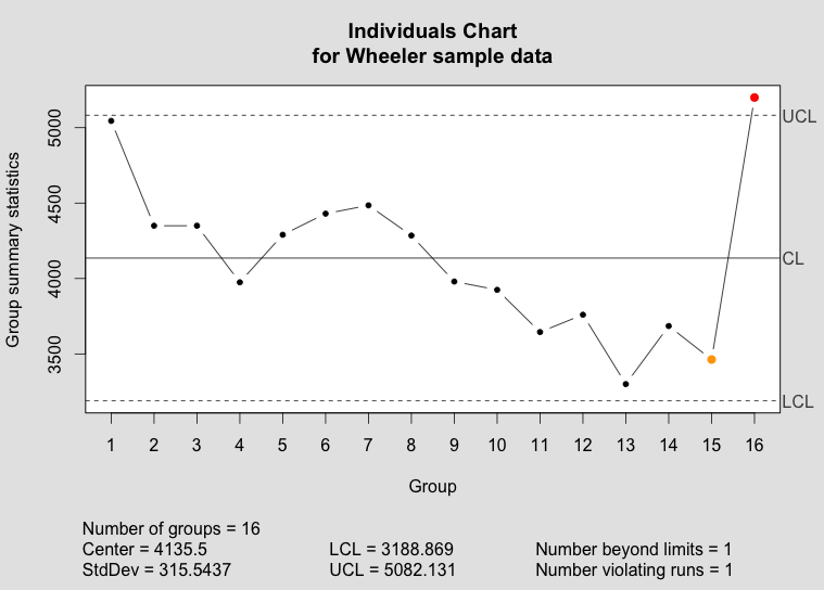
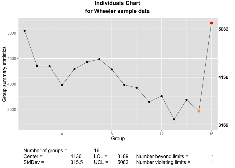
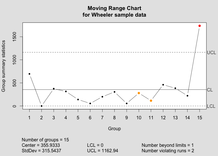
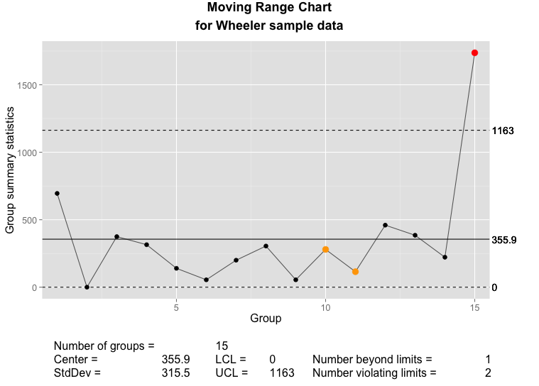
Below, you can compare the individuals and moving range charts generated by qcc and by my new implementation of plot.qcc():
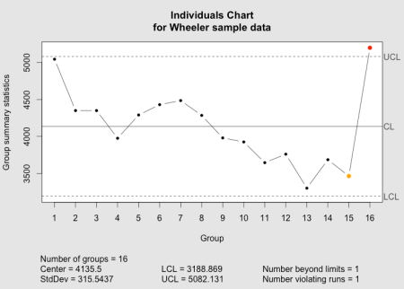
The qcc individuals chart as implemented in the qcc package.
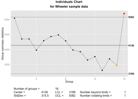
The qcc individuals chart as implemented using ggplot2 and grid graphics.
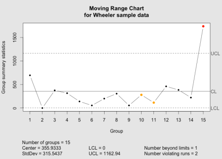
The qcc moving range chart as implemented in the qcc package.
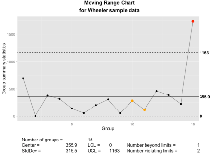
The qcc moving range chart as implemented using ggplot2 and grid graphics.
New features
In addition to the standard features in qcc plots, I’ve added a few new options.
size or cex- Set the size of the points used in the plot. This is passed directly to
geom_point().
font.size- Sets the size of text elements. Passed directly to
ggplot() and grid’s viewport().
title = element_blank()- Eliminate the main graph title completely, and expand the data region to fill the empty space. As with qcc, with the default
title = NULL a title will be created, or a user-defined text string may be passed to title.
- new.plot
- If
TRUE, creates a new graph (grid.newpage()). Otherwise, will write into the existing device and viewport. Intended to simplify the creation of multi-panel or composite charts.
- digits
- The argument
digits is provided by the qcc package to control the number of digits printed on the graph, where it either uses the default option set for R or a user-supplied value. I have tried to add some intelligence to calculating a default value under the assumption that we can tell something about the measurement from the data supplied. You can see the results in the sample graphs above.
Lessons Learned
This little project turned out to be somewhat more difficult than I had envisioned, and there are several lessons-learned, particularly in the use of ggplot2.
First, ggplot2 really needs data frames when plotting. Passing discrete values or variables not connected to a data frame will often result in errors or just incorrect results. This is different than either base graphics or grid graphics, and while Hadley Wickham has mentioned this before, I hadn’t fully appreciated it. For instance, this doesn’t work very well:
my.test.data <- data.frame(x = seq(1:10), y = round(runif(10, 100, 300)))
my.test.gplot <- ggplot(my.test.data, aes(x = x, y = y)) +
  geom_point(shape = 20)
index.1 <- c(5, 6, 7)
my.test.gplot <- my.test.gplot +
  geom_point(aes(x = x[index.1], y = y[index.1]), col = "red")
my.test.gplot
Different variations of this sometimes worked, or sometimes only plotted some of the points that are supposed to be colored red.
However, if I wrap that index.1 into a data frame, it works perfectly:
my.test.data <- data.frame(x = seq(1:10), y = round(runif(10, 100, 300)))
my.test.gplot <- ggplot(my.test.data, aes(x = x, y = y)) +
  geom_point(shape = 20)
index.1 <- c(5, 6, 7)
my.test.subdata <- my.test.data[index.1,]
my.test.gplot <- my.test.gplot +
  geom_point(data = my.test.subdata, aes(x = x, y = y), col = "red")
my.test.gplot
Another nice lesson was that aes() doesn’t always work properly when ggplot2 is called from within a function. In this case, aes_string() usually works. There’s less documentation than I would like on this, but you can search the ggplot2 Google Group or Stack Overflow for more information.
One of the bigger surprises was discovering that aes() searches for data frames in the global environment. When ggplot() is used from within a function, though, any variables created within that function are not accessible in the global environment. The work-around is to tell ggplot which environment to search in, and a simple addition of environment = environment() within the ggplot() call seems to do the trick. This is captured in a stack overflow post and the ggplot2 issue log.
my.test.data <- data.frame(x = seq(1:10), y = round(runif(10, 100, 300)))
my.test.gplot <- ggplot(my.test.data, environment = environment(), aes(x = x, y = y)) +
  geom_point(shape = 20)
index.1 <- c(5, 6, 7)
my.test.subdata <- my.test.data[index.1,]
my.test.gplot <- my.test.gplot +
  geom_point(data = my.test.subdata, aes(x = x, y = y), col = "blue")
my.test.gplot
Finally, it is possible to completely and seamlessly replace a function created in a package and loaded in that package’s namespace. When I set out, I wanted to end up with a complete replacement for qcc’s internal plot.qcc() function, but wasn’t quite sure this would be possible. Luckily, the below code, called after the function declaration, worked. One thing I found was that I needed to name my function the same as the one in the qcc package in order for the replacement to work in all cases. If I used a different name for my function, it would work when I called plot() with a qcc object, but qcc’s base graphics version would be used when calling qcc() with the parameter plot = TRUE.
unlockBinding(sym="plot.qcc", env=getNamespace("qcc"));
assignInNamespace(x="plot.qcc", value=plot.qcc, ns=asNamespace("qcc"), envir=getNamespace("qcc"));
assign("plot.qcc", plot.qcc, envir=getNamespace("qcc"));
lockBinding(sym="plot.qcc", env=getNamespace("qcc"));
Outlook
For now, the code suits my immediate needs, and I hope that you will find it useful. I have some ideas for additional features that I may implement in the future. There are some parts of the code that can and should be further cleaned up, and I’ll tweak the code as needed. I am certainly interested in any bug reports and in seeing any forks; good ideas are always welcome.
References
- R Core Team (2013). R: A language and environment for statistical computing. R Foundation for Statistical Computing, Vienna, Austria. URL http://www.R-project.org/.
- Scrucca, L. (2004). qcc: an R package for quality control charting and statistical process control. R News 4/1, 11-17.
- H. Wickham. ggplot2: elegant graphics for data analysis. Springer New York, 2009.
- Wheeler, Donald. “Individual Charts Done Right and Wrong.” Quality Digest. 2 Feb 20102 Feb 2010. Print. <http://www.spcpress.com/pdf/DJW206.pdf>.
 may not be meaningful. This typology is a useful thinking tool, but it is essential to understand the statistical methods being applied and their sensitivity to departures from underlying assumptions.
 list where all columns must be vectors of the same number of rows (determined with NROW()). However, unlike matrices, different columns can contain different types of data and each row and column must have a name. If not named explicitly, R names rows by their row number and columns according to the data assigned assigned to the column. Data frames are typically used to store the sort of data that industrial engineers and scientists most often work with, and is the closest analog in R to an Excel spreadsheet. Usually data frames are made up of one or more columns of factors and one or more columns of numeric data.


You must be logged in to post a comment.