Aside

Update to plot.qcc using ggplot2 and grid

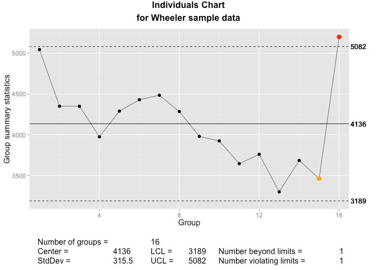
Two years ago, I blogged about my experience rewriting the plot.qcc() function in the qcc package to use ggplot2 and grid. My goal was to allow manipulation of qcc’s quality control plots using grid graphics, especially to combine range charts with their associated individuals or moving range charts, as these two diagnostic tools should be used together. At the time, I posted the code on my GitHub.

I recently discovered that the update to ggplot2 v2.0 broke my code, so that attempting to generate a qcc plot would throw an obscure error from someplace deep in ggplot2. The fix turned out to be pretty easy. The original code used aes_string() instead of aes() because of a barely-documented problem of calling aes() inside a function. It looks like this has been quietly corrected with ggplot2 2.0, and aes_string() is no longer needed for this.

The updated code is up on GitHub. As before, load the qcc library, then source() qcc.plot.R. For the rest of the current session, calls to qcc() will automatically use the new plot.qcc() function.

Explorable, multi-tabbed reports in R and Shiny

Matt Parker recently showed us how to create multi-tab reports with R and jQuery UI. His example was absurdly easy to reproduce; it was a great blog post.

I have been teaching myself Shiny in fits and starts, and I decided to attempt to reproduce Matt’s jQuery UI example in Shiny. You can play with the app on shinyapps.io, and the complete project is up on Github. The rest of this post walks through how I built the Shiny app.

plot_all_states

It’s a demo

The result demonstrates a few Shiny and ggplot2 techniques that will be useful in other projects, including:

  • Creating tabbed reports in Shiny, with different interactive controls or widgets associated with each tab;
  • Combining different ggplot2 scale changes in a single legend;
  • Sorting a data frame so that categorical labels in a legend are ordered to match the position of numerical data on a plot;
  • Borrowing from Matt’s work,
    • Summarizing and plotting data using dplyr and ggplot2;
    • Limiting display of categories in a graph legend to the top n (selectable by the user), with remaining values listed as “other;”
    • Coloring only the top n categories on a graph, and making all other categories gray;
    • Changing line weight for the top n categories on a graph, and making;

Obtaining the data

As with Matt’s original report, the data can be downloaded from the CDC WONDER database by selecting “Data Request” under “current cases.”

To get the same data that I’ve used, group results by “state” and by “year,” check “incidence rate per 100,000” and, near the bottom, “export results.” Uncheck “show totals,” then submit the request. This will download a .txt tab-delimited data file, which in this app I read in using read_tsv() from the readr package.

Looking at Matt’s example, his “top 5” states look suspiciously like the most populous states. He’s used total count of cases, which will be biased toward more populous states and doesn’t tell us anything interesting. When examining occurrences—whether disease, crime or defects—we have to look at the rates rather than total counts; we can only make meaningful comparisons and make useful decisions from an examination of the rates.

Setup

As always, we need to load our libraries into R. For this example, I use readr, dplyr, ggplot2 and RColorBrewer.

The UI

The app generates three graphs: a national total, that calculates national rates from the state values; a combined state graph that highlights the top n states, where the user chooses n; and a graph that displays individual state data, where the user can select the state to view. Each goes on its own tab.

ui.R contains the code to create a tabset panel with three tab panels.

tabsetPanel(
  tabPanel("National", fluidRow(plotOutput("nationPlot"))),
  tabPanel("By State",
           fluidRow(plotOutput("statePlot"),
                    wellPanel(
                      sliderInput(inputId = "nlabels",
                                  label = "Top n States:",
                                  min = 1,
                                  max = 10,
                                  value = 6,
                                  step = 1)
                    )
           )
  ),
  tabPanel("State Lookup",
           fluidRow(plotOutput("iStatePlot"),
                    wellPanel(
                      htmlOutput("selectState"))
           )
  )
)

Each panel contains a fluidRow element to ensure consistent alignment of graphs across tabs, and on tabs where I want both a graph and controls, fluidRow() is used to add the controls below the graph. The controls are placed inside a wellPanel() so that they are visually distinct from the graph.

Because I wanted to populate a selection menu (selectInput()) from the data frame, I created the selection menu in server.R and then displayed it in the third tab panel set using the htmlOutput() function.

The graphs

The first two graphs are very similar to Matt’s example. For the national rates, the only change is the use of rates rather than counts.

df_tb <- read_tsv("../data/OTIS 2013 TB Data.txt", n_max = 1069, col_types = "-ciiii?di")

df_tb %>%
  group_by(Year) %>%
  summarise(n_cases = sum(Count), pop = sum(Population), us_rate = (n_cases / pop * 100000)) %>%
  ggplot(aes(x = Year, y = us_rate)) +
  geom_line() +
  labs(x = "Year Reported",
       y = "TB Cases per 100,000 residents",
       title = "Reported Active Tuberculosis Cases in the U.S.") +
  theme_minimal()

The main trick, here, is the use of dplyr to summarize the data across states. Since we can’t just sum or average rates to get the combined rate, we have to sum all of the state counts and populations for each year, and add another column for the calculated national rate.

To create a graph that highlights the top n states, we generate a data frame with one variable, State, that contains the top n states. This is, again, almost a direct copy of Matt’s code with changes to make the graph interactive within Shiny. This code goes inside of the shinyServer() block so that it will update when the user selects a different value for n. Instead of hard-coding n, there’s a Shiny input slider named nlabels. With a list of the top n states ordered by rate of TB cases, df_tb is updated with a new field containing the top n state names and “Other” for all other states.

top_states <- df_tb %>%
      filter(Year == 2013) %>%
      arrange(desc(Rate)) %>%
      slice(1:input$nlabels) %>%
      select(State)

df_tb$top_state <- factor(df_tb$State, levels = c(top_states$State, "Other"))
df_tb$top_state[is.na(df_tb$top_state)] <- "Other"

The plot is generated from the newly-organized data frame. Where Matt’s example has separate legends for line weight (size) and color, I’ve had ggplot2 combine these into a single legend by passing the same value to the “guide =” argument in the scale_XXX_manual() calls. The colors and line sizes also have to be updated dynamically for the selected n.

    df_tb %>%
      ggplot() +
      labs(x = "Year reported",
           y = "TB Cases per 100,000 residents",
           title = "Reported Active Tuberculosis Cases in the U.S.") +
      theme_minimal() +
      geom_line(aes(x = Year, y = Rate, group = State, colour = top_state, size = top_state)) +
      scale_colour_manual(values = c(brewer.pal(n = input$nlabels, "Paired"), "grey"), guide = guide_legend(title = "State")) +
      scale_size_manual(values = c(rep(1,input$nlabels), 0.5), guide = guide_legend(title = "State"))
  })

})

The last graph is nearly a copy of the national totals graph, except that it is filtered for the state selected in the drop-down menu control. The menu is as selectInput() control.

renderUI({
    selectInput(inputId = "state", label = "Which state?", choices = unique(df_tb$State), selected = "Alabama", multiple = FALSE)
  })

With a state selected, the data is filtered by the selected state and TB rates are plotted.

df_tb %>%
  filter(State == input$state) %>%
  ggplot() +
  labs(x = "Year reported",
       y = "TB Cases per 100,000 residents",
       title = "Reported Active Tuberculosis Cases in the U.S.") +
  theme_minimal() +
  geom_line(aes(x = Year, y = Rate))

Wrap up

I want to thank Matt Parker for his original example. It was well-written, clear and easy to reproduce.

A Simple Introduction to the Graphing Philosophy of ggplot2

“The emphasis in ggplot2 is reducing the amount of thinking time by making it easier to go from the plot in your brain to the plot on the page.” (Wickham, 2012)

“Base graphics are good for drawing pictures; ggplot2 graphics are good for understanding the data.” (Wickham, 2012)

I’m not ggplot2’s creator, Hadley Wickham, but I do find myself in discussions trying to explain how to build graphs in ggplot2. It’s a very elegant system, but also very different from other graphing systems. Once you understand the organizing philosophy, ggplot2 becomes very easy to work with.

The grammar of ggplot2 graphics

There is a basic grammar to all graphics production. In R‘s base graphics or in Excel, you feed ranges of data to a plot as x and y elements, then manipulate colors, scale dimensions and other parts of the graph as graphical elements or options.

ggplot2’s grammar makes a clear distinction between your data and what gets displayed on the screen or page. You feed ggplot2 your data, then apply a series of mappings and transformations to create a visual representation of that data. Even with base graphics or Excel we never really plot the data itself, we only create a representation; ggplot2 makes this distinction explicit. In addition, ggplot2’s structure makes it very easy to tweak a graph to look the way you want by adding mappings.

A ggplot2 graph is built up from a few basic elements:

1. Data The raw data that you want to plot
2. Geometries geom_ The geometric shapes that will represent the data.
3. Aethetics aes() Aesthetics of the geometric and statistical objects, such as color, size, shape and position.
4. Scales scale_ Maps between the data and the aesthetic dimensions, such as data range to plot width or factor values to colors

Putting it together, the code to build a ggplot2 graph looks something like:

data
+ geometry to represent the data,
+ aesthetic mappings of data to plot coordinates like position, color and size
+ scaling of ranges of the data to ranges of the aesthetics

A real example shows off how this all fits together.

library(ggplot2)
# Create some data for our example
some.data <- data.frame(timer = 1:12, 
                        countdown = 12:1, 
                        category = factor(letters[1:3]))
# Generate the plot
some.plot <- ggplot(data = some.data, aes(x = timer, y = countdown)) +
  geom_point(aes(colour = category)) +
  scale_x_continuous(limits = c(0, 15)) +
  scale_colour_brewer(palette = "Dark2") +
  coord_fixed(ratio=1)
# Display the plot
some.plot
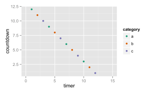
Demonstration of the key concepts in the grammar of graphics: data, geometries, aesthetic mappings and scale mappings.

Demonstration of the key concepts in the grammar of graphics: data, geometries, aesthetic mappings and scale mappings.

Here you can see that the data is passed to ggplot(), aesthetic mappings between the data and the plot coordinates, a geometry to represent the data and a couple of scales to map between the data range and the plot ranges.

More advanced parts of the ggplot2 grammar

The above will get you a basic graph, but ggplot2 includes a few more parts of the grammar that you’ll want to be aware of as you try to visualize more complex data:

5. Statistical transformations stat_ Statistical summaries of the data that can be plotted, such as quantiles, fitted curves (loess, linear models, etc.), sums and so o.
6. Coordinate systems coord_ The transformation used for mapping data coordinates into the plane of the data rectangle.
7. Facets facet_ The arrangement of the data into a grid of plots (also known as latticing, trellising or creating small multiples).
8. Visual Themes theme The overall visual defaults of a plot: background, grids, axe, default typeface, sizes, colors, etc.

Hadley Wickham describes various pieces of this grammar in recorded presentations on Vimeo and YouTube and the online documentation to ggplot2. The most complete explanation is in his book ggplot2: Elegant Graphics for Data Analysis (Use R!) (Wickham, 2009).

References

Wickham, Hadley. ggplot2: Elegant Graphics for Data Analysis. Dordrecht, Heibelberg, London, New York: Springer, 2009. Print.
Wickham, Hadley. A Backstage Tour of ggplot2 with Hadley Wickham. 2012. Video. YouTube. Web. 21 Mar 2014. . Contributed by REvolutionAnalytics.

Graphing Highly Skewed Data

Recently Chandoo.org posted a question about how to graph data when you have a lot of small values and a few larger values. It’s not the first time that I’ve come across this question, and I’ve seen a lot of answers, many of them really bad. While all solutions involve trade-offs for understanding and interpreting graphs, some solutions are better than others.

Data graphs tell stories by revealing patterns in complex data. Good data graphs let the data tell the story by revealing the patterns, rather than trying to impose patterns on the data.

As William Cleveland discusses in The Elements of Graphing Data and his 1993 paper A Model for Studying Display Methods of Statistical Graphics, there are two basic visual operations that people employ when looking at and interpreting graphs: pattern perception and table look-up. Pattern perception is where we see the geometric patterns in a graph: groupings; relative differences (larger/smaller); or trends (straight/curved or increasing/decreasing). Table look-up is where we explore details of values and names on a graph. These two operations are distinct and complimentary, and it is through these two operations that the data’s story is told.

month sales
1 Feb 09 200
2 Mar 09 300
3 Apr 09 200
4 May 09 300
5 Jun 09 200
6 Jul 09 300
7 Aug 09 350
8 Sep 09 400
9 Oct 09 450
10 Nov 09 1200
11 Dec 09 100000
12 Jan 10 85000
13 Feb 10 450

So suppose that we have some data like that at right, where we are interested in the patterns of smaller, individual values, but there are also a few extremely large values, or outliers. We describe such data as being skewed. How do we plot this data? First, for such a small data set, a simple table is the best approach. People can see the numbers and interpret them, there aren’t too many numbers to make sense of and the table is very compact. For more complicated data sets, though, a graph is needed. There’s a few basic options:

  • Graph as-is;
  • Graph with a second axis;
  • Graph the logarithm of the data;
  • Use a scale break.
  • Plot the data multiple times.

Graph As-Is

Bar chart with all data plotted

A bar chart with all data, including outliers, plotted on the same scale.

This is the simplest solution, and if you’re only interested in knowing about the outliers (Dec ’09 and Jan ’10) then it will do. However, it completely hides whatever is happening in the rest of the months. Pattern recognition tells us that two months near the end of the series have the big numbers. Table-lookup tells us the approximate values and that these months are around December ’09 and February ’10, but the way the labels string together and overlap the tick marks, it’s not clear exactly what the labels are, let alone which label applies to which bar (which months are those, precisely? Is that “09 Dec” and “09 Feb?” Do the numbers even go with the text, or are they separate labels?).

For all but the simplest of messages, this rendition defeats both pattern recognition and table look-up. We definitely need a better solution.

Use a Secondary Axis

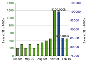
Excel gives us an easy solution: break the data into two columns (“small” numbers in one and “large” numbers in the other) and plot them on separate axes. Now we can see all the data, including the patterns in all the months.
Bar Chart with Outliers on Secondary Axis

Bar chart, with outliers plotted using a secondary axis.

Unfortunately, pattern recognition tells us that the big-sales months are about the same as all the other months. It’s only the table look-up that tells us how big of a difference there is between the two blue columns and the rest of the data. This is why I’ve added data labels to the two columns: to aid table look-up.

Even if we tweaked around with the axes to set the outliers off from the rest of the data, we’d still have the same basic problem: pattern recognition would tell us that there is a much smaller difference than there actually is. By using a secondary axis, we’ve set up a basic conflict between pattern recognition and table look-up. Worse, it’s easy to confuse the axes; which bars go with which axis? Reproduction in black and white or grayscale would make it impossible to correctly connect bars to the correct axis. Some types of color blindness would similarly make it difficult to interpret the graph. Table look-up is easily defeated with secondary axes.

The secondary axis presents so many problems that I always advise against using it. Stephen Few, author of Show Me The Numbers and Information Dashboard Design, calls graphs with secondary axes “dual-scaled graphs.” In his 2008 article Dual-Scaled Axes in Graphs, he concludes that there is always a better way to display data than by using secondary axes. Excel makes it easy to create graphs like this, but it’s always a bad idea.

Take the Logarithm

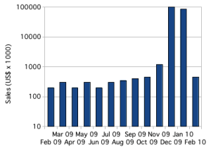
In scientific applications, skewed data is common, and the usual solution is to plot the logarithm of the values.
Bar Chart with Logarithmic Axis

Bar chart plotting skewed with logarithmic axis.

With the logarithm, it is easy to plot, and see, all of the data. Trends in small values are not hidden. Pattern perception immediately tells us the overall story of the data. Table look-up is easier than with secondary axes, and immediately tells us the scale of the differences. Plotting the logarithm allows pattern perception and table look-up to compliment each other.

Below, I’ve created the same graph using a dot plot instead of a bar chart. Dot plots have many advantages over bar charts: most obviously, dot plots provide a better arrangement for category labels (e.g. the months); also, dot plots provide a clearer view of the data by plotting the data points rather than filling in the space between the axis and the data point. There are some nice introductions to dot plots, including William Cleveland’s works and a short introduction by Naomi Robbins. The message is clear: any data that you might present with a bar chart (or pie chart) will be better presented using dot plots.
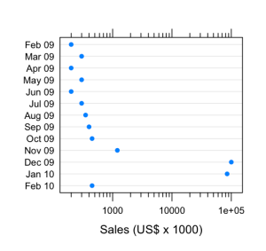
Dot plot with logarithmic scale

Skewed data plotted on a dot plot using a logarithmic scale.

Use a Scale Break

Another approach, which might be better for audiences unfamiliar with logarithmic scales, is to use a scale break, or broken axis. With some work, we can create a scale break in Excel or OpenOffice.org.
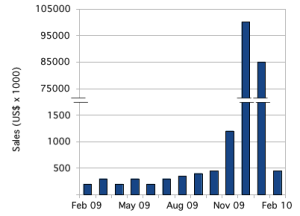
Bar chart with a subtle scale break on the Y axis.

Bar chart with outliers plotted by introducing a subtle scale break on the y-axis.

There are plenty of tutorials for how to accomplish this in Excel. For this example, I created the graph in OpenOffice.org Spreadsheet, using the same graph with the secondary axis, above. I adjusted the two scales, turned off the labels for both y-axes and turned off the tick marks for the secondary y-axis. Then I copied the graph over to the OpenOffice.org Draw application and added y-axis labels and the break marks as drawing objects.

That pretty much highlights the first problem with this approach: it takes a lot of work. The second problem is that those break marks are just too subtle; people will miss them.

The bigger problem is with interpretation. As with the secondary axis, this subtle scale break sets up a basic conflict between the two basic operations of graph interpretation. Pattern recognition tells us that the numbers are comparable; it’s only table look-up that tells us what a large difference there is.

Cleveland’s recommendation, when the logarithm won’t work, is to use a full-panel scale break. In this way, pattern recognition tells that there are two distinct groups of data, and table look-up tells us what they are.
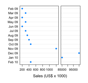
Dot plot with full scale break

Dot plot with a full scale break to show outliers.

The potential disadvantage of this approach is that pattern perception might be fooled. While the scale break visually groups the “large” values from the “small” ones, the scale also changes, so that the broader panel on the left actually represents a much narrower range of values (about 1100 dollars range) than the narrower panel on the right (about 17000 dollars range). Our audience might have difficulties interpreting this correctly.

Small Multiples

Edward Tufte has popularized the idea of small multiples, the emphasis of differences by repeating a graph or image with small changes from one frame to the next. In this case, we could show the full data set, losing fidelity in the smaller values, and then repeat the graph while progressively zooming in on a narrower and narrower slice with each repetition.
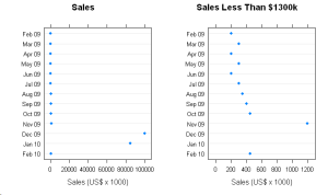
Dot Plot showing full data (including outliers) side-by-side with zoomed view.

The full data, with outliers, is plotted on the left. On the right, a zoomed view showing detail in the smaller values.

This shares many similarities to Cleveland’s full scale break, but provides greater flexibility. With this data, there are two natural ranges: 0 – 100000 and 0 – 1200. If there were more data between 1200 and 85000, we might repeat the graph several times, zooming in more with each repetition to show lower levels of detail.

I think there are two potential pitfalls. As with the full scale break, the audience might fail to appreciate the effect of the changes to scale. Worse, the audience might be fooled into thinking that each graph represented a different set of data, rather than just a different slice of the same data. Some care  in preparing such graphs will be needed for successful communication.

Summary

When presenting data that is, like the data above, arranged by category, use a dot plot instead of bar charts. When your data is heavily skewed, the best solution is to graph the logarithm of the data. However, if your audience will be unable to correctly interpret the logarithm, try a full scale break or small multiples.