Understanding Data

When analyzing data, I have often found it useful to think of the data as being one of four main types, according to the typology proposed by Stevens.[1] Different types of data have certain characteristics; understanding what type of data you have helps with selecting the analysis to perform perform while preventing basic mistakes.

The types, or “scales of measurement,” are:

Nominal
Data identifying unique classifications or objects where the order of values is not meaningful. Examples include zip codes, gender, nationality, sports teams and multiple choice answers on a test.
Ordinal
Data where the order is important but the difference or distance between items is not important or not measured. Examples include team rankings in sport (team A is better than team B, but how much better is open to debate), scales such as health (e.g. “healthy” to “sick”), ranges of opinion (e.g. “strongly agree” to “strongly disagree” or “on a scale of 1 to 10”) and Intelligence Quotient.
Interval
Numeric data identified by values where the degree of difference between items is significant and meaningful, but their ratio is not. Common examples are dates—we can say 2000 CE is 1000CE + 1000 years, but 1000 CE is not half of 2000 CE in any meaningful way—and temperatures on the Celsius and Fahrenheit scales, where a difference of 10° is meaningful, but 10° is not twice as hot as 5°.
Ratio
Numeric data where the ratio between numbers is meaningful. Usually, such scales have a meaningful “0.” Examples include length, mass, velocity, acceleration, voltage, power, duration, energy and Kelvin-scale temperature.

The generally-appropriate statistics and mathematical operations for each type are summarized in table 1.

Table 1: Scales of measurement and allowed statistical and mathematical operations.
Scale Type Statistics Operations
Nominal mode, frequency, chi-squared, cluster analysis =, ≠
Ordinal above, plus: median, non-parametric tests, Kruskal-Wallis, rank-correlation =, ≠, >, <
Interval plus: arithmetic mean, some parametric tests, correlation, regression, ANOVA (sometimes), factor analysis =, ≠, >, <, +, –
Ratio plus: geometric and harmonic mean, ANOVA, regression, correlation coefficient =, ≠, >, <, +, -, ×, ÷

While this is a useful typology for most use, and certainly for initial consideration, there are valid criticisms of Stevens’ typology. For example, percentages and count data have some characteristics of ratio-scale data, but with additional constraints. e.g. the average of the counts \overline{(2, 2, 1)} = 1.66\ldots may not be meaningful. This typology is a useful thinking tool, but it is essential to understand the statistical methods being applied and their sensitivity to departures from underlying assumptions.

Types of data in R

R[2] recognizes at least fifteen different types of data. Several of these are related to identifying functions and other objects—most users don’t need to worry about most of them. The main types that industrial engineers and scientists will need to use are:

numeric
Real numbers. Also known as double, real and single (note that R stores all real numbers in double-precision). May be used for all scales of measurement, but is particularly suited to ratio scale measurements.
complex
Imaginary real numbers can be manipulated directly as a data type using

x <- 1 + i2

or

x <- complex(real=1, imaginary=2)

Like type numeric, may be used for all scales of measurement.

integer
Stores integers only, without any decimal point. Can be used mainly for ordinal or interval data, but may be used as ratio data—such as counts—with some caution.
logical
Stores Boolean values of TRUE or FALSE, typically used as nominal data.
character
Stores text strings and can be used as nominal or ordinal data.

Types of variables in R

The above types of data can be stored in several types, or structures, of variables. The equivalent to a variable in Excel would be rows, columns or tables of data. The main ones that we will use are:

vector
Contains one or many elements, and behaves like a column or row of data. Vectors can contain any of the above types of data but each vector is stored, or encoded, as a single type. The vector

c(1, 2, 1, 3, 4)
## [1] 1 2 1 3 4

is, by default, a numeric vector of type double, but

c(1, 2, 1, 3, 4, "name")
## [1] "1" "2" "1" "3" "4" "name"

will be a character vector, or a vector where all data is stored as type character, and the numbers will be stored as characters rather than numbers. It will not be possible to perform mathematical operations on these numbers-stored-as-characters without first converting them to type numeric.

factor
A special type of character vector, where the text strings signify factor levels and are encoded internally as integer counts of the occurrence of each factor. Factors can be treated as nominal data when the order does not matter, or as ordinal data when the order does matter.
factor(c("a", "b", "c", "a"), levels=c("a","b","c","d"))
## [1] a b c a  
## Levels: a b c d
array
A generalization of vectors from one dimension to two or more dimensions. Array dimensions must be pre-defined and can have any number of dimensions. Like vectors, all elements of an array must be of the same data type. (Note that the letters object used in the example below is a variable supplied by R that contains the letters a through z.)

# letters a - c in 2x4 array 
array(data=letters[1:3], dim=c(2,4))
##      [,1] [,2] [,3] [,4]  
## [1,] "a"  "c"  "b"  "a"  
## [2,] "b"  "a"  "c"  "b"

# numbers 1 - 3 in 2x4 array 
array(data=1:3, dim=c(2,4))
##      [,1] [,2] [,3] [,4]  
## [1,]    1    3    2    1  
## [2,]    2    1    3    2
matrix
A special type of array with the properties of a mathematical matrix. It may only be two-dimensional, having rows and columns, where all columns must have the same type of data and every column must have the same number of rows. R provides several functions specific to manipulating matrices, such as taking the transpose, performing matrix multiplication and calculation eigenvectors and eigenvalues.

matrix(data = rep(1:3, times=2), nrow=2, ncol=3)
##      [,1] [,2] [,3]  
## [1,]    1    3    2  
## [2,]    2    1    3
list
Vectors whose elements are other R objects, where each object of the list can be of a different data type, and each object can be of different length and dimension than the other objects. Lists can therefore store all other data types, including other lists.

list("text", "more", 2, c(1,2,3,2))
## [[1]]  
## [1] "text"  
##  
## [[2]]  
## [1] "more"  
##  
## [[3]]  
## [1] 2  
##  
## [[4]]  
## [1] 1 2 3 2
data.frame
For most industrial and data scientists, data frames are the most widely useful type of variable. A data.frame is the list analog to the matrix: it is an m \times n list where all columns must be vectors of the same number of rows (determined with NROW()). However, unlike matrices, different columns can contain different types of data and each row and column must have a name. If not named explicitly, R names rows by their row number and columns according to the data assigned assigned to the column. Data frames are typically used to store the sort of data that industrial engineers and scientists most often work with, and is the closest analog in R to an Excel spreadsheet. Usually data frames are made up of one or more columns of factors and one or more columns of numeric data.

data.frame(rnorm(5), rnorm(5), rnorm(5))
##     rnorm.5.  rnorm.5..1  rnorm.5..2  
## 1  0.2939566  1.28985202 -0.01669957  
## 2  0.3672161 -0.01663912 -1.02064116  
## 3  1.0871615  1.13855476  0.78573775  
## 4 -0.8501263 -0.17928722  1.03848796  
## 5 -1.6409403 -0.34025455 -0.62113545

More generally, in R all variables are objects, and R distinguishes between objects by their internal storage type and by their class declaration, which are accessible via the typeof() and class() functions. Functions in R are also objects, and the users can define new objects to control the output from functions like summary() and print(). For more on objects, types and classes, see section 2 of the R Language Definition.

Table 2 summarizes the internal storage and R classes of the main data and variable types.

Table 2: Table of R data and variable types.
Variable type Storage type Class Measurement Scale
vector of decimals double numeric ratio
vector of integers integer integer ratio or interval
vector of complex complex complex ratio
vector of characters character character nominal
factor vector integer factor nominal or ordinal
matrix of decimals double matrix ratio
data frame list data.frame mixed
list list list mixed

References

  1. Stevens, S. S. “On the Theory of Scales of Measurement.” Science. 103.2684 (1946): 677-680. Print.
  2. R Core Team (2017). R: A language and environment for statistical computing. R Foundation for Statistical Computing, Vienna, Austria. URL https://www.R-project.org/.
Aside

Update to plot.qcc using ggplot2 and grid

Two years ago, I blogged about my experience rewriting the plot.qcc() function in the qcc package to use ggplot2 and grid. My goal was to allow manipulation of qcc’s quality control plots using grid graphics, especially to combine range charts with their associated individuals or moving range charts, as these two diagnostic tools should be used together. At the time, I posted the code on my GitHub.

I recently discovered that the update to ggplot2 v2.0 broke my code, so that attempting to generate a qcc plot would throw an obscure error from someplace deep in ggplot2. The fix turned out to be pretty easy. The original code used aes_string() instead of aes() because of a barely-documented problem of calling aes() inside a function. It looks like this has been quietly corrected with ggplot2 2.0, and aes_string() is no longer needed for this.

The updated code is up on GitHub. As before, load the qcc library, then source() qcc.plot.R. For the rest of the current session, calls to qcc() will automatically use the new plot.qcc() function.

Explorable, multi-tabbed reports in R and Shiny

Matt Parker recently showed us how to create multi-tab reports with R and jQuery UI. His example was absurdly easy to reproduce; it was a great blog post.

I have been teaching myself Shiny in fits and starts, and I decided to attempt to reproduce Matt’s jQuery UI example in Shiny. You can play with the app on shinyapps.io, and the complete project is up on Github. The rest of this post walks through how I built the Shiny app.

plot_all_states

It’s a demo

The result demonstrates a few Shiny and ggplot2 techniques that will be useful in other projects, including:

  • Creating tabbed reports in Shiny, with different interactive controls or widgets associated with each tab;
  • Combining different ggplot2 scale changes in a single legend;
  • Sorting a data frame so that categorical labels in a legend are ordered to match the position of numerical data on a plot;
  • Borrowing from Matt’s work,
    • Summarizing and plotting data using dplyr and ggplot2;
    • Limiting display of categories in a graph legend to the top n (selectable by the user), with remaining values listed as “other;”
    • Coloring only the top n categories on a graph, and making all other categories gray;
    • Changing line weight for the top n categories on a graph, and making;

Obtaining the data

As with Matt’s original report, the data can be downloaded from the CDC WONDER database by selecting “Data Request” under “current cases.”

To get the same data that I’ve used, group results by “state” and by “year,” check “incidence rate per 100,000” and, near the bottom, “export results.” Uncheck “show totals,” then submit the request. This will download a .txt tab-delimited data file, which in this app I read in using read_tsv() from the readr package.

Looking at Matt’s example, his “top 5” states look suspiciously like the most populous states. He’s used total count of cases, which will be biased toward more populous states and doesn’t tell us anything interesting. When examining occurrences—whether disease, crime or defects—we have to look at the rates rather than total counts; we can only make meaningful comparisons and make useful decisions from an examination of the rates.

Setup

As always, we need to load our libraries into R. For this example, I use readr, dplyr, ggplot2 and RColorBrewer.

The UI

The app generates three graphs: a national total, that calculates national rates from the state values; a combined state graph that highlights the top n states, where the user chooses n; and a graph that displays individual state data, where the user can select the state to view. Each goes on its own tab.

ui.R contains the code to create a tabset panel with three tab panels.

tabsetPanel(
  tabPanel("National", fluidRow(plotOutput("nationPlot"))),
  tabPanel("By State",
           fluidRow(plotOutput("statePlot"),
                    wellPanel(
                      sliderInput(inputId = "nlabels",
                                  label = "Top n States:",
                                  min = 1,
                                  max = 10,
                                  value = 6,
                                  step = 1)
                    )
           )
  ),
  tabPanel("State Lookup",
           fluidRow(plotOutput("iStatePlot"),
                    wellPanel(
                      htmlOutput("selectState"))
           )
  )
)

Each panel contains a fluidRow element to ensure consistent alignment of graphs across tabs, and on tabs where I want both a graph and controls, fluidRow() is used to add the controls below the graph. The controls are placed inside a wellPanel() so that they are visually distinct from the graph.

Because I wanted to populate a selection menu (selectInput()) from the data frame, I created the selection menu in server.R and then displayed it in the third tab panel set using the htmlOutput() function.

The graphs

The first two graphs are very similar to Matt’s example. For the national rates, the only change is the use of rates rather than counts.

df_tb <- read_tsv("../data/OTIS 2013 TB Data.txt", n_max = 1069, col_types = "-ciiii?di")

df_tb %>%
  group_by(Year) %>%
  summarise(n_cases = sum(Count), pop = sum(Population), us_rate = (n_cases / pop * 100000)) %>%
  ggplot(aes(x = Year, y = us_rate)) +
  geom_line() +
  labs(x = "Year Reported",
       y = "TB Cases per 100,000 residents",
       title = "Reported Active Tuberculosis Cases in the U.S.") +
  theme_minimal()

The main trick, here, is the use of dplyr to summarize the data across states. Since we can’t just sum or average rates to get the combined rate, we have to sum all of the state counts and populations for each year, and add another column for the calculated national rate.

To create a graph that highlights the top n states, we generate a data frame with one variable, State, that contains the top n states. This is, again, almost a direct copy of Matt’s code with changes to make the graph interactive within Shiny. This code goes inside of the shinyServer() block so that it will update when the user selects a different value for n. Instead of hard-coding n, there’s a Shiny input slider named nlabels. With a list of the top n states ordered by rate of TB cases, df_tb is updated with a new field containing the top n state names and “Other” for all other states.

top_states <- df_tb %>%
      filter(Year == 2013) %>%
      arrange(desc(Rate)) %>%
      slice(1:input$nlabels) %>%
      select(State)

df_tb$top_state <- factor(df_tb$State, levels = c(top_states$State, "Other"))
df_tb$top_state[is.na(df_tb$top_state)] <- "Other"

The plot is generated from the newly-organized data frame. Where Matt’s example has separate legends for line weight (size) and color, I’ve had ggplot2 combine these into a single legend by passing the same value to the “guide =” argument in the scale_XXX_manual() calls. The colors and line sizes also have to be updated dynamically for the selected n.

    df_tb %>%
      ggplot() +
      labs(x = "Year reported",
           y = "TB Cases per 100,000 residents",
           title = "Reported Active Tuberculosis Cases in the U.S.") +
      theme_minimal() +
      geom_line(aes(x = Year, y = Rate, group = State, colour = top_state, size = top_state)) +
      scale_colour_manual(values = c(brewer.pal(n = input$nlabels, "Paired"), "grey"), guide = guide_legend(title = "State")) +
      scale_size_manual(values = c(rep(1,input$nlabels), 0.5), guide = guide_legend(title = "State"))
  })

})

The last graph is nearly a copy of the national totals graph, except that it is filtered for the state selected in the drop-down menu control. The menu is as selectInput() control.

renderUI({
    selectInput(inputId = "state", label = "Which state?", choices = unique(df_tb$State), selected = "Alabama", multiple = FALSE)
  })

With a state selected, the data is filtered by the selected state and TB rates are plotted.

df_tb %>%
  filter(State == input$state) %>%
  ggplot() +
  labs(x = "Year reported",
       y = "TB Cases per 100,000 residents",
       title = "Reported Active Tuberculosis Cases in the U.S.") +
  theme_minimal() +
  geom_line(aes(x = Year, y = Rate))

Wrap up

I want to thank Matt Parker for his original example. It was well-written, clear and easy to reproduce.

The Most Useful Data Plot You’ve Never Used

Those of us working in industry with Excel are familiar with scatter plots, line graphs, bar charts, pie charts and maybe a couple of other graph types. Some of us have occasionally used the Analysis Pack to create histograms that don’t update when our data changes (though there is a way to make dynamic histograms in Excel; perhaps I’ll cover this in another blog post).

One of the most important steps in data analysis is to just look at the data. What does the data look like? When we have time-dependent data, we can lay it out as a time-series or, better still, as a control chart (a.k.a. “natural process behavior chart”). Sometimes we just want to see how the data looks as a group. Maybe we want to look at the product weight or the cycle time across production shifts.

Unless you have Minitab, R or another good data analysis tool at your disposal, you have probably never used—maybe never heard of—boxplots. That’s unfortunate, because boxplots should be one of the “go-to” tools in your data analysis tool belt. It’s a real oversight that Excel doesn’t provide a good way to create them.

For the purpose of demonstration, let’s start with creating some randomly generated data:

head(df)
##   variable   value
## 1   group1 -1.5609
## 2   group1 -0.3708
## 3   group1  1.4242
## 4   group1  1.3375
## 5   group1  0.3007
## 6   group1  1.9717
tail(df)
##     variable   value
## 395   group1  1.4591
## 396   group1 -1.5895
## 397   group1 -0.4692
## 398   group1  0.1450
## 399   group1 -0.3332
## 400   group1 -2.3644

If we don’t have much data, we can just plot the points:

library(ggplot2)

ggplot(data = df[1:10,]) +
  geom_point(aes(x = variable, y = value)) +
  coord_flip() +
  theme_bw()

Points plot with few data

But if we have lots of data, it becomes hard to see the distribution due to overplotting:

ggplot(data = df) +
  geom_point(aes(x = variable, y = value)) +
  coord_flip() +
  theme_bw()

Points plot with many data

We can try to fix this by changing some parameters, like adding semi-transparency (alpha blending) and using an open plot symbol, but for the most part this just makes the data points harder to see; the distribution is largely lost:

ggplot(data = df) +
  geom_point(aes(x = variable, y = value), alpha = 0.3, shape = 1) +
  coord_flip() +
  theme_bw()

Points plot with many data using alpha blending

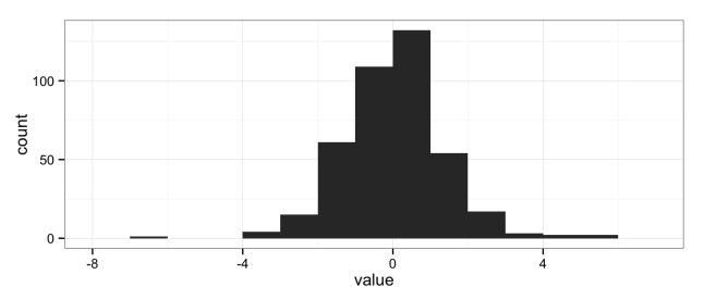
The natural solution is to use histograms, another “go-to” data analysis tool that Excel doesn’t provide in a convenient way:

ggplot(data = df) +
  geom_histogram(aes(x = value), binwidth = 1) +
  theme_bw()

histogram

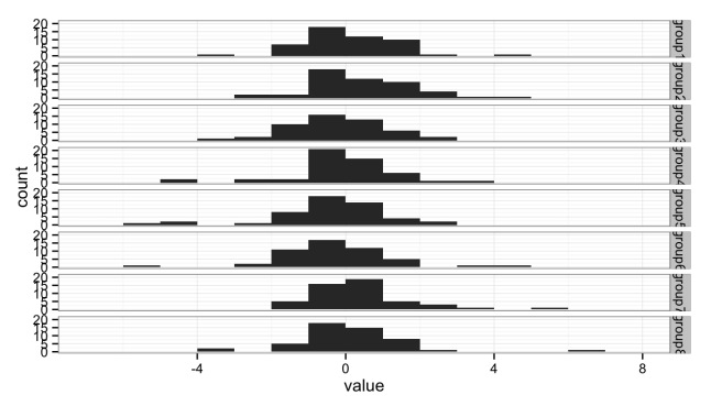
But histograms don’t scale well when you want to compare multiple groups; the histograms get too short (or too narrow) to really provide useful information. Here I’ve broken the data into eight groups:

head(df)
##   variable   value
## 1   group1 -1.5609
## 2   group1 -0.3708
## 3   group1  1.4242
## 4   group1  1.3375
## 5   group1  0.3007
## 6   group1  1.9717
tail(df)
##     variable   value
## 395   group8 -0.6384
## 396   group8 -3.0245
## 397   group8  1.5866
## 398   group8  1.9747
## 399   group8  0.2377
## 400   group8 -0.3468
ggplot(data = df) +
  geom_histogram(aes(x = value), binwidth = 1) +
  facet_grid(variable ~ .) +
  theme_bw()

Stacked histograms

Either the histograms need to be taller, making the stack too tall to fit on a page, or we need a better solution.

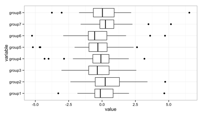
The solution is the box plot:

ggplot() +
  geom_boxplot(data = df, aes(y = value, x = variable)) +
  coord_flip() +
  theme_bw()

Stacked boxplots

The boxplot provides a nice, compact representation of the distribution of a set of data, and makes it easy to compare across a large number of groups.

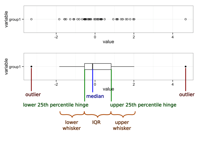
There’s a lot of information packed into that graph, so let’s unpack it:

Boxplot with markup

Median
A measure of the central tendency of the data that is a little more robust than the mean (or arithmetic average). Half (50%) of the data falls below this mark. The other half falls above it.
First quartile (25th percentile) hinge
Twenty-five percent (25%) of the data falls below this mark.
Third quartile (75th percentile) hinge
Seventy-five percent (75%) of the data falls below this mark.
Inter-Quartile Range (IQR)
The middle half (50%) of the data falls within this band, drawn between the 25th percentile and 75th percentile hinges.
Lower whisker
The lower whisker connects the first quartile hinge to the lowest data point within 1.5 * IQR of the hinge.
Upper whisker
The upper whisker connects the third quartile hinge to the highest data point within 1.5 * IQR of the hinge.
Outliers
Any data points below 1.5 * IQR of the first quartile hinge, or above 1.5 * IQR of the third quartile hinge, are marked individually as outliers.

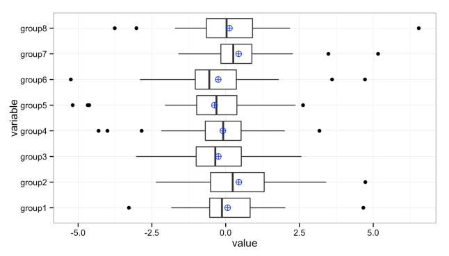
We can add additional values to these plots. For instance, it’s sometimes useful to add the mean (average) when the distributions are heavily skewed:

ggplot(data = df, aes(y = value, x = variable)) +
  geom_boxplot() +
  stat_summary(fun.y = mean, geom="point", shape = 10, size = 3, colour = "blue") +
  coord_flip() +
  theme_bw()

Stacked box plots with means

Graphs created in the R programming language using the ggplot2 and gridExtra packages.

References

  1. R Core Team (2014). R: A language and environment for statistical computing. R Foundation for Statistical
    Computing, Vienna, Austria. URL http://www.R-project.org/.
  2. H. Wickham. ggplot2: elegant graphics for data analysis. Springer New York, 2009.
  3. Baptiste Auguie (2012). gridExtra: functions in Grid graphics. R package version 0.9.1.
    http://CRAN.R-project.org/package=gridExtra

Can We do Better than R-squared?

If you're anything like me, you've used Excel to plot data, then used the built-in “add fitted line” feature to overlay a fitted line to show the trend, and displayed the “goodness of fit,” the r-squared (R2) value, on the chart by checking the provided box in the chart dialog.

The R2 calculated in Excel is often used as a measure of how well a model explains a response variable, so that “R2 = 0.8” is interpreted as “80% of the variation in the 'y' variable is explained by my model.” I think that the ease with which the R2 value can be calculated and added to a plot is one of the reasons for its popularity.

There's a hidden trap, though. R2 will increase as you add terms to a model, even if those terms offer no real explanatory power. By using the R2 that Excel so helpfully provides, we can fool ourselves into believing that a model is better than it is.

Below I'll demonstrate this and show an alternative that can be implemented easily in R.

Some data to work with

First, let's create a simple, random data set, with factors a, b, c and response variable y.

head(my.df)
##       y a       b      c
## 1 2.189 1 -1.2935 -0.126
## 2 3.912 2 -0.4662  1.623
## 3 4.886 3  0.1338  2.865
## 4 5.121 4  1.2945  4.692
## 5 4.917 5  0.1178  5.102
## 6 4.745 6  0.4045  5.936

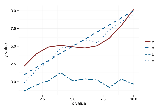
Here is what this data looks like:

Plot of the response and factors in a linear model.

Calculating R-squared

What Excel does when it displays the R2 is create a linear least-squares model, which in R looks something like:

my.lm <- lm(y ~ a + b + c, data = my.df)

Excel also does this when we call RSQ() in a worksheet. In fact, we can do this explicitly in Excel using the Regression analysis option in the Analysis Pack add-on, but I don't know many people who use this, and Excel isn't known for its reliability in producing good output from the Analysis Pack.

In R, we can obtain R2 via the summary() function on a linear model.

summary(my.lm)
## 
## Call:
## lm(formula = y ~ a + b + c, data = my.df)
## 
## Residuals:
##     Min      1Q  Median      3Q     Max 
## -1.2790 -0.6006  0.0473  0.5177  1.5299 
## 
## Coefficients:
##             Estimate Std. Error t value Pr(&gt;|t|)  
## (Intercept)    2.080      0.763    2.72    0.034 *
## a             -0.337      0.776   -0.43    0.679  
## b             -0.489      0.707   -0.69    0.515  
## c              1.038      0.817    1.27    0.250  
## ---
## Signif. codes:  0 '***' 0.001 '**' 0.01 '*' 0.05 '.' 0.1 ' ' 1
## 
## Residual standard error: 1.1 on 6 degrees of freedom
## Multiple R-squared:  0.833,  Adjusted R-squared:  0.75 
## F-statistic:   10 on 3 and 6 DF,  p-value: 0.00948

Since summary() produces a list object as output, we can grab just the R2 value.

summary(my.lm)$r.squared
## [1] 0.8333

Normally, we would (somewhat loosely) interpret this as telling us that about 83% of the variation in the response y is explained by the model.

Notice that there is also an "adjusted r-squared” value given by summary(). This tells us that only 75% of the variation is explained by the model. Which is right?

The problem with R-squared

Models that have many terms will always give higher R2 values, just because more terms will slightly improve the model fit to the given data. The unadjusted R2 is wrong. The calculation for adjusted R2 is intended to partially compensate for that “overfit,” so it's better.

It's nice that R shows us both values, and a pity that Excel won't show the adjusted value. The only way to get an adjusted R2 in Excel is to run the Regression analysis; otherwise, we have to calculate adjusted R2 manually.

Both R2 and adjusted R2 are measures of how well the model explains the given data. However, in industry we usually want to know something a little different. We don't build regression models to explain only the data we have; we build them to think about future results. We want R2 to tell us how well the model predicts the future. That is, we want a predictive R2. Minitab has added the ability to calculate predictive R2 in Minitab 17, and has a nice blog post explaining this statistic.

Calcuting predictive R-squared

Neither R nor Excel provide a means of calculating the predictive R2 within the default functions. While some free R add-on packages provide this ability (DAAG, at least), we can easily do it ourselves. We'll need a linear model, created with lm(), for the residuals so we can calculate the “PRESS” statistic, and then we need the sum of squares of the terms so we can calculate a predictive R2.

Since the predictive R2 depends entirely on the PRESS statistic, we could skip the added work of calculating predictive R2 and just use PRESS, as some authors advocate. The lower the PRESS, the better the model is at fitting future data from the same process, so we can use PRESS to compare different models. Personally, I'm used to thinking in terms of R2, and I like having the ability to compare to the old R2 statistic that I'm familiar with.

To calculate PRESS, first we calculate the predictive residuals, then take the sum of squares (thanks to (Walker’s helpful blog post) for this). This is pretty easy if we already have a linear model. It would take a little more work in Excel.

pr <- residuals(my.lm)/(1 - lm.influence(my.lm)$hat)
PRESS <- sum(pr^2)
PRESS
## [1] 19.9

The predictive R2 is then (from a helpful comment by Ibanescu on LikedIn) the PRESS divided by the total sum of squares, subtracted from one. The total sum of squares can be calculated directly as the sum of the squared residuals, or obtained by summing over Sum Sq from an anova() on our linear model. I prefer using the anova function, as any statistical subtleties are more likely to be properly accounted for there than in my simple code.

# anova to calculate residual sum of squares
my.anova <- anova(my.lm)
tss <- sum(my.anova$"Sum Sq")
# predictive R^2
pred.r.squared <- 1 - PRESS/(tss)
pred.r.squared
## [1] 0.5401

You'll notice that this is smaller than the residual R2, which is itself smaller than the basic R2. This is the point of the exercise. We don't want to fool ourselves into thinking we have a better model than we actually do. One way to think of this is that 29% (83% – 54%) of the model is explained by too many factors and random correlations, which we would have attributed to our model if we were just using Excel's built-in function.

When the model is good and has few terms, the differences are small. For example, working through the examples in Mitsa's two posts, we see that for her model 3, R2 = 0.96 and the predictive R2 = 0.94, so calculating the predictive R2 wasn't really worth the extra effort for that model. Unfortunately, we can't know, in advance, which models are “good.” For Mitsa's model 1 we have R2 = 0.95 and predictive R2 = 0.32. Even the adjusted R2 looks pretty good for model 1, at 0.94, but we see from the predictive R2 that our model is not very useful. This is the sort of thing we need to know to make correct decisions.

Automating

In R, we can easily wrap these in functions that we can source() and call directly, reducing the typing. Just create a linear model with lm() (or an equivalent) and pass that to either function. Note that pred_r_squared() calls PRESS(), so both functions have to be sourced.

pred_r_squared <- function(linear.model) {
    lm.anova <- anova(linear.model)
    tss <- sum(lm.anova$"Sum Sq")
    # predictive R^2
    pred.r.squared <- 1 - PRESS(linear.model)/(tss)
    return(pred.r.squared)
}
PRESS <- function(linear.model) {
    pr <- residuals(linear.model)/(1 - lm.influence(linear.model)$hat)
    PRESS <- sum(pr^2)
    return(PRESS)
}

Then we just call the function to get the result:

pred.r.squared <- pred_r_squared(my.lm)
pred.r.squared
## [1] 0.5401

I've posted these as Gists on GitHub, with extra comments, so you can copy and paste from here or go branch or copy them there.

References and further reading

A Simple Introduction to the Graphing Philosophy of ggplot2

“The emphasis in ggplot2 is reducing the amount of thinking time by making it easier to go from the plot in your brain to the plot on the page.” (Wickham, 2012)

“Base graphics are good for drawing pictures; ggplot2 graphics are good for understanding the data.” (Wickham, 2012)

I’m not ggplot2’s creator, Hadley Wickham, but I do find myself in discussions trying to explain how to build graphs in ggplot2. It’s a very elegant system, but also very different from other graphing systems. Once you understand the organizing philosophy, ggplot2 becomes very easy to work with.

The grammar of ggplot2 graphics

There is a basic grammar to all graphics production. In R‘s base graphics or in Excel, you feed ranges of data to a plot as x and y elements, then manipulate colors, scale dimensions and other parts of the graph as graphical elements or options.

ggplot2’s grammar makes a clear distinction between your data and what gets displayed on the screen or page. You feed ggplot2 your data, then apply a series of mappings and transformations to create a visual representation of that data. Even with base graphics or Excel we never really plot the data itself, we only create a representation; ggplot2 makes this distinction explicit. In addition, ggplot2’s structure makes it very easy to tweak a graph to look the way you want by adding mappings.

A ggplot2 graph is built up from a few basic elements:

1. Data The raw data that you want to plot
2. Geometries geom_ The geometric shapes that will represent the data.
3. Aethetics aes() Aesthetics of the geometric and statistical objects, such as color, size, shape and position.
4. Scales scale_ Maps between the data and the aesthetic dimensions, such as data range to plot width or factor values to colors

Putting it together, the code to build a ggplot2 graph looks something like:

data
+ geometry to represent the data,
+ aesthetic mappings of data to plot coordinates like position, color and size
+ scaling of ranges of the data to ranges of the aesthetics

A real example shows off how this all fits together.

library(ggplot2)
# Create some data for our example
some.data <- data.frame(timer = 1:12, 
                        countdown = 12:1, 
                        category = factor(letters[1:3]))
# Generate the plot
some.plot <- ggplot(data = some.data, aes(x = timer, y = countdown)) +
  geom_point(aes(colour = category)) +
  scale_x_continuous(limits = c(0, 15)) +
  scale_colour_brewer(palette = "Dark2") +
  coord_fixed(ratio=1)
# Display the plot
some.plot
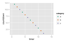
Demonstration of the key concepts in the grammar of graphics: data, geometries, aesthetic mappings and scale mappings.

Demonstration of the key concepts in the grammar of graphics: data, geometries, aesthetic mappings and scale mappings.

Here you can see that the data is passed to ggplot(), aesthetic mappings between the data and the plot coordinates, a geometry to represent the data and a couple of scales to map between the data range and the plot ranges.

More advanced parts of the ggplot2 grammar

The above will get you a basic graph, but ggplot2 includes a few more parts of the grammar that you’ll want to be aware of as you try to visualize more complex data:

5. Statistical transformations stat_ Statistical summaries of the data that can be plotted, such as quantiles, fitted curves (loess, linear models, etc.), sums and so o.
6. Coordinate systems coord_ The transformation used for mapping data coordinates into the plane of the data rectangle.
7. Facets facet_ The arrangement of the data into a grid of plots (also known as latticing, trellising or creating small multiples).
8. Visual Themes theme The overall visual defaults of a plot: background, grids, axe, default typeface, sizes, colors, etc.

Hadley Wickham describes various pieces of this grammar in recorded presentations on Vimeo and YouTube and the online documentation to ggplot2. The most complete explanation is in his book ggplot2: Elegant Graphics for Data Analysis (Use R!) (Wickham, 2009).

References

Wickham, Hadley. ggplot2: Elegant Graphics for Data Analysis. Dordrecht, Heibelberg, London, New York: Springer, 2009. Print.
Wickham, Hadley. A Backstage Tour of ggplot2 with Hadley Wickham. 2012. Video. YouTube. Web. 21 Mar 2014. . Contributed by REvolutionAnalytics.

Normality and Testing for Normality

Many of our statistical tests make assumptions about the distribution of the underlying population. Many of the most common—ImR (XmR) and XbarR control charts, ANOVA, t-tests—assume normal distributions in the underlying population (or normal distributions in the residuals, in the case of ANOVA), and we’re often told that we must carefully check the assumptions.

At the same time, there’s a lot of conflicting advice about how to test for normality. There are the statistical tests for normality, such as Shapiro-Wilk or Anderson-Darling. There’s the “fat pencil” test, where we just eye-ball the distribution and use our best judgement. We could even use control charts, as they’re designed to detect deviations from the expected distribution. We are discouraged from using the “fat pencil” because it will result in a lot of variation from person to person. We’re often told not to rely too heavily on the statistical tests because they are not sensitive with small sample sizes and too sensitive to the tails. In industrial settings, our data is often messy, and the tails are likely to be the least reliable portion of our data.

I’d like to explore what the above objections really look like. I’ll use R to generate some fake data based on the normal distribution and the t distribution, and compare the frequency of p-values obtained from the Shapiro-Wilk test for normality.

A Function to test normality many times

First, we need to load our libraries

library(ggplot2)
library(reshape2)

To make this easy to run, I’ll create a function to perform a large number of normality tests (Shapiro-Wilk) for sample sizes n = 5, 10 and 1000, all drawn from the same data:

#' @name assign_vector
#' @param data A vector of data to perform the t-test on.
#' @param n An integer indicating the number of t-tests to perform. Default is 1000
#' @return A data frame in "tall" format
assign_vector <- function(data, n = 1000) {
  # replicate the call to shapiro.test n times to build up a vector of p-values
  p.5 <- replicate(n=n, expr=shapiro.test(sample(my.data, 5, replace=TRUE))$p.value)
  p.10 <- replicate(n=n, expr=shapiro.test(sample(my.data, 10, replace=TRUE))$p.value)
  p.1000 <- replicate(n=n, expr=shapiro.test(sample(my.data, 1000, replace=TRUE))$p.value)
  #' Combine the data into a data frame, 
  #' one column for each number of samples tested.
  p.df <- cbind(p.5, p.10, p.1000)
  p.df <- as.data.frame(p.df)
  colnames(p.df) <- c("5 samples","10 samples","1000 samples")
  #' Put the data in "tall" format, one column for number of samples
  #' and one column for the p-value.
  p.df.m <- melt(p.df)
  #' Make sure the levels are sorted correctly.
  p.df.m <- transform(p.df.m, variable = factor(variable, levels = c("5 samples","10 samples","1000 samples")))
  return(p.df.m)  
}

Clean, random data

I want to simulate real-word conditions, where we have an underlying population from which we sample a limited number of times. To start, I’ll generate 100000 values from a normal distribution. To keep runtimes low I’ll have assign_vector() sample from that distribution when performing the test for normality.

n.rand <- 100000
n.test <- 10000
my.data <- rnorm(n.rand)
p.df.m <- assign_vector(my.data, n = n.test)

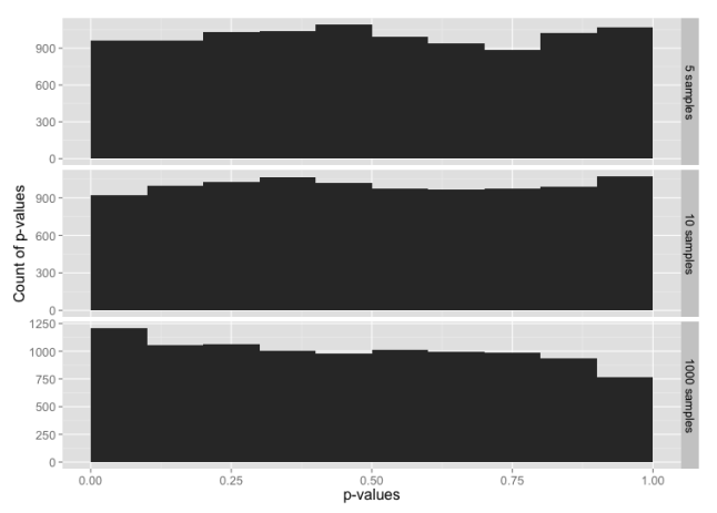
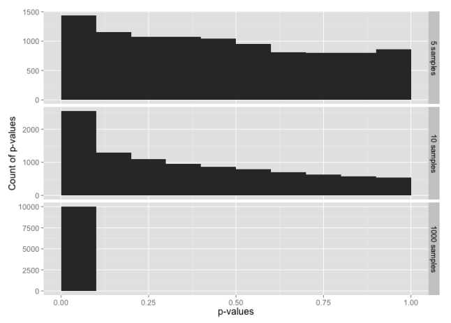
We would expect that normally distributed random data will have an equal probability of any given p-value. i.e. 5% of the time we’ll see p-value ≤ 0.05, 5% of the time we’ll see p-value > 0.05 and ≤ 0.10, and so on through > 0.95 and ≤ 1.00. Let’s graph that and see what we get for each sample size:

ggplot(p.df.m, aes(x = value)) + 
  geom_histogram(binwidth = 1/10) + 
  facet_grid(facets=variable ~ ., scales="free_y") + 
  xlim(0,1) +
  ylab("Count of p-values") +
  xlab("p-values") +
  theme(text = element_text(size = 16))
Histogram of p-values for the normal distribution, for sample sizes 5, 10 and 1000.

Histogram of p-values for the normal distribution, for sample sizes 5, 10 and 1000.

This is, indeed, what we expected.

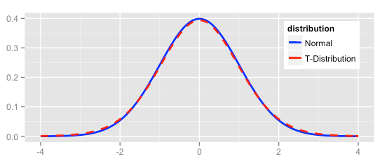
Now let’s compare the normal distribution to a t distribution. The t distribution would pass the “fat pencil” test—it looks normal to the eye:

ggplot(NULL, aes(x=x, colour = distribution)) + 
  stat_function(fun=dnorm, data = data.frame(x = c(-6,6), distribution = factor(1)), size = 1) + 
  stat_function(fun=dt, args = list( df = 20), data = data.frame(x = c(-6,6), distribution = factor(2)), linetype = "dashed", size = 1) + 
  scale_colour_manual(values = c("blue","red"), labels = c("Normal","T-Distribution")) +
  theme(text = element_text(size = 12),
        legend.position = c(0.85, 0.75)) +
  xlim(-4, 4) +
  xlab(NULL) +
  ylab(NULL)

Density plot of normal and t distributions

Starting with random data generated from the t-distribution:

my.data <- rt(n.rand, df = 20)
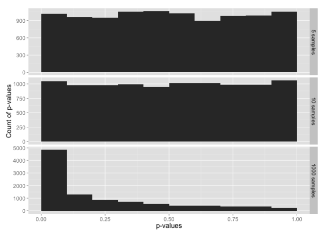
Histogram of p-values for the t distribution, for sample sizes 5, 10 and 1000.

Histogram of p-values for the t distribution, for sample sizes 5, 10 and 1000.

The tests for normality are not very sensitive for small sample sizes, and are much more sensitive for large sample sizes. Even with a sample size of 1000, the data from a t distribution only fails the test for normality about 50% of the time (add up the frequencies for p-value > 0.05 to see this).

Testing the tails

Since the t distribution is narrower in the middle range and has longer tails than the normal distribution, the normality test might be failing because the entire distribution doesn’t look quite normal; we haven’t learned anything specifically about the tails.

To test the tails, we can construct a data set that uses the t distribution for the middle 99% of the data, and the normal distribution for the tails.

my.data <- rt(n.rand, df = 20)
my.data.2 <- rnorm(n.rand)
# Trim off the tails
my.data <- my.data[which(my.data < 3 & my.data > -3)]
# Add in tails from the other distribution
my.data <- c(my.data, my.data.2[which(my.data.2 < -3 | my.data.2 > 3)])
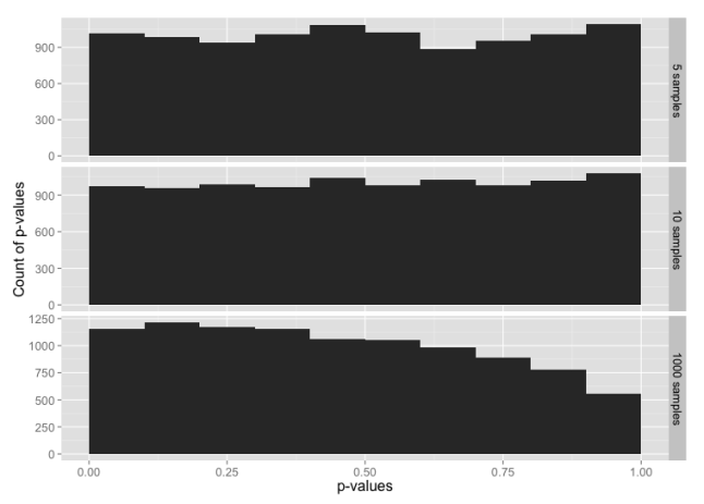
Histogram of p-values for sample sizes 5, 10 and 1000, from a data set constructed from the t distribution in the range -3 to +3 sigmas, with tails from the normal distribution below -3 and above +3.

Histogram of p-values for sample sizes 5, 10 and 1000, from a data set constructed from the t distribution in the range -3 to +3 sigmas, with tails from the normal distribution below -3 and above +3.

Despite 99% of the data being from the t distribution, this is almost identical to our test with data from just the normal distribution. It looks like the tails may be having a larger impact on the normality test than rest of the data

Now let’s flip this around: data that is 99% normally-distributed, but using the t distribution in the extreme tails.

my.data <- rnorm(n.rand)
my.data.2 <- rt(n.rand, df = 20)
# Trim off the tails
my.data <- my.data[which(my.data < 3 & my.data > -3)]
# Add in tails from the other distribution
my.data <- c(my.data, my.data.2[which(my.data.2 < -3 | my.data.2 > 3)])
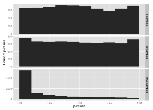
Histogram of p-values for sample sizes 5, 10 and 1000, from a data set constructed from the normal distribution in the range -3 to +3 sigmas, with tails from the t-distribution below -3 and above +3.

Histogram of p-values for sample sizes 5, 10 and 1000, from a data set constructed from the normal distribution in the range -3 to +3 sigmas, with tails from the t-distribution below -3 and above +3.

Here, 99% of the data is from the normal distribution, yet the normality test looks almost the same as the normality test for just the t-distribution. If you check the y-axis scales carefully, you’ll see that the chance of getting p-value ≤ 0.05 is a bit lower here than for the t distribution.

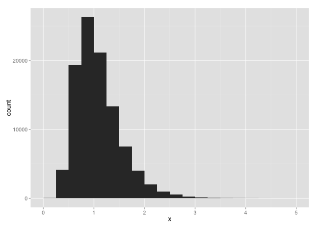
To make the point further, suppose we have highly skewed data:

my.data <- rlnorm(n.rand, 0, 0.4)

This looks like:
Histogram of log-normal data

For small sample sizes, even this is likely to pass a test for normality:
Histogram of p-values for a log-normal distribution

What have we learned?

  • With small sample sizes, everything looks normal.
  • The normality tests are, indeed, very sensitive to what goes on in the extreme tails.

In other words, if we have enough data to fail a normality test, we always will because our real-world data won’t be clean enough. If we don’t have enough data to reliably fail a normality test, then there’s no point in performing the test, and we have to rely on the fat pencil test or our own understanding of the underlying processes.

Don’t get too hung up on whether your data is normally distributed or not. When evaluating and summarizing data, rely mainly on your brain and use the statistics only to catch really big errors in judgement. When attempting to make predictions about future performance, e.g. calculating Cpk or simulating a process, recognize the opportunities for errors in judgment and explicitly state you assumptions.

Rewriting plot.qcc using ggplot2 and grid

The free and open-source R statistics package is a great tool for data analysis. The free add-on package qcc provides a wide array of statistical process control charts and other quality tools, which can be used for monitoring and controlling industrial processes, business processes or data collection processes. It’s a great package and highly customizable, but the one feature I wanted was the ability to manipulate the control charts within the grid graphics system, and that turned out to be not so easy.

I went all-in and completely rewrote qcc’s plot.qcc() function to use Hadley Wickham’s ggplot2 package, which itself is built on top of grid graphics. I have tested the new code against all the examples provided on the qcc help page, and the new ggplot2 version works for all the plots, including X-bar and R, p- and u- and c-charts.

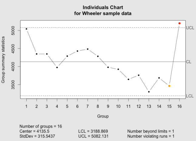
In qcc, an individuals and moving range (XmR or ImR) chart can be created simply:

library(qcc)
my.xmr.raw <- c(5045,4350,4350,3975,4290,4430,4485,4285,3980,3925,3645,3760,3300,3685,3463,5200)
x <- qcc(my.xmr.raw, type = "xbar.one", title = "Individuals Chart\nfor Wheeler sample data")
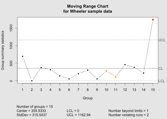
x <- qcc(matrix(cbind(my.xmr.raw[1:length(my.xmr.raw)-1], my.xmr.raw[2:length(my.xmr.raw)]), ncol = 2), type = "R", title = "Moving Range Chart\nfor Wheeler sample data")

This both generates the plot and creates a qcc object, assigning it to the variable x. You can generate another copy of the plot with plot(x).

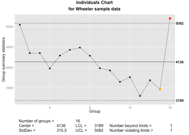
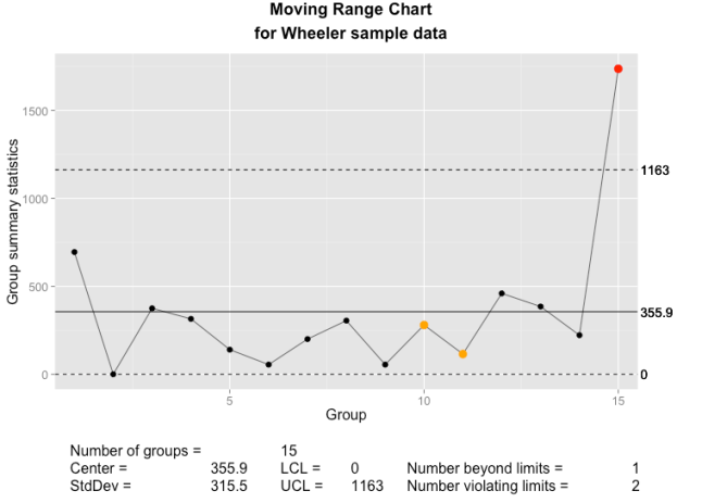
To use my new plot function, you will need to have the packages ggplot2, gtable, qcc and grid installed. Download my code from the qcc_ggplot project on Github, load qcc in R and then run source("qcc.plot.R"). The ggplot2-based version of the plotting function will be used whenever a qcc object is plotted.

library(qcc)
source("qcc.plot.R")
my.xmr.raw <- c(5045,4350,4350,3975,4290,4430,4485,4285,3980,3925,3645,3760,3300,3685,3463,5200)
x <- qcc(my.xmr.raw, type = "xbar.one", title = "Individuals Chart\nfor Wheeler sample data")
x <- qcc(matrix(cbind(my.xmr.raw[1:length(my.xmr.raw)-1], my.xmr.raw[2:length(my.xmr.raw)]), ncol = 2), type = "R", title = "Moving Range Chart\nfor Wheeler sample data")

Below, you can compare the individuals and moving range charts generated by qcc and by my new implementation of plot.qcc():

The qcc individuals chart as implemented in the qcc package.

The qcc individuals chart as implemented in the qcc package.

The qcc individuals chart as implemented using ggplot2 and grid graphics.

The qcc individuals chart as implemented using ggplot2 and grid graphics.

The qcc moving range chart as implemented in the qcc package.

The qcc moving range chart as implemented in the qcc package.

The qcc moving range chart as implemented using ggplot2 and grid graphics.

The qcc moving range chart as implemented using ggplot2 and grid graphics.

New features

In addition to the standard features in qcc plots, I’ve added a few new options.

size or cex
Set the size of the points used in the plot. This is passed directly to geom_point().
font.size
Sets the size of text elements. Passed directly to ggplot() and grid’s viewport().
title = element_blank()
Eliminate the main graph title completely, and expand the data region to fill the empty space. As with qcc, with the default title = NULL a title will be created, or a user-defined text string may be passed to title.
new.plot
If TRUE, creates a new graph (grid.newpage()). Otherwise, will write into the existing device and viewport. Intended to simplify the creation of multi-panel or composite charts.
digits
The argument digits is provided by the qcc package to control the number of digits printed on the graph, where it either uses the default option set for R or a user-supplied value. I have tried to add some intelligence to calculating a default value under the assumption that we can tell something about the measurement from the data supplied. You can see the results in the sample graphs above.

Lessons Learned

This little project turned out to be somewhat more difficult than I had envisioned, and there are several lessons-learned, particularly in the use of ggplot2.

First, ggplot2 really needs data frames when plotting. Passing discrete values or variables not connected to a data frame will often result in errors or just incorrect results. This is different than either base graphics or grid graphics, and while Hadley Wickham has mentioned this before, I hadn’t fully appreciated it. For instance, this doesn’t work very well:

my.test.data <- data.frame(x = seq(1:10), y = round(runif(10, 100, 300)))
my.test.gplot <- ggplot(my.test.data, aes(x = x, y = y)) + 
  geom_point(shape = 20)
index.1 <- c(5, 6, 7)
my.test.gplot <- my.test.gplot +
  geom_point(aes(x = x[index.1], y = y[index.1]), col = "red")
my.test.gplot

Different variations of this sometimes worked, or sometimes only plotted some of the points that are supposed to be colored red.

However, if I wrap that index.1 into a data frame, it works perfectly:

my.test.data <- data.frame(x = seq(1:10), y = round(runif(10, 100, 300)))
my.test.gplot <- ggplot(my.test.data, aes(x = x, y = y)) + 
  geom_point(shape = 20)
index.1 <- c(5, 6, 7)
my.test.subdata <- my.test.data[index.1,]
my.test.gplot <- my.test.gplot +
  geom_point(data = my.test.subdata, aes(x = x, y = y), col = "red")
my.test.gplot

Another nice lesson was that aes() doesn’t always work properly when ggplot2 is called from within a function. In this case, aes_string() usually works. There’s less documentation than I would like on this, but you can search the ggplot2 Google Group or Stack Overflow for more information.

One of the bigger surprises was discovering that aes() searches for data frames in the global environment. When ggplot() is used from within a function, though, any variables created within that function are not accessible in the global environment. The work-around is to tell ggplot which environment to search in, and a simple addition of environment = environment() within the ggplot() call seems to do the trick. This is captured in a stack overflow post and the ggplot2 issue log.

my.test.data <- data.frame(x = seq(1:10), y = round(runif(10, 100, 300)))
my.test.gplot <- ggplot(my.test.data, environment = environment(), aes(x = x, y = y)) + 
  geom_point(shape = 20)
index.1 <- c(5, 6, 7)
my.test.subdata <- my.test.data[index.1,]
my.test.gplot <- my.test.gplot +
  geom_point(data = my.test.subdata, aes(x = x, y = y), col = "blue")
my.test.gplot

Finally, it is possible to completely and seamlessly replace a function created in a package and loaded in that package’s namespace. When I set out, I wanted to end up with a complete replacement for qcc’s internal plot.qcc() function, but wasn’t quite sure this would be possible. Luckily, the below code, called after the function declaration, worked. One thing I found was that I needed to name my function the same as the one in the qcc package in order for the replacement to work in all cases. If I used a different name for my function, it would work when I called plot() with a qcc object, but qcc’s base graphics version would be used when calling qcc() with the parameter plot = TRUE.

unlockBinding(sym="plot.qcc", env=getNamespace("qcc"));
assignInNamespace(x="plot.qcc", value=plot.qcc, ns=asNamespace("qcc"), envir=getNamespace("qcc"));
assign("plot.qcc", plot.qcc, envir=getNamespace("qcc"));
lockBinding(sym="plot.qcc", env=getNamespace("qcc"));

Outlook

For now, the code suits my immediate needs, and I hope that you will find it useful. I have some ideas for additional features that I may implement in the future. There are some parts of the code that can and should be further cleaned up, and I’ll tweak the code as needed. I am certainly interested in any bug reports and in seeing any forks; good ideas are always welcome.

References

  • R Core Team (2013). R: A language and environment for statistical computing. R Foundation for Statistical Computing, Vienna, Austria. URL http://www.R-project.org/.
  • Scrucca, L. (2004). qcc: an R package for quality control charting and statistical process control. R News 4/1, 11-17.
  • H. Wickham. ggplot2: elegant graphics for data analysis. Springer New York, 2009.
  • Wheeler, Donald. “Individual Charts Done Right and Wrong.” Quality Digest. 2 Feb 20102 Feb 2010. Print. <http://www.spcpress.com/pdf/DJW206.pdf>.

R Function Reference

Updated below

The R Function Reference is a mind map that I created as a guide for novice and intermediate users of the R statistics language. When you first open it, I suggest that you collapse all the nodes by clicking on the “Expand/Collapse all nodes” button in the bottom left of the screen to make the map easier to navigate. You can also adjust the zoom level with the slider next to that button.

R Function Reference screenshot

The top-level nodes of the R Function Reference

The mind map is arranged in eight sections, or main branches, arranged by task. What do you want to do? Each branch covers a general set tasks, such as learning to use R, running R, working with data, statistical analysis or plotting data. The end of each string of nodes is generally a function and example. The Reference provides code fragments, rather than details of the function or complete reproducible code blocks. Once you’ve followed the Reference and have an idea of how to accomplish something, you can look up the details in R’s help system (e.g. “?read.csv” to learn more about using the read.csv() function), or search Google or the online R-Help mailing list archives for answers using the function name.

There are a lot of useful nodes and examples, especially in the “Graphs” section, but the mind map is not complete; some trails end before you get to a useful function reference. I am sorry for that, but it’s a work in progress, and will be slowly updated over time.

Comments and suggestions are welcome.

Update 1

In comments, several users reported problems opening the mind map. With a little investigation, it appears that the size of the mind map is the problem. To try to fix the problems , I have split the mind map out into several small mind maps, all linked together.

The new main mind map is the R Function Reference, Main. The larger branches on this main map no longer expand to their own content, but contain a link to a “child” mind map. The link looks like a sheet of paper with an arrow pointing to the right, click on it and little cartoon speech bubble will pop up with a link that you have to click on to go to the child mind map. Likewise, the central nodes on the child mind maps contain a link back to the main mind map.

Due to load times and the required extra clicks, this may slightly reduce usability for users who didn’t have a problem with the all-in-one version, but will hopefully make the mind map accessible to a broader audience.

I have to offer praise to the developers of Mind42. Though I couldn’t directly split branches off into their own mind maps or duplicate the mind map, it was very easy to export the mind map as a native Mind42 file and then import it multiple times, editing the copies without any loss of data or links. The ability to link directly between mind maps within Mind42 was also a key enabling feature. Considering that this is a free web app, its capabilities are most impressive. They were also quick to respond when I posted a call for help on the Mind42 forum.

Please let me know how the new, “improved” version works.

The old mind map, containing everything, is still available, but I will not update it.