Aside

Update to plot.qcc using ggplot2 and grid

Two years ago, I blogged about my experience rewriting the plot.qcc() function in the qcc package to use ggplot2 and grid. My goal was to allow manipulation of qcc’s quality control plots using grid graphics, especially to combine range charts with their associated individuals or moving range charts, as these two diagnostic tools should be used together. At the time, I posted the code on my GitHub.

I recently discovered that the update to ggplot2 v2.0 broke my code, so that attempting to generate a qcc plot would throw an obscure error from someplace deep in ggplot2. The fix turned out to be pretty easy. The original code used aes_string() instead of aes() because of a barely-documented problem of calling aes() inside a function. It looks like this has been quietly corrected with ggplot2 2.0, and aes_string() is no longer needed for this.

The updated code is up on GitHub. As before, load the qcc library, then source() qcc.plot.R. For the rest of the current session, calls to qcc() will automatically use the new plot.qcc() function.

The Most Useful Data Plot You’ve Never Used

Those of us working in industry with Excel are familiar with scatter plots, line graphs, bar charts, pie charts and maybe a couple of other graph types. Some of us have occasionally used the Analysis Pack to create histograms that don’t update when our data changes (though there is a way to make dynamic histograms in Excel; perhaps I’ll cover this in another blog post).

One of the most important steps in data analysis is to just look at the data. What does the data look like? When we have time-dependent data, we can lay it out as a time-series or, better still, as a control chart (a.k.a. “natural process behavior chart”). Sometimes we just want to see how the data looks as a group. Maybe we want to look at the product weight or the cycle time across production shifts.

Unless you have Minitab, R or another good data analysis tool at your disposal, you have probably never used—maybe never heard of—boxplots. That’s unfortunate, because boxplots should be one of the “go-to” tools in your data analysis tool belt. It’s a real oversight that Excel doesn’t provide a good way to create them.

For the purpose of demonstration, let’s start with creating some randomly generated data:

head(df)
##   variable   value
## 1   group1 -1.5609
## 2   group1 -0.3708
## 3   group1  1.4242
## 4   group1  1.3375
## 5   group1  0.3007
## 6   group1  1.9717
tail(df)
##     variable   value
## 395   group1  1.4591
## 396   group1 -1.5895
## 397   group1 -0.4692
## 398   group1  0.1450
## 399   group1 -0.3332
## 400   group1 -2.3644

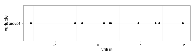
If we don’t have much data, we can just plot the points:

library(ggplot2)

ggplot(data = df[1:10,]) +
  geom_point(aes(x = variable, y = value)) +
  coord_flip() +
  theme_bw()

Points plot with few data

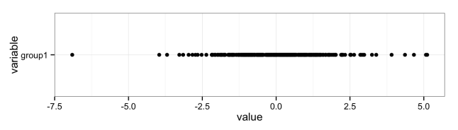
But if we have lots of data, it becomes hard to see the distribution due to overplotting:

ggplot(data = df) +
  geom_point(aes(x = variable, y = value)) +
  coord_flip() +
  theme_bw()

Points plot with many data

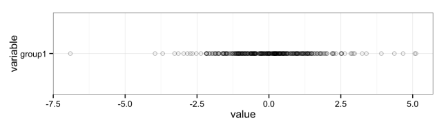
We can try to fix this by changing some parameters, like adding semi-transparency (alpha blending) and using an open plot symbol, but for the most part this just makes the data points harder to see; the distribution is largely lost:

ggplot(data = df) +
  geom_point(aes(x = variable, y = value), alpha = 0.3, shape = 1) +
  coord_flip() +
  theme_bw()

Points plot with many data using alpha blending

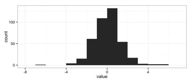
The natural solution is to use histograms, another “go-to” data analysis tool that Excel doesn’t provide in a convenient way:

ggplot(data = df) +
  geom_histogram(aes(x = value), binwidth = 1) +
  theme_bw()

histogram

But histograms don’t scale well when you want to compare multiple groups; the histograms get too short (or too narrow) to really provide useful information. Here I’ve broken the data into eight groups:

head(df)
##   variable   value
## 1   group1 -1.5609
## 2   group1 -0.3708
## 3   group1  1.4242
## 4   group1  1.3375
## 5   group1  0.3007
## 6   group1  1.9717
tail(df)
##     variable   value
## 395   group8 -0.6384
## 396   group8 -3.0245
## 397   group8  1.5866
## 398   group8  1.9747
## 399   group8  0.2377
## 400   group8 -0.3468
ggplot(data = df) +
  geom_histogram(aes(x = value), binwidth = 1) +
  facet_grid(variable ~ .) +
  theme_bw()

Stacked histograms

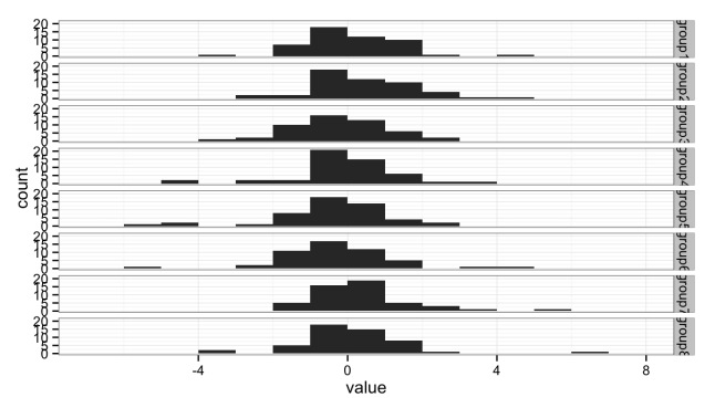
Either the histograms need to be taller, making the stack too tall to fit on a page, or we need a better solution.

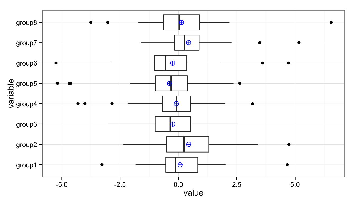
The solution is the box plot:

ggplot() +
  geom_boxplot(data = df, aes(y = value, x = variable)) +
  coord_flip() +
  theme_bw()

Stacked boxplots

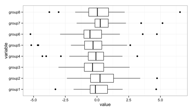
The boxplot provides a nice, compact representation of the distribution of a set of data, and makes it easy to compare across a large number of groups.

There’s a lot of information packed into that graph, so let’s unpack it:
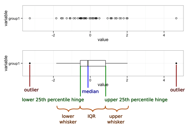
Boxplot with markup

Median
A measure of the central tendency of the data that is a little more robust than the mean (or arithmetic average). Half (50%) of the data falls below this mark. The other half falls above it.
First quartile (25th percentile) hinge
Twenty-five percent (25%) of the data falls below this mark.
Third quartile (75th percentile) hinge
Seventy-five percent (75%) of the data falls below this mark.
Inter-Quartile Range (IQR)
The middle half (50%) of the data falls within this band, drawn between the 25th percentile and 75th percentile hinges.
Lower whisker
The lower whisker connects the first quartile hinge to the lowest data point within 1.5 * IQR of the hinge.
Upper whisker
The upper whisker connects the third quartile hinge to the highest data point within 1.5 * IQR of the hinge.
Outliers
Any data points below 1.5 * IQR of the first quartile hinge, or above 1.5 * IQR of the third quartile hinge, are marked individually as outliers.

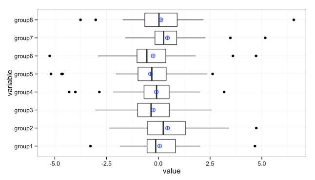
We can add additional values to these plots. For instance, it’s sometimes useful to add the mean (average) when the distributions are heavily skewed:

ggplot(data = df, aes(y = value, x = variable)) +
  geom_boxplot() +
  stat_summary(fun.y = mean, geom="point", shape = 10, size = 3, colour = "blue") +
  coord_flip() +
  theme_bw()

Stacked box plots with means

Graphs created in the R programming language using the ggplot2 and gridExtra packages.

References

  1. R Core Team (2014). R: A language and environment for statistical computing. R Foundation for Statistical
    Computing, Vienna, Austria. URL http://www.R-project.org/.
  2. H. Wickham. ggplot2: elegant graphics for data analysis. Springer New York, 2009.
  3. Baptiste Auguie (2012). gridExtra: functions in Grid graphics. R package version 0.9.1.
    http://CRAN.R-project.org/package=gridExtra

Individual and Team Learning

If product development is about learning, then there must be at least two kinds of learning going on: individual learning and team learning. By their very nature, individuals and teams must learn in different ways, so our product development and management processes need to support both kinds of learning. I will lay the groundwork for future posts by looking at how people and teams learn and what sort of behaviors they engage in as part of the learning process. Learning and behavior are open fields of research, with volumes of published material. I will be brief.

Nancy Leveson, in her book Safeware: System Safety and Computers, has a couple of excellent chapters on human learning and behavior, from which I’ll borrow. I recommend her book; the first ten chapters or so are well worth reading even if you’re not involved with computers. Borrowing from Jens Rasmussen, she discusses three levels of cognitive control: skill-based behavior; rule-based behavior; and knowledge-based behavior.

Knowledge-based behavior sits at the highest level of cognitive learning and control. Performance is controlled by explicit goals and actions are formulated through a conscious analysis of the environment and subsequent planning. One of the primary learning tools used at this level is the scientific method of hypothesis formulation, experimentation and evaluation.

Rule-based behavior develops when the environment is familiar and fairly unchanging. Situations are controlled through the application of heuristics, or rules, that are acquired through training and experience, and that are triggered by conditions or indicators of normal events or states. This sort of behavior is very efficient, and learning is achieved primarily through experimentation, or trial and error, that leads to further refinement of the rules and improved identification of conditions under which to apply those rules. People transition back to knowledge-based behavior when the environment changes in unexpected ways, but only as they become aware that the rules-based behaviors are failing to produce the usual results.

Skill-based behavior “is characterized by almost unconscious performance of routine tasks, such as driving a car on a familiar road.” The behavior requires a trade-off, often between speed and accuracy, and learning involves constant tests of the limits of that trade-off. These tests are experimental in nature, but largely sub-conscious (not planned). Only by occasionally crossing the limits (making “mistakes”) can learning be achieved. As with rule-based behavior, people transition from skill-based behavior to rules-based behavior only after they become aware of a change in the environment that is having a negative impact on outcomes of the skill-based behavior.

When people learn new skills they typically progress from knowledge-based behaviors to rule-based behaviors and eventually to skill-based behaviors. A surprising amount of engineering is based on heuristics rather than knowledge. This is often a good thing, as it allows us to efficiently deal with very complex problems and systems, making it possible to arrive at approximately-correct solutions much faster than through more explicit planning and evaluation. It can also go badly wrong when signs incorrectly lead one to apply the wrong rules to a situation that appears familiar but is not.

What might not be obvious is that learning at any level is only possible through a mix of successful and non-successful experiments. Unexpected outcomes (“mistakes,” “errors” or “failures”) are a necessary part of learning. In fact, the rate of learning is maximized (learning is most efficient) when the rate of unexpected outcomes is 50%.

Teams learn when individuals communicate, sharing and synthesizing the knowledge and heuristics that they’ve learned. This occurs primarily through two behaviors or tools: assessment and feedback. Assessment involves observation and reflection on what behaviors are working or not working in pursuit of the team goals. It should be performed by both by individuals and by the team as a whole. Feedback is comprised of constructive observations provided by others and objective measurements, and is the input to assessment. Because feedback and assessment are so important to team learning and growth, they should be planned, structured and ongoing.

For assessment to be effective at generating team learning and growth, some action needs to follow. An action might be to change an existing condition (e.g. change how meetings are run, explore design alternatives, etc.), or to document a process or norm that “works” and sharing the result with team members (e.g. documenting the work flow, standardizing parts, implementing decision processes, etc.).

Repeated and effective use of both individual and team learning behaviors results in team learning cycles. In any product development project, these learning cycles occur in different domains simultaneously. The main forms of feedback in product design are testing and design review, and there are multiple ways to assess and plan those feedback loops. Project feedback comes primarily from monitoring the schedule performance. At the same time, the team should be eliciting feedback about its ability to make decisions, work together and work with the rest of the organization, and assessing that feedback.

Peter Scholtes’ The Team Handbook is a well-written and practical guide to implementing team processes and behaviors, and is geared toward both team members and team leaders. It’s the kind of book that a new team could refer to throughout a project to guide them in becoming more cohesive and effective. His The Leader’s Handbook: Making Things Happen, Getting Things Done also provides an excellent supplement, geared more toward team leaders and business managers.

To summarize, product development processes and organizations must be designed to support repeated structured and “accidental” experimentation by individuals and team processes of feedback, assessment, decision-making and actions that result in either change or standardization.