Those of us working in industry with Excel are familiar with scatter plots, line graphs, bar charts, pie charts and maybe a couple of other graph types. Some of us have occasionally used the Analysis Pack to create histograms that don’t update when our data changes (though there is a way to make dynamic histograms in Excel; perhaps I’ll cover this in another blog post).
One of the most important steps in data analysis is to just look at the data. What does the data look like? When we have time-dependent data, we can lay it out as a time-series or, better still, as a control chart (a.k.a. “natural process behavior chart”). Sometimes we just want to see how the data looks as a group. Maybe we want to look at the product weight or the cycle time across production shifts.
Unless you have Minitab, R or another good data analysis tool at your disposal, you have probably never used—maybe never heard of—boxplots. That’s unfortunate, because boxplots should be one of the “go-to” tools in your data analysis tool belt. It’s a real oversight that Excel doesn’t provide a good way to create them.
For the purpose of demonstration, let’s start with creating some randomly generated data:
head(df)
##   variable   value
## 1   group1 -1.5609
## 2   group1 -0.3708
## 3   group1  1.4242
## 4   group1  1.3375
## 5   group1  0.3007
## 6   group1  1.9717
tail(df)
##     variable   value
## 395   group1  1.4591
## 396   group1 -1.5895
## 397   group1 -0.4692
## 398   group1  0.1450
## 399   group1 -0.3332
## 400   group1 -2.3644
If we don’t have much data, we can just plot the points:
library(ggplot2)

ggplot(data = df[1:10,]) +
  geom_point(aes(x = variable, y = value)) +
  coord_flip() +
  theme_bw()
But if we have lots of data, it becomes hard to see the distribution due to overplotting:
ggplot(data = df) +
  geom_point(aes(x = variable, y = value)) +
  coord_flip() +
  theme_bw()
We can try to fix this by changing some parameters, like adding semi-transparency (alpha blending) and using an open plot symbol, but for the most part this just makes the data points harder to see; the distribution is largely lost:
ggplot(data = df) +
  geom_point(aes(x = variable, y = value), alpha = 0.3, shape = 1) +
  coord_flip() +
  theme_bw()
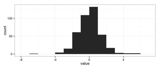
The natural solution is to use histograms, another “go-to” data analysis tool that Excel doesn’t provide in a convenient way:
ggplot(data = df) +
  geom_histogram(aes(x = value), binwidth = 1) +
  theme_bw()
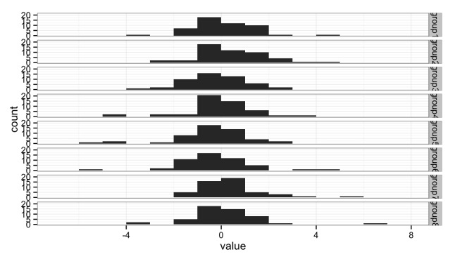
But histograms don’t scale well when you want to compare multiple groups; the histograms get too short (or too narrow) to really provide useful information. Here I’ve broken the data into eight groups:
head(df)
##   variable   value
## 1   group1 -1.5609
## 2   group1 -0.3708
## 3   group1  1.4242
## 4   group1  1.3375
## 5   group1  0.3007
## 6   group1  1.9717
tail(df)
##     variable   value
## 395   group8 -0.6384
## 396   group8 -3.0245
## 397   group8  1.5866
## 398   group8  1.9747
## 399   group8  0.2377
## 400   group8 -0.3468
ggplot(data = df) +
  geom_histogram(aes(x = value), binwidth = 1) +
  facet_grid(variable ~ .) +
  theme_bw()
Either the histograms need to be taller, making the stack too tall to fit on a page, or we need a better solution.
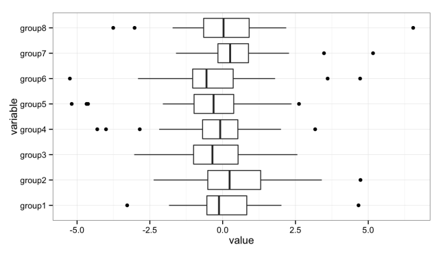
The solution is the box plot:
ggplot() +
  geom_boxplot(data = df, aes(y = value, x = variable)) +
  coord_flip() +
  theme_bw()
The boxplot provides a nice, compact representation of the distribution of a set of data, and makes it easy to compare across a large number of groups.
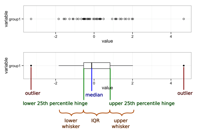
There’s a lot of information packed into that graph, so let’s unpack it:
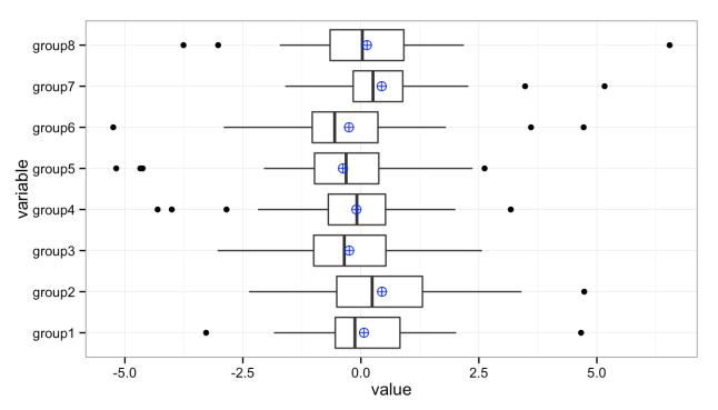
We can add additional values to these plots. For instance, it’s sometimes useful to add the mean (average) when the distributions are heavily skewed:
ggplot(data = df, aes(y = value, x = variable)) +
  geom_boxplot() +
  stat_summary(fun.y = mean, geom="point", shape = 10, size = 3, colour = "blue") +
  coord_flip() +
  theme_bw()
Graphs created in the R programming language using the ggplot2 and gridExtra packages.
References
- R Core Team (2014). R: A language and environment for statistical computing. R Foundation for Statistical
Computing, Vienna, Austria. URL http://www.R-project.org/. - H. Wickham. ggplot2: elegant graphics for data analysis. Springer New York, 2009.
- Baptiste Auguie (2012). gridExtra: functions in Grid graphics. R package version 0.9.1.
http://CRAN.R-project.org/package=gridExtra


2 thoughts on “The Most Useful Data Plot You’ve Never Used”