Individuals and Moving Range Charts in R

Individuals and moving range charts, abbreviated as ImR or XmR charts, are an important tool for keeping a wide range of business and industrial processes in the zone of economic production, where a process produces the maximum value at the minimum costs.

While there are many commercial applications that will produce such charts, one of my favorites is the free and open-source software package R. The freely available add-on package qcc will do all the heavy-lifting. There is little documentation on how to create a moving range chart, but the code is actually quite simple, as shown below.

The individuals chart requires a simple vector of data. The moving range chart needs a two-column matrix arranged so that qcc() can calculate the moving range from each row.

library(qcc)
#' The data, from sample published by Donald Wheeler
my.xmr.raw <- c(5045,4350,4350,3975,4290,4430,4485,4285,3980,3925,3645,3760,3300,3685,3463,5200)
#' Create the individuals chart and qcc object
my.xmr.x <- qcc(my.xmr.raw, type = "xbar.one", plot = TRUE)
#' Create the moving range chart and qcc object. qcc takes a two-column matrix
#' that is used to calculate the moving range.
my.xmr.raw.r <- matrix(cbind(my.xmr.raw[1:length(my.xmr.raw)-1], my.xmr.raw[2:length(my.xmr.raw)]), ncol=2)
my.xmr.mr <- qcc(my.xmr.raw.r, type="R", plot = TRUE)

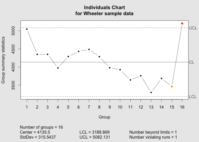
This produces the individuals chart:

The qcc individuals chart as implemented in the qcc package.

The qcc individuals chart.

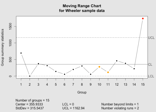
and the moving range chart:

The qcc moving range chart as implemented in the qcc package.

The qcc moving range chart.

The code is also available as a gist.

References

  • R Core Team (2013). R: A language and environment for statistical computing. R Foundation for Statistical Computing, Vienna, Austria. URL http://www.R-project.org/.
  • Scrucca, L. (2004). qcc: an R package for quality control charting and statistical process control. R News 4/1, 11-17.
  • Wheeler, Donald. “Individual Charts Done Right and Wrong.” Quality Digest. 2 Feb 20102 Feb 2010. Print. <http://www.spcpress.com/pdf/DJW206.pdf>.

Scientific Consensus

I have seen a number of comments lately that “consensus” has no place in science, and that claims that there is a “scientific consensus” are just thinly veiled political double-speak. I have to take issue with such criticisms. In fact, consensus is one of the cornerstones of science.

This is not quite the same consensus used in politics or everyday life. Consensus means “general agreement” and is usually achieved through some form of discussion and negotiation. Consensus is therefore agreement over opinions, and is often agreement over a course of action despite differing opinions.

In science, consensus is derived from data and independent replication of experiments. It is the consensus that an idea—specifically, a testable hypothesis—is correct. It is the expression of scientists that a hypothesis is (a) scientifically testable and falsifiable, (b) that it has not been falsified and (c) that it explains the universe better than competing hypotheses. It is a consensus derived from the replication of observations or tests by other researchers.

Part of the problem, here, is that science has a habit of taking everyday words and developing very specific meanings around them. This happens because scientists need to communicate clearly and exactly at times, and language is messy and full of fuzzy concepts. The same thing happens in a lot of occupations. For example, accountants also develop specific meanings for everyday words.

Scientists no longer argue over the validity of Newton’s hypothesis on the gravitational force because there is broad consensus that the hypothesis is correct (as far as it goes). Objects attract each other according to their mass and the distance between them, and there have been plenty of independent experiments confirming the specific relationship, F = -G M1m2 / r2. The consensus is so strong that it’s referred to as Newton’s law of gravity. Likewise, scientists no longer argue over the geocentric model of the universe because there is broad consensus—derived from data collected over centuries by many independent researchers—that the Earth is not at the center of the solar system, let alone the universe.

Conversely, there is very little consensus when it comes to the accelerating expansion of the universe. Cosmologists agree that the universe is expanding faster than can be explained by our current understanding of the universe, but there are many, conflicting hypotheses about the causes. There is consensus over the fact of the accelerating expansion but the data does not yet support consensus on the underlying physical processes or mechanism causing it, and so there is no consensus about the physical process.

In one sense, scientific consensus is stronger, or more robust, than we are used to thinking about in politics and everyday life, precisely because it is based on observation and careful analysis by independent groups. It’s not just consensus based on what we think might be true, or what we want to be true, but based on what careful observation tells us must be true. Scientific consensus is not subject to whim.

From another perspective, though, scientific consensus is much weaker than we are used to. In science, there is no downside to abandoning or overturning a consensus when the data points in a different direction. In fact, there is significant benefit to being the person who can overturn a previous consensus; we remember Galileo, Newton, Darwin, Einstein and others precisely because their work, collecting and analyzing data, was so pivotal in altering the scientific consensus. In everyday life, if you back out of a consensus agreement, it’s likely that others party to the agreement will feel betrayed. There can be a significant social cost to pay for backing out of a consensus, even when you are convinced that you are right. Scientists may sometimes feel this same social pressure, but the scientific method provides clear guidance for adopting or abandoning consensus, and it doesn’t focus on the people involved but rather on external, objective observations of how the universe works. Scientific consensus is, perhaps, more readily changed than conventional consensus.

So consensus does exist is science and it plays an important role in science. We should be careful to distinguish, though, between consensus based on independent replication of results and consensus based on preconceptions and social negotiation.

And You Thought Physics Was *YAWN*

Part of my day job involves monitoring the renewable energy market, and particularly keeping abreast of storage technologies. It’s like combining my hobby with my job.

A new wind turbine design was recently announced, the SeaTwirl. It’s an off-shore turbine design using vertical blades. The key technological advance here is that it includes a method to store energy, so that it can continue to produce electricity when the wind stops blowing. This ability to deliver a constant output is important, because, as you may have heard, wind energy is intermittent; you only get electricity when the wind blows, and only to the degree that it’s blowing. Demand, unfortunately, doesn’t follow wind’s intermittancy—nobody stops to check that the wind is blowing before they turn on their lights—and the utilities, transmission system operators and distribution system operators all have to supply electricity to meet demand.

The SeaTwirl stores energy by integrating an unusual wind turbine design with a pumped hydro system. It has the turbine blades on a large circular ring, which rotates parallel to the water’s surface kind of like a hula-hoop. This ring is hollow (more or less), and is filled up with water when the wind blows. When the wind stops blowing, the momentum of the water keeps the tube spinning, generating electricity, and the water is allowed to drain back out, spinning a hydro turbine to generate electricity.

The nice thing about this is that the storage can always be “recharged” and it’s “free.” Or at least it seems to be. If you’ve ever held a bucket while spinning around, you know that spinning with an empty bucket takes a lot less effort than spinning around with a full bucket. In part, this is because of a property known as the moment of inertia. The heavier or larger a spinning object gets, the more it resists changes to its rate of rotation (or rpm).

If the SeaTwirl is filling up this horizontal “hula-hoop” with water, then the weight of the tube is increasing and so is the moment of inertia. As the moment of inertia increases, the energy needed to reach a given rpm increases. Wind turbines normally generate electricity in proportion to the wind speed, because the rpm of the blades is proportional to the wind speed. Increase the moment of inertia and you decrease the rpm, which means you generate less electricity for a given wind speed.

Now comes the physics. For something shaped like a hula-hoop, the moment of inertia, I, is calculated from the mass, M, and the radius of the hoop, R, according to:

I = M R^{2}

The energy, E, in a spinning object is equal to the moment of inertia times the speed of rotation, ω, according to

E=\frac{1}{2} I \omega ^{2}

If we know the energy (because we know the wind speed), then we can calculate the speed of rotation, ω, by rearranging that equation to get ω on the left-hand side:

\omega = \sqrt{\frac{2E}{I}}

We can then replace I with mass and radius from the first equation to get

\omega = \sqrt{\frac{2E}{MR^{2}}}

So we can see that, if we don’t change the energy E (or don’t change the wind speed), and don’t change the radius R of the spinning hoop, then increasing the mass M results in a slower rate of rotation.

From SeaTwirl’s website and press releases, we can estimate how big the SeaTwirl is, which will let us estimate how much slower a full SeaTwirl will spin than an empty one, and therefore how much less electricity must be generated. We can calculate this by taking the ratio of ω full to ω empty, so that the parts that we don’t have to know E and R.

\frac{\omega_{full}}{\omega_{empty}} = \frac{\sqrt{\frac{2E}{M_{full}R^{2}}}}{\sqrt{\frac{2E}{M_{empty}R^{2}}}} = \sqrt{\frac{\frac{2E}{R^{2}}}{\frac{2E}{R^{2}}}}\sqrt{\frac{M_{empty}}{M_{full}}}=\sqrt{\frac{M_{empty}}{M_{full}}}

For the SeaTwirl, we now have to find out what R is, and estimate M for both filled and empty

The whole turbine assembly is made of composite materials, which probably have a density, \rho_{c}, of around 2500 kilograms per cubic meter (similar to fiberglass). Water has a density, \rho_{w}, of near 1000 kilograms per cubit meter (depending on temperature). The diameter of the turbine will be near 180 meters, so the radius, R, of our “hula-hoop” is half that, or 90 meters. From the pictures, it looks like the thickness of that hula-hoop is a few percent of the total diameter of the turbine, so we can figure an outside diameter of the “hula-hoop” of about 2 meters, for a radius, r, of 1 meter. Figure that at least ten percent of this is composite, and the rest is the hollow, water-filled portion.

To estimate the weight of the water in the “hula-hoop,” we can approximate the water as being a cylinder of radius r_{w} = 0.9r and length equal to the circumference of the “hula-hoop,” l = 2\pi R. The volume of such a cylinder is equal to the cross-sectional area of the water column, A_{w}=\pi r_{w}^{2} times the length of the column, l. The total mass of the water, m_{w} is the density times this volume.

m_{w} = \rho_{w}\pi r_{w}^{2}2\pi R = \rho_{w}3\pi (0.9r)^{2} R

Plugging in our estimates for the above values gives us

m_{w} = 1000 \cdot 3\pi (0.9)^{2} 90 = 687000 kg

That’s a lot of water.

Now for the empty “hula-hoop.” We can treat it in the same way: a cylinder of material of radius r, length l = 2\pi R. However, we don’t want to calculate for a solid cylinder of composite; we have to subtract out the hollow part with radius r_{w}. So the mass of the composite is

m_{c} = \rho_{c} 2 \pi R ( \pi r^{2} - \pi r^{2}_{w} )

m_{c} = 2500 \cdot 3 \pi 90 (1^{2} - 0.9^{2} ) = 403000 kg

So the water more than doubles the weight of the hoop.

From the picture, you can see that there’s another hoop at the top, and the two hoops are connected by the turbines, which combined are probably worth at least another hoop in weight, so we can further assume that the mass of this bottom hoop, empty, is roughly one-third of the total mass of the movable parts of turbine.

The mass of the turbine, empty, is therefore about 1200000 kg, or 1200 tons. Filled with water, this goes up to about 1900000 kg, or 1900 tons. Empty, that’s maybe twice the largest off-shore turbine currently in existence, but this thing is easily twice as big as any current turbine, so our estimate appears to be in the right neighborhood.

Now we go back to our equation for the ratio of the rotational velocities, ω, and plug in these weights:

\frac{\omega_{full}}{\omega_{empty}} = \sqrt{\frac{M_{empty}}{M_{full}}} =\sqrt{\frac{1200}{1900}} = 0.8

So we get about 80% as much electricity from a water-filled turbine as from an empty one, when the wind blows. This is a direct efficiency loss due to the storage of energy in the spinning-water-hoop.

In addition, there’s the efficiency losses in loading water into the hoop, or “charging” the hoop, and the efficiency losses of “discharging” the hoop, running the water back out through a hydro turbine. Pumped hydro is usually about 72% efficient, or less, in each direction, so the total round-trip efficiency of storage + discharge is about 50% efficient. There are a lot of other storage technologies that do at least this good, if not better.

These two figures, the 80% efficiency loss of just operating the turbine and the 50% storage-discharge efficiency, can be used to directly compare SeaTwist with other wind turbine + storage technology solutions. Any storage technology that has at least a 50% round-trip efficiency and increases the total system cost by less than 20% over the system’s operating lifetime will outperform SeaTwist in terms of return on investment.
Is there a Market for Premium R Packages?

Nathan Yau, of the excellent FlowingData blog, recently asked on his Twitter stream:

I wonder if there’s a market for premium R packages, like there is for say, @wordpress themes and plugins

There are some great packages available for R, all of which are currently free. I think it would be great if authors like Hadley Wickham and Ian Fellows received remuneration for their efforts. However, I see a trap here.

From my perspective, R has two main barriers to adoption: the learning curve and IT support.

The learning curve is steep enough that casual users will not get very far, and infrequent users tend to slide backwards and have to relearn (I’ve had to develop a mind map of common functions to help mitigate this problem for myself). R packages generally address the learning curve. There aren’t many packages that provide functions that the user couldn’t have created for themselves with base R, but the packages make using their functions much easier. ggplot2 and its support packages plyr and reshape make a perfect example. The default R graphical output is pretty good, but ggplot2 offers better aesthetic defaults and provides an easier path to advanced functions, like transforming data and adding fitted curves and “ribbons.”

IT departments will not have any readily available, professional support should problems arise with any R installation. I’ve seen a couple of IT departments balk at supporting open source software for this very reason, and one of them balked at supporting R for this reason. IT departments must evaluate software through the lenses of incident response and down time. However good the community, open source software leaves a big uncertainty when planning for support budgets. The only solution that I’ve found for IT is to convince them that they don’t have to support R; I can do it myself. I’m sure some of you are luckier that way, and it seems that Revolution is slowly addressing this issue, but it’s not an issue that has been generally addressed in the community. In addition, IT departments are usually responsible for ensuring that all software installed on their organization’s computers is legally licensed to the organization. With everything currently free, that’s a problem that is easily overcome.

Make ggplot2, or any other package, available only to those who can pay, and you exacerbate the two main problems with R: great functionality that flattens the learning curve will be lost to a large segment of users (i.e. casual or infrequent users and cash-strapped users like students), and IT departments will have to choose between actively supporting R and simply banning it. Providing user-installable R packages where some are freely licensed and others are not would create an environment where some IT departments would simply ban R rather than have to sort out the licensing issues. I suspect that many would ban R.

We need a way to repay package authors for their time, without losing the benefits of freely available packages. Donationware seems like a good first step, even though the response rate is typically very low.

R Function Reference

Updated below

The R Function Reference is a mind map that I created as a guide for novice and intermediate users of the R statistics language. When you first open it, I suggest that you collapse all the nodes by clicking on the “Expand/Collapse all nodes” button in the bottom left of the screen to make the map easier to navigate. You can also adjust the zoom level with the slider next to that button.

R Function Reference screenshot

The top-level nodes of the R Function Reference

The mind map is arranged in eight sections, or main branches, arranged by task. What do you want to do? Each branch covers a general set tasks, such as learning to use R, running R, working with data, statistical analysis or plotting data. The end of each string of nodes is generally a function and example. The Reference provides code fragments, rather than details of the function or complete reproducible code blocks. Once you’ve followed the Reference and have an idea of how to accomplish something, you can look up the details in R’s help system (e.g. “?read.csv” to learn more about using the read.csv() function), or search Google or the online R-Help mailing list archives for answers using the function name.

There are a lot of useful nodes and examples, especially in the “Graphs” section, but the mind map is not complete; some trails end before you get to a useful function reference. I am sorry for that, but it’s a work in progress, and will be slowly updated over time.

Comments and suggestions are welcome.

Update 1

In comments, several users reported problems opening the mind map. With a little investigation, it appears that the size of the mind map is the problem. To try to fix the problems , I have split the mind map out into several small mind maps, all linked together.

The new main mind map is the R Function Reference, Main. The larger branches on this main map no longer expand to their own content, but contain a link to a “child” mind map. The link looks like a sheet of paper with an arrow pointing to the right, click on it and little cartoon speech bubble will pop up with a link that you have to click on to go to the child mind map. Likewise, the central nodes on the child mind maps contain a link back to the main mind map.

Due to load times and the required extra clicks, this may slightly reduce usability for users who didn’t have a problem with the all-in-one version, but will hopefully make the mind map accessible to a broader audience.

I have to offer praise to the developers of Mind42. Though I couldn’t directly split branches off into their own mind maps or duplicate the mind map, it was very easy to export the mind map as a native Mind42 file and then import it multiple times, editing the copies without any loss of data or links. The ability to link directly between mind maps within Mind42 was also a key enabling feature. Considering that this is a free web app, its capabilities are most impressive. They were also quick to respond when I posted a call for help on the Mind42 forum.

Please let me know how the new, “improved” version works.

The old mind map, containing everything, is still available, but I will not update it.

Process Stability

(Updated below)

While performing a web search, I remembered how difficult the concept of “process stability” can be. How do you know when a process is stable?

D. C. Montgomery, one of the recognized authorities on the subject of statistical process control, seems to give conflicting advice on this. For instance, he’s careful to point out the assumptions underlying all of the measures that one would use on a process, and unstable processes invalidate most or all of these assumptions. How do you know if a process is stable if none of your analyses are applicable?

Process stability needs an operational definition. Luckily, there are at least two:

1) No signals on the appropriate process behavior chart (a.k.a. control chart);

2) Cpk / Ppk == 1 and Cp / Pp == 1

Signals on a process behavior chart do not necessarily mean that a process is out of control (i.e. false signals are possible, and expected at certain mathematically determinable rates), but we can be sure of process stability if there are no signals.

Likewise, we can take issue with using the process capability indices Pp, Ppk, Cp and Cpk in this manner. All assume a normal distribution, which you only get with a stable process, so you shouldn’t trust them as measures of process capability. In this case, that’s fine: don’t report the actual values; just report the ratio of Cp to Pp or Cpk to Ppk. When the ratio is 1, the process is stable; the larger the ratio, the worse the process. Donald Wheeler discusses this use of Ppk and Cpk, and the measures’ relation to production costs, in his latest column for Quality Digest.

Whether or not the process is economical (i.e. Cpk and Ppk are high enough) is a question completely separate from stability.

Update:

I was discussing this with a friend who, for various reasons, needs to allow for some process drift. In other words, a Ppk less than Cpk is expected and acceptable, but only up to a certain point. The nice thing about the Cpk/Ppk ratio is that it’s simple: a ratio of 1 means the process is stable; a ratio greater than 1 means the process is not stable; a ratio of less than 1 means someone has made a mistake or is lying. If we need to allow for some process drift, we lose this simplicity.

So suppose that we have a Cpk of 1.66. There are then five standard deviations between the process mean and the nearest specification limit. Assuming a process drift of 1.5 Sigmas, our Ppk is 1.16, giving us a ratio Cpk/Ppk of 1.43. If, however, our Cpk is 1.00, then a process drift of 1.5 Sigmas gives us a Cpk/Ppk ratio of 2.00.

With an allowed process drift of a fixed number of Sigma, it’s no longer so simple to determine, from the Cpk/Ppk ratio, whether or not a process is “stable” within the limits set by management.

A slightly more sophisticated calculation is needed, then. What we can calculate is the ratio

(Short Term SigmaLong Term Sigma) / Allowed Process Drift

If the result is less than or equal to 1, then the process is “good enough” (i.e. within our allowed drift). If the ratio is greater than 1, then the process is considered out of control and action needs to be taken to eliminate sources of variation. If the ratio is less than 0, then someone made a mistake or is lying (i.e. long-term Sigma can never be less than short-term Sigma).

Graphing Highly Skewed Data

Recently Chandoo.org posted a question about how to graph data when you have a lot of small values and a few larger values. It’s not the first time that I’ve come across this question, and I’ve seen a lot of answers, many of them really bad. While all solutions involve trade-offs for understanding and interpreting graphs, some solutions are better than others.

Data graphs tell stories by revealing patterns in complex data. Good data graphs let the data tell the story by revealing the patterns, rather than trying to impose patterns on the data.

As William Cleveland discusses in The Elements of Graphing Data and his 1993 paper A Model for Studying Display Methods of Statistical Graphics, there are two basic visual operations that people employ when looking at and interpreting graphs: pattern perception and table look-up. Pattern perception is where we see the geometric patterns in a graph: groupings; relative differences (larger/smaller); or trends (straight/curved or increasing/decreasing). Table look-up is where we explore details of values and names on a graph. These two operations are distinct and complimentary, and it is through these two operations that the data’s story is told.

month sales
1 Feb 09 200
2 Mar 09 300
3 Apr 09 200
4 May 09 300
5 Jun 09 200
6 Jul 09 300
7 Aug 09 350
8 Sep 09 400
9 Oct 09 450
10 Nov 09 1200
11 Dec 09 100000
12 Jan 10 85000
13 Feb 10 450

So suppose that we have some data like that at right, where we are interested in the patterns of smaller, individual values, but there are also a few extremely large values, or outliers. We describe such data as being skewed. How do we plot this data? First, for such a small data set, a simple table is the best approach. People can see the numbers and interpret them, there aren’t too many numbers to make sense of and the table is very compact. For more complicated data sets, though, a graph is needed. There’s a few basic options:

  • Graph as-is;
  • Graph with a second axis;
  • Graph the logarithm of the data;
  • Use a scale break.
  • Plot the data multiple times.

Graph As-Is

Bar chart with all data plotted

A bar chart with all data, including outliers, plotted on the same scale.

This is the simplest solution, and if you’re only interested in knowing about the outliers (Dec ’09 and Jan ’10) then it will do. However, it completely hides whatever is happening in the rest of the months. Pattern recognition tells us that two months near the end of the series have the big numbers. Table-lookup tells us the approximate values and that these months are around December ’09 and February ’10, but the way the labels string together and overlap the tick marks, it’s not clear exactly what the labels are, let alone which label applies to which bar (which months are those, precisely? Is that “09 Dec” and “09 Feb?” Do the numbers even go with the text, or are they separate labels?).

For all but the simplest of messages, this rendition defeats both pattern recognition and table look-up. We definitely need a better solution.

Use a Secondary Axis

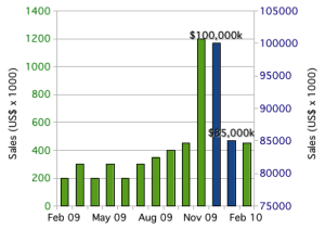
Excel gives us an easy solution: break the data into two columns (“small” numbers in one and “large” numbers in the other) and plot them on separate axes. Now we can see all the data, including the patterns in all the months.

Bar Chart with Outliers on Secondary Axis

Bar chart, with outliers plotted using a secondary axis.

Unfortunately, pattern recognition tells us that the big-sales months are about the same as all the other months. It’s only the table look-up that tells us how big of a difference there is between the two blue columns and the rest of the data. This is why I’ve added data labels to the two columns: to aid table look-up.

Even if we tweaked around with the axes to set the outliers off from the rest of the data, we’d still have the same basic problem: pattern recognition would tell us that there is a much smaller difference than there actually is. By using a secondary axis, we’ve set up a basic conflict between pattern recognition and table look-up. Worse, it’s easy to confuse the axes; which bars go with which axis? Reproduction in black and white or grayscale would make it impossible to correctly connect bars to the correct axis. Some types of color blindness would similarly make it difficult to interpret the graph. Table look-up is easily defeated with secondary axes.

The secondary axis presents so many problems that I always advise against using it. Stephen Few, author of Show Me The Numbers and Information Dashboard Design, calls graphs with secondary axes “dual-scaled graphs.” In his 2008 article Dual-Scaled Axes in Graphs, he concludes that there is always a better way to display data than by using secondary axes. Excel makes it easy to create graphs like this, but it’s always a bad idea.

Take the Logarithm

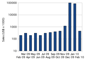
In scientific applications, skewed data is common, and the usual solution is to plot the logarithm of the values.

Bar Chart with Logarithmic Axis

Bar chart plotting skewed with logarithmic axis.

With the logarithm, it is easy to plot, and see, all of the data. Trends in small values are not hidden. Pattern perception immediately tells us the overall story of the data. Table look-up is easier than with secondary axes, and immediately tells us the scale of the differences. Plotting the logarithm allows pattern perception and table look-up to compliment each other.

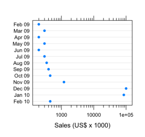
Below, I’ve created the same graph using a dot plot instead of a bar chart. Dot plots have many advantages over bar charts: most obviously, dot plots provide a better arrangement for category labels (e.g. the months); also, dot plots provide a clearer view of the data by plotting the data points rather than filling in the space between the axis and the data point. There are some nice introductions to dot plots, including William Cleveland’s works and a short introduction by Naomi Robbins. The message is clear: any data that you might present with a bar chart (or pie chart) will be better presented using dot plots.

Dot plot with logarithmic scale

Skewed data plotted on a dot plot using a logarithmic scale.

Use a Scale Break

Another approach, which might be better for audiences unfamiliar with logarithmic scales, is to use a scale break, or broken axis. With some work, we can create a scale break in Excel or OpenOffice.org.

Bar chart with a subtle scale break on the Y axis.

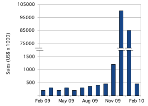
Bar chart with outliers plotted by introducing a subtle scale break on the y-axis.

There are plenty of tutorials for how to accomplish this in Excel. For this example, I created the graph in OpenOffice.org Spreadsheet, using the same graph with the secondary axis, above. I adjusted the two scales, turned off the labels for both y-axes and turned off the tick marks for the secondary y-axis. Then I copied the graph over to the OpenOffice.org Draw application and added y-axis labels and the break marks as drawing objects.

That pretty much highlights the first problem with this approach: it takes a lot of work. The second problem is that those break marks are just too subtle; people will miss them.

The bigger problem is with interpretation. As with the secondary axis, this subtle scale break sets up a basic conflict between the two basic operations of graph interpretation. Pattern recognition tells us that the numbers are comparable; it’s only table look-up that tells us what a large difference there is.

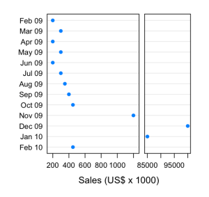
Cleveland’s recommendation, when the logarithm won’t work, is to use a full-panel scale break. In this way, pattern recognition tells that there are two distinct groups of data, and table look-up tells us what they are.

Dot plot with full scale break

Dot plot with a full scale break to show outliers.

The potential disadvantage of this approach is that pattern perception might be fooled. While the scale break visually groups the “large” values from the “small” ones, the scale also changes, so that the broader panel on the left actually represents a much narrower range of values (about 1100 dollars range) than the narrower panel on the right (about 17000 dollars range). Our audience might have difficulties interpreting this correctly.

Small Multiples

Edward Tufte has popularized the idea of small multiples, the emphasis of differences by repeating a graph or image with small changes from one frame to the next. In this case, we could show the full data set, losing fidelity in the smaller values, and then repeat the graph while progressively zooming in on a narrower and narrower slice with each repetition.

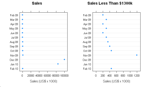
Dot Plot showing full data (including outliers) side-by-side with zoomed view.

The full data, with outliers, is plotted on the left. On the right, a zoomed view showing detail in the smaller values.

This shares many similarities to Cleveland’s full scale break, but provides greater flexibility. With this data, there are two natural ranges: 0 – 100000 and 0 – 1200. If there were more data between 1200 and 85000, we might repeat the graph several times, zooming in more with each repetition to show lower levels of detail.

I think there are two potential pitfalls. As with the full scale break, the audience might fail to appreciate the effect of the changes to scale. Worse, the audience might be fooled into thinking that each graph represented a different set of data, rather than just a different slice of the same data. Some care  in preparing such graphs will be needed for successful communication.

Summary

When presenting data that is, like the data above, arranged by category, use a dot plot instead of bar charts. When your data is heavily skewed, the best solution is to graph the logarithm of the data. However, if your audience will be unable to correctly interpret the logarithm, try a full scale break or small multiples.

You Know You’re a Geek When…

I’m reading a work of fiction about the Knights Templar, based on the same mythos as Dan Brown’s novels. A throw-away line about the history of the Order’s Masters sparked my mathematical curriosity: “For the sixty-six who’d come before, the average tenure was a mere eighteen years.”

Is this reasonable? Did the author calculate the average tenure or just guess? The Knights Templar got their start in 1119. The story takes place around 2000, maybe 2005. So do sixty-six Masters average eighteen-year tenures over some 885 years?

We can do a quick check: had there been eighty-eight Masters, the average tenure would be about ten years. Had there been forty-four Masters, the average tenure would have been twenty years. Sixty-six falls mid-way between the two, so the average should be around fifteen. Eighteen is not completely unreasonable, but it might be too long.

We can be more exact: divide 885 by 66 and we immediately see that the average should be about 13.5 years. But this calculation is really answering the question “how long would the tenures be if all the Masters had the same tenure?” We might expect some short tenures of a year or two and one or two long tenures of perhaps twenty or thirty years.

Such a distribution, with no values less than zero, a few large values and most values clustering somewhere inbetween, might have a very different average due to the lopsided (skewed) distribution. We can approximate such a distribution with the Poisson distribution. Poisson does not have fractional increments, so we’ll only get whole-year tenures, but it should be good enough to determine if 18 is a reasonable average tenure. Also, Poisson is easier to fit than the more precise beta distribution.

So I fired up Minitab, generated a bunch of random Poisson-distributed values with a mean of 18, and then added them up in groups of sixty-six. The average of these sums was 1224 years; much longer than the 885 years required by the story. Eighteen years is too long.

Playing around with different values for the mean, I find that the “right” average for tenure length should be close to 13.5.

To answer the original question, then: eighteen years isn’t completely unreasonable, but it’s definitly wrong. I have to wonder how the author came up with this. If he just pulled “eighteen” and “sixty-six” out of thin air, then I have to say that he guessed pretty well. Unfortunately, it’s clear that he didn’t bother to do even a simple calculation while sitting in front of his computer typing, where a calculator was readily available.

I know: mathematical accuracy isn’t the point of the story. However, the point of fiction isn’t to create a milieu based on logical falsehoods, but to create a fictional milieu that is believable (i.e. our modern world, if the myths surrounding the Templars were real). The author lets us down through such acts of carelessness or laziness.

This also brings me back to my title. You know you’re a geek when you take a throw-away statement in a work of fiction and perform some statistical analysis to fact-check it.

At least it’s a fun journey.

Team Size and Organizational Structure, Part 1

With this post, I am stepping outside my core skills and into an area that I am less familiar with, but still find very interesting.

I’ve worked in small- to mid-sized companies, where an emphasis was placed on getting things done quickly. This always means acquiring resources from outside of your core team. These resources might be team members, materials, equipment or utilities. In most cases, there has not been any formal mechanism for requesting, locating, allocating or releasing those resources.

Senior management often treats successfully locating and negotiating for these resources as a natural part of everyone’s job. In a very small company, everyone knows everyone else and such negotiation seems to be a natural extension of the social relationships. I suspect that this is how even larger companies look to senior managers, who routinely have to negotiate with their peers (who are limited in number). As companies grow, however, problems appear for people lower down in the organization.

It becomes more difficult to determine who has the needed resources, or if the resources even exist. Conflicting priorities across groups make the negotiations more difficult. As the company grows, relationships between people become less social and more purely professional, reducing the common ground that eases the negotiations in very small companies. I believe that this can be described as a shift from high context communication in small companies to low context communication in larger companies. Finally, the negotiations become more political, developing aspects of one-upmanship or CYA that drive behaviors aimed at benefiting the individual but not the entire company.

Some individuals can overcome such challenges. They have the charisma, social graces or relationships with senior management to get what they want, and sometimes they’ll even do what is best for the company globally. For the rest, success becomes more difficult, and they end up aligning themselves with those who can succeed. When this happens during company growth, it fractures a company along political lines, into groups that treat each other as outsiders, if not as outright enemies.

It seems to me that this political division of a company is harmful to the business goals and to the people. A former colleague used to say that we must attend to the quality of our relationships. I have wondered how best to do this, and would like to explore the beginnings of my own ideas.

I was recently considering the number of possible interactions in a group, and at the same time came across mention of Dunbar’s number. Dunbar’s number is named after one Robin Dunbar, who proposed that, based on cognitive limitations, there is a limit to the number of people that one can maintain stable social relationships. Larger groups require more formal rules to remain stable. Dunbar proposed that this limit was one hundred fifty people. Other estimates exist, ranging to about two hundred fifty people. These estimates appear to be based off of a mix of speculation and study of tribal group sizes.

Organizational structures are often described by one of three basic structures: functional; project and matrix. Each of these breaks a company into smaller, largely independent units. A fourth model, not as widely recognized, exists: the spider web. In a spider web, everyone is connected to everyone else, and almost anyone can step into any other role in the company, at least temporarily. It is my understanding that this spiderweb only works in small companies. I’ll bet it only works in companies smaller than Dunbar’s number. The spider-web organization is also the type of organization where direct negotiation is easiest.

In the next post, I will look at smaller team interactions and size limitations. I will follow that with conclusions about organizational structure and growth.

Definitions

I was recently asked a question that raised some good design issues. The question went “why should changing this cause a change in that characteristic?”

The immediate and obvious answer was that it wouldn’t and couldn’t. Theoretically, a large decrease in this (X) might cause an increase of a few percent in that (Y); nothing more. Only someone was claiming that decreasing X decreased Y, too.

They were right. No, the theoretical relationship isn’t wrong. It’s right.

The theoretical calculation is fairly straightforward. You put so much of X in, and, after some calculation, you get so much of Y out. The less X you have, the more Y you get. The hard part is figuring out just how much of X you’re putting in.

The measurement of Y introduces a bunch of variation based on other factors. You measure by changing certain conditions A, B and C. These, in turn, affect some other factors, M and N. X, A, M and N together determine what value you measure for Y.

So decreasing X affects the other factors in such a way that the net effect is a decrease in the measured value of Y.

“Oh, sure,” you respond. “But the theoretical calculation should account for that.”

Not really. The theoretical calculation should tell us what the best case is…what our target should be. The actual measurement is going to produce different results based on various factors, some of which we control and some we can’t. A calculation based on the measurement process would require uncertainty ranges and return a probability distribution; not a singular value. Messy.

Engineers and researchers need to consider both of these as definitions. If you’re designing for some characteristic, as a researcher or engineer you’re usually going to be concerned with the theoretical calculations. This is how you were taught in school, and you’ll naturally be interested in getting as close to the best case as possible. However, not everyone is going to be interested in the theoretical calculation. The folks in Quality who are checking the product for conformance will be more interested in how it’s measured, the operational definition, than in the theoretical definition. The manufacturing plant only want to hear about the operational definition; for them, the world would be a better place without the theoretical definition.

As a design engineer, you need to be more concerned about the operational definition. You’ll be arguing that you designed a part for Y performance (or to “do Y“). The next question that management and your customers should (and probably will) ask is, how do you know you designed it to do that? The answer is always by data analysis. How do you get the data? Via the operational definition. What you know is determined by how you measure, and that’s the operational definition.

This has applicability well outside of engineering design. Physicists have been arguing this very point ever since Bohm and Heisenberg developed the Copenhagen interpretation of quantum physics. Management by objective depends on the ability to close the loop by measuring outcomes. This means that management by objectives requires operational definitions of every objective (though few organizations actually get this far, and management by objectives becomes management by manager gut feeling). Even more enlightened management techniques, such as those advocated by Deming and Scholtes, require operational definitions to enable an organization’s performance improvement (e.g. through the use of control charts, which are only possible with operational definitions).

Use the theoretical definition to tell you the best possible case, but be sure to design according to the operational definition.