Setting product specifications is an iterative and challenging process, combining lab test data, historical data and educated guesses. All too often, the result is a set of product and process specifications that must be changed to meet manufacturing needs and that do not meet all customer requirements. To achieve specifications that are correct and defendable, the engineer must understand how the voice of the customer and the voice of the process interact, and must fully specify product through both specification limits (also called tolerance limits) and production capability, or Cpk.
Voice of the Customer
What the customer expects a product to do—what they are willing to pay for—is known as the “voice of the customer” (VoC). A customer’s expectations may not all be written or explicitly stated, and unwritten or unrecognized needs or wants can be even more important than the written ones. As we design a product, we first translate the VoC to engineering requirements and then flow the requirements down to subcomponents.
For simplicity, I will adopt the convention of referring to the specifications or tolerances as the Target Specification, the Upper Specification Limit (USL) and the Lower Specification Limit (LSL). The target, USL and LSL are the engineering translation of the VoC. I will refer to the measure being specified—length, mass, voltage, etc.—as a characteristic.
Voice of the Process
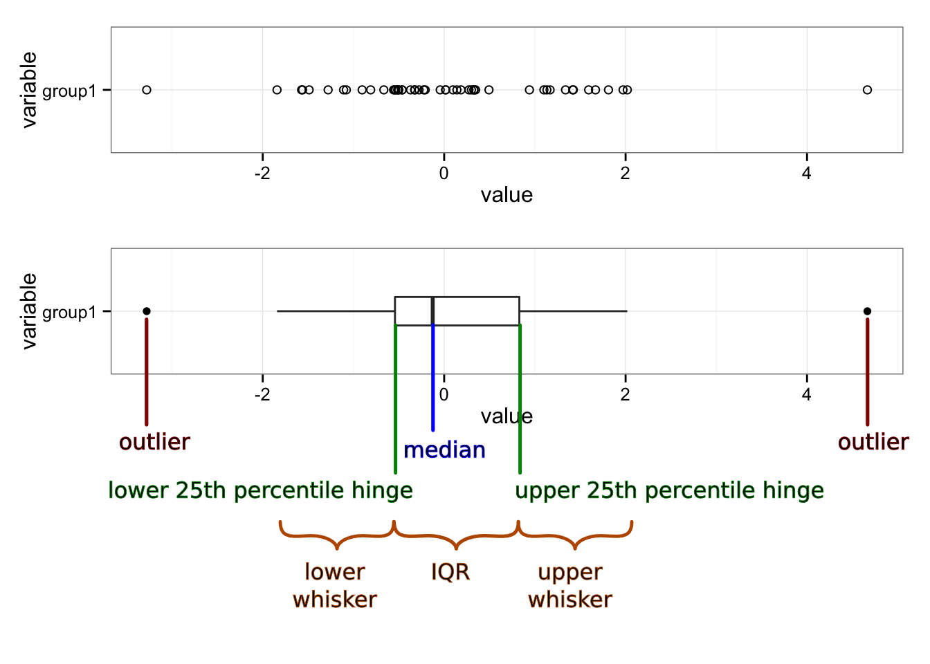
What we know about the parts actually produced—maximum and minimum, average, standard deviation, outliers, etc.—is known as the “voice of the process” (VoP). The VoP tells us the limits of our manufacturing abilities.
Suppose that we know from the production plant that the typical weight of our product is between 99.2 and 104.2 kg. This is the VoP; it may or may not be acceptable to the customer or fit within the USL and LSL. When we engage in statistical process control (SPC), we are listening to the VoP, but not the VoC.
The engineer must design to the VoC while considering the VoP.
Specification Limits
First, some definitions:
- Target Specification
- The desired value of the characteristic.
- Mean Specification
- The average of the upper and lower specification values—the value in the middle of the specification or tolerance range.
- Nominal Specification
- Used in different ways. May mean the target value of the specification. Sometimes the value printed in marketing literature or on the product, which may be the minimum or some other value.
- Upper Specification Limit
- The maximum allowed value of the characteristic. Sometimes referred to as the upper tolerance.
- Lower Specification Limit
- The minimum allowed value of the characteristic. Also referred to the lower tolerance.
Suppose that the customer has said that they want our product to weigh at least 100 kg. Since the customer will always want to pay as little as possible, a customer-specified lower specification limit of 100 kg is equivalent to saying that they are only willing to pay for 100 kg worth of costs; any extra material is added cost that reduces our profit margin.
If the customer does not specify a maximum weight, or upper specification limit, then we can choose the upper limit by the maximum extra material cost we want to bear. For this example, we decide that we are willing to absorb up to 5% additional cost. For our product, material and construction contributes 50% to the total assembled part cost, so the USL on weight is 110 kg.
Defect Rates and Cpk: Where VoC and VoP Intersect
Defect rates are expressed variously as Sigma, Cpk (“process capability”), Ppk (“process performance”), parts per million (ppm), yield (usually as a percent) or defects per million opportunities (DPMO). “Sigma” refers to the number of standard deviations that fit between the tolerance limits and the process mean. A 1-Sigma process has 1 standard deviation ( ) between the mean (
 ) and the nearest specification limit. Cpk is a measure of the number of times that three standard deviations (
 ) fit between the mean and the nearest specification limit. Cpk is often used by customers, especially automotive OEMs. We can easily convert between Cpk, Sigma yield, ppm and DPMO.
Production tells us that historically, they usually see a range of about 5 kg in assembled part weight, with weights between 99.2 kg and 104.2 kg. With enough data, the range of observed data will cover roughly the range from [mean – 3 standard devations] to [mean + 3 standard devations], so this gives us  kg and
  kg. From
  ,
,  , we have a 2-Sigma process. With this data, we could estimate the percent of parts that will be below the LSL.
Defect Rate Calculation
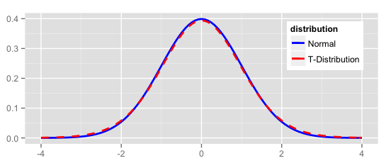
We can use this data to estimate the percent of product that will be out of the customer’s specification. We’ll assume that our process produces parts where the weight is normally distributed (having a Gaussian or bell-shaped curve).
Using Minitab, you can do this by opening the “Calc” menu, the “Probability Distributions” submenu, and choosing “Normal….” Then choose “Cumulative probability,” enter “101.7” for the mean and “0.83” for the standard deviation. Select “Input constant” and enter “100.” Click “OK.” The result in the Session Window looks like:
Cumulative Distribution Function

Normal with mean = 101.7 and standard deviation = 0.83

  x  P( X <= x )
100     0.02027
This is read as: the probability of seeing a weight X less than or equal to the given value x = 100 is 0.02, so we can expect about 2% of parts to be out of specification. This can also be done in Excel using NORMDIST(100, 101.7, 0.83, TRUE) or, in Excel 2010 and later, NORM.DIST(100, 101.7, 0.83, TRUE). In R we would use pnorm(100, 101.7, 0.83).
Minitab can also display this graphically. Open the “Graph” menu, select “Probability Distribution Plot…” Select “View Probability” (the right-most option) and click “OK,” On the “Distribution” tab, select “Normal” from the distribution menu and enter “101.7” for the mean and “0.83” for the standard deviation. Then switch to the “Shaded Area” tab, select “X Value,” “Left Tail” and enter “100” for the “X value.” Click on “OK” to obtain a plot like that below.
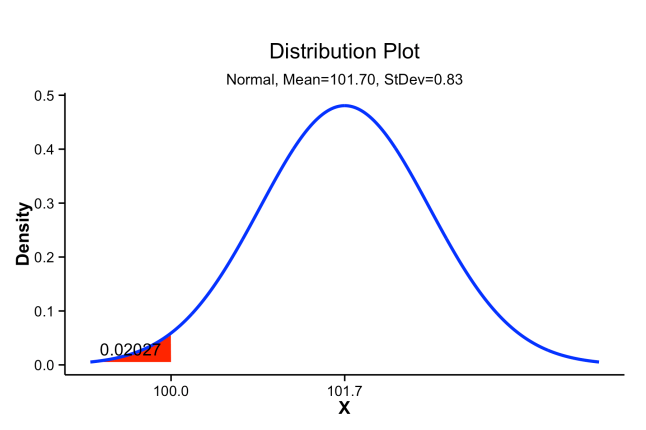
Probability density distribution showing cumulative probability below a target value of 100 shaded in red.
Of course, not all processes produce parts that are normally distributed, and you can use a distribution that fits your data. However, a normal distribution will give you a good approximation in most circumstances.
Cpk
The calculation for Cpk is:
where Cpu and Cpl are defined as:
If is centered between the USL and the LSL, then by simple algebra we have
which is often a convenient form to use to estimate the “best case” process capability, even when we do not know what is.
The combination of VoC-derived specification limits (USL, LSL and T) with process data ( and ) ties together the VoC and the VoP, and allows us to predict future performance against the requirements.
Multiplying Cp or Cpk by  produces a measure of the process capability that includes centering on the target value, T, referred to as Cpm or Cpkm, respectively. These versions are more informative but much less commonly used than Cp and Cpk.
In the example,  . We can then calculate the Cpk:
Acceptable values of Cpk are usually 1.33, 1.67 or 2.0. Automotive OEMs typically require Cpk = 1.33 for non-critical or new production processes, and Cpk = 1.67 or 2.0 for regular production. In safety-critical systems, a Cpk should be 6 or higher. The “Six Sigma” improvement methodology and Design For Six Sigma refers to reducing process variation until six standard deviations of variation fit between the mean and the nearest tolerance (i.e. Cpk = 2), achieving a defect rate of less than 3.4 per million opportunities. Some typical Cpk, and corresponding process sigma and process yield are provided in table [tblCpkSigmaYield].
| Cpk |
Sigma |
Yield (max) |
Yield (likely) |
| 0.33 |
1 |
85.% |
30.% |
| 1.00 |
3 |
99.9% |
90.% |
| 1.33 |
4 |
99.997% |
99.% |
| 1.67 |
5 |
99.99997% |
99.98% |
| 2.00 |
6 |
99.9999999% |
99.9997% |
In the table, “Yield (max)” assumes that the process is perfectly stable, such that parts produced today and parts produced weeks from now all exhibit the same mean and variance. Since no manufacturing process is perfectly stable, “Yield (likely)” assumes additional sources of variation that shift the process by  (e.g. seasonal effects, or differences in setups across days or shifts). This shift is a standard assumption in such calculations when we do not have real data about the long-term process stability of our processes.
Specification Limits and Cost
When parts are out of specification—that is, they may be identified prior to shipment as defective or nonconforming—they they can have four possible impacts:
- they must be reworked;
- they must be scrapped;
- they come back as warranty claims; or
- they result in lost customers (reduced revenue without reducing “fixed” costs).
For example, underweight or damaged injection-molded plastics might be melted and reprocessed, but this adds cost in capital for the added equipment to proces the parts and cost for extra electricity and labor to move, sort and remelt. Later in production, defective parts will have to be scrapped.
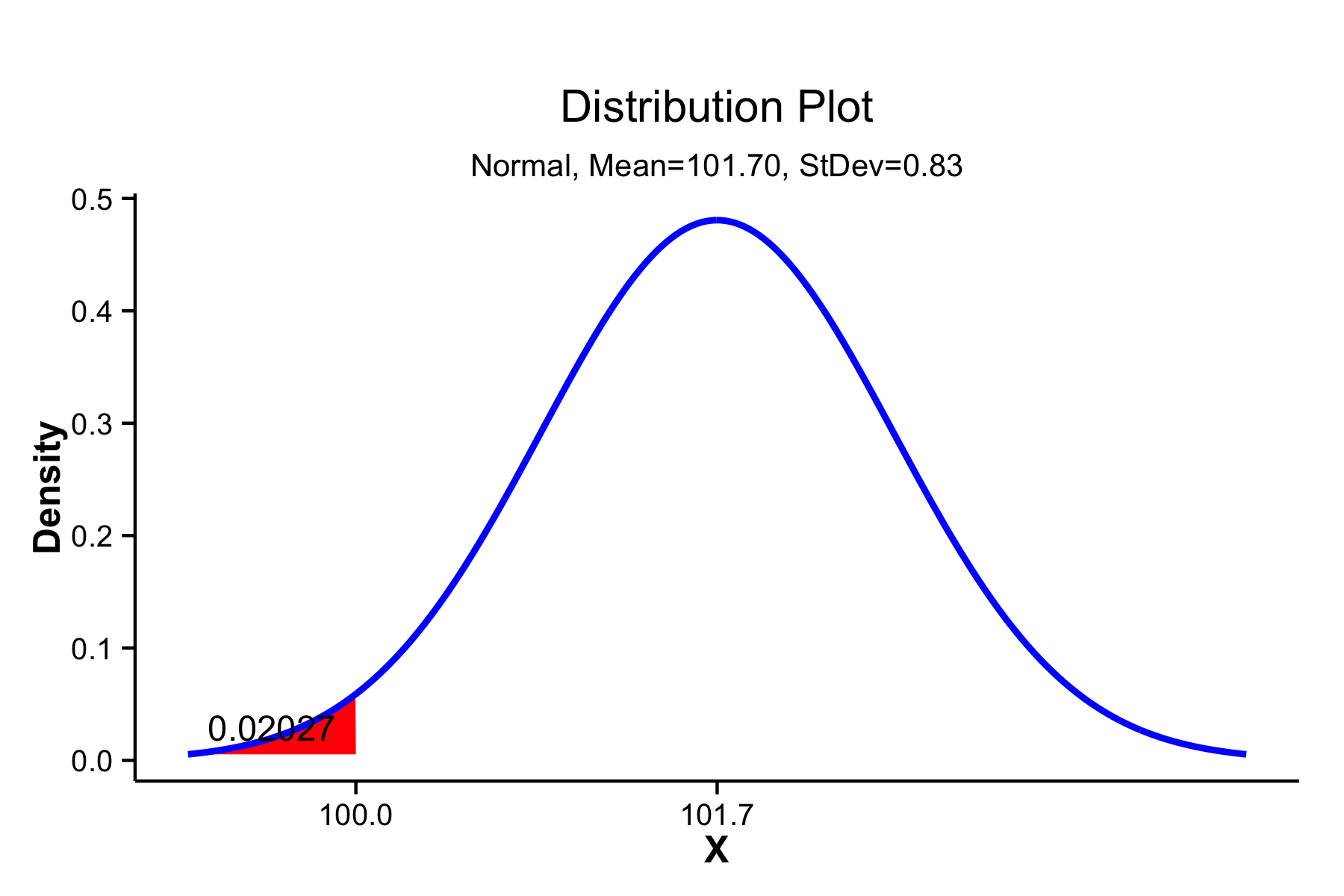
We can see, then, that a cost function can be associated with each end of a specification range. The specification limits must be derived from the VoC, but the VoP imposes the cost function. The figures below illustrate this for both one-sided and two-sided specifications.
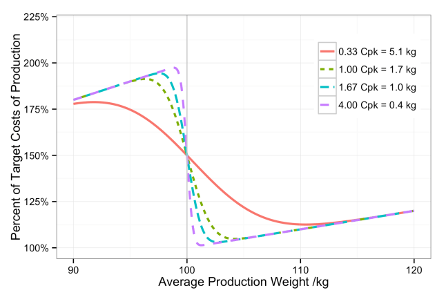
Percent of target production costs given an average production weight and four different process capabilities.
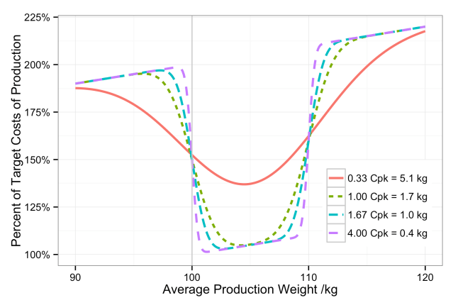
Percent of target production costs given an average production weight and four different process capabilities.
The minimum of the cost function is a good place to set our target specification, unless we have some strong need to set a different target.
Variance of Components and Cpk
When a part characteristic is the sum of the part’s components, as with weight, then the variation in the part characteristic is likewise due to the variation in the individual components. However, while the weight adds as the sum of the components,
the variance in weight,  , adds as the sum of squares
Since the given is the maximum allowed for the assembled part to meet the desired Cpk, this means that the component variances,  , are an estimate for the maximum allowed component variance. Manufacturing can produce parts better than this specification, but any greater variance will drive the parent part out of specification.
Specifying Characteristics
Very often, only specification ranges (or tolerances)—the USL and LSL—are provided by engineering when designing parts. Almost as often, these ranges are based on a target value (derived from the VoC) with some “allowed” tolerance based on what manufacturing says they can achieve on the existing equipment and processes (the VoP). It should be clear from the above that a minimally-adequate part specification includes USL and LSL derived from the VoC and the minimum acceptable Cpk derived from both the VoC and the VoP. The inclusion of the minimum process capability is the only way to ensure that the parts are made within the target costs and at the target quality level.
The next challenge is to flow these requirements down to the components. Having laid the groundwork for the basis of requirements flow-down, I will look at a way to do this in a future post.
References
All graphs created in R using ggplot2.
- R Core Team (2014). R: A language and environment for statistical computing. R Foundation for
Statistical Computing, Vienna, Austria. URL http://www.R-project.org/.
- H. Wickham. ggplot2: elegant graphics for data analysis. Springer New York, 2009.


 , for each requirement Y and each subcomponent characteristic X. There are methods for doing this, like Design for X or QFD, but they can be difficult to implement. In the real world, we don’t always know these transfer functions, and determining them can require non-trivial research projects that are best left to academia.
![General drawing of the structure of aircraft battery's vented type NiCd cell. Ransu. Wikipedia, [http://en.wikipedia.org/wiki/ File:Aircraft_battery_cell.gif]. Accessed 2014-04-04.](https://tomhopper.me/wp-content/uploads/2014/05/aircraft_battery_cell.gif)


 or
or  .
.


 and
and  will be approximately equal. Therefore if we don’t know the fractions
 of a subcomponent
  of a parent component,
 .
.  are known,
 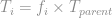 .
. (or percent) of the parent total for each subcomponent if not already established in step (5).
  and
and  .
.
 for each subcomponent as

 , for the mean,


 is the number of process Sigmas desired, based on the tolerance cost function. Most of the time, we will use
  , to achieve a Cpk of 1.67.
 ) from recent production data. In Excel, use the AVERAGE() function on the data range.
  ) from recent production data. In Excel, you can use the STDEV() function on the data range.

 and
and  .
.

 . You might use a value other than 5 if the customer requirements or application require a higher process Sigma.
 .
.
 .
.

 for the mean,
  .
.


You must be logged in to post a comment.